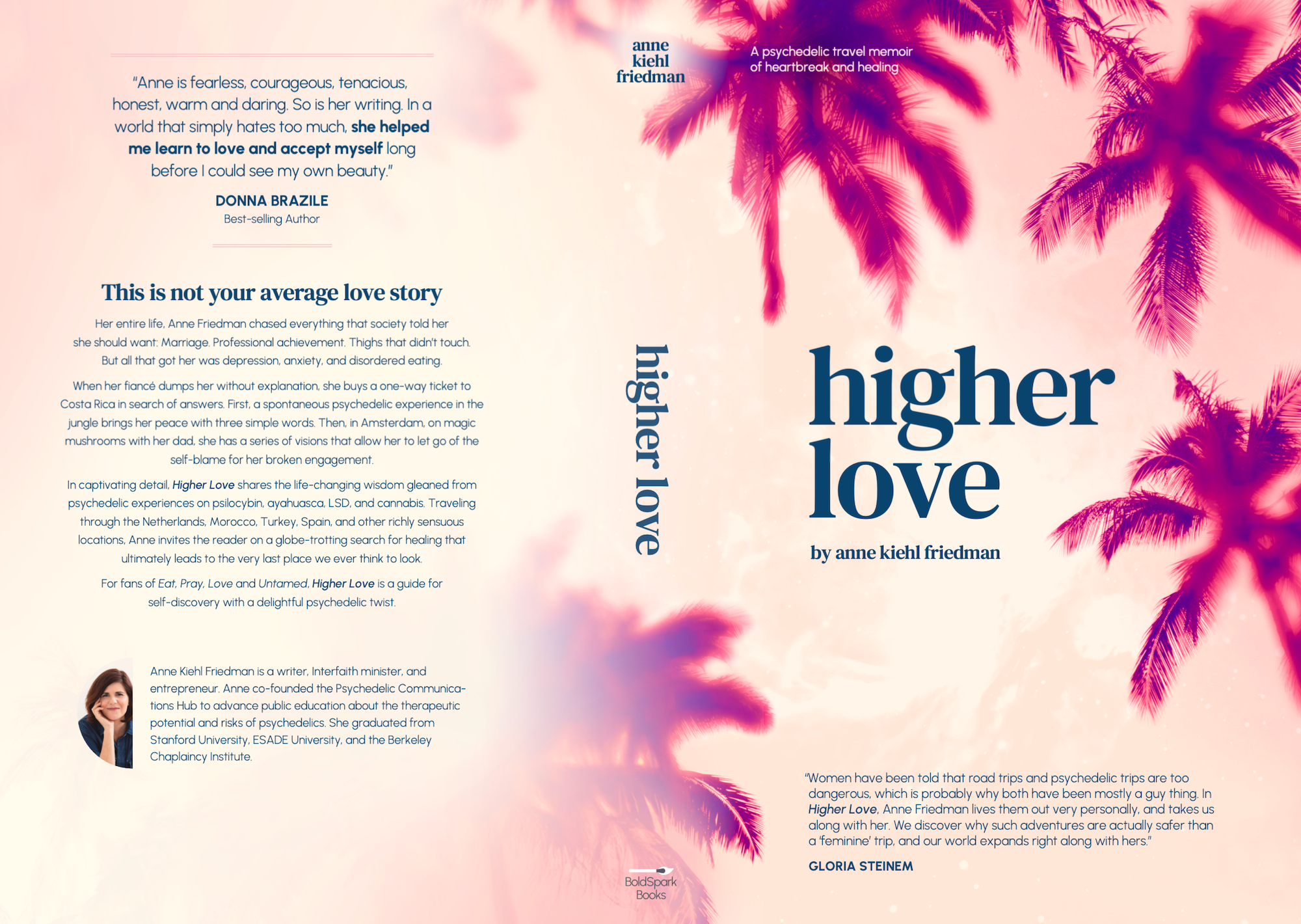
Higher Love’s cover captures the electric dreaminess of psychedelics, as experienced through the female gaze.
There’s a beautiful scene in the memoir where Anne, fueled by a micro-turned-macro dose of LSD, is immensely moved by the rugged, life-giving nature of a ragged palm, identifying it as the ultimate juxtaposition to the “manicured, domesticated, constrained” vision she’d assigned to her own body.
It was this scene specifically that influenced the cover, the view of a woman looking up at melting palm fronds against a subtly celestial sky.
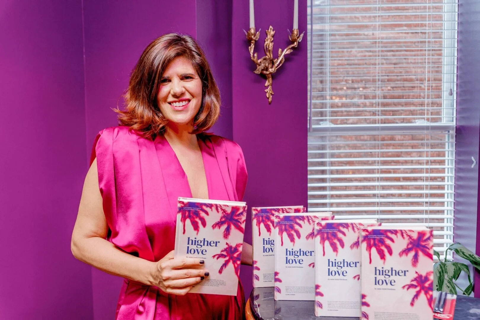
As sole designer on the project, I worked directly with Anne to translate the book’s themes into visual art.
Publishing your first book (a memoir, no less) is stressful and vulnerable, with the book’s cover serving as its face. I listened closely to understand what Anne needed: feminine and sensual, mature and personally resonant (vs. more commercial appeal.)
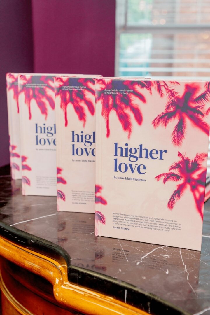
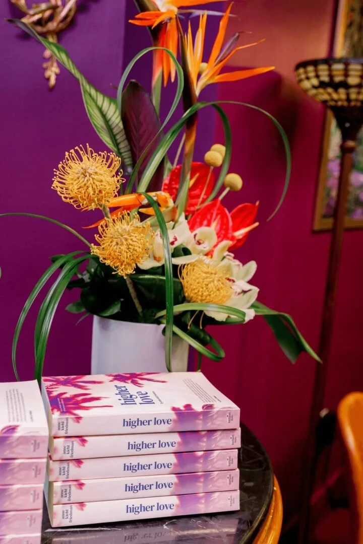
Photos by Danielle Flowers @amberirisphotography
Women have been told that road trips and psychedelic trips are too dangerous, which is probably why both have been mostly a guy thing. In Higher Love, Anne Friedman lives them out very personally, and takes us along with her. We discover why such adventures are actually safer than a 'feminine' trip, and our world expands right along with hers.”
- Gloria Steinem
This design leverages exclusively open-source elements, lowering administrative complexity & avoiding fees.
As an first-time author, self publishing for the first time was an enormous task. Using open-source elements meant one less thing on Anne’s plate during the process. Using the Adobe Suite, I edited the photos heavily to achieve the desired effect. Small tweaks to tracking for the title and leading for the body elevated the highly-accessible Google Fonts.

Aldebaran S (via Unsplash)

Jordan McQueen (via Unsplash)


DM Serif Text (Title), Urbanist (Body)

Custom color palette

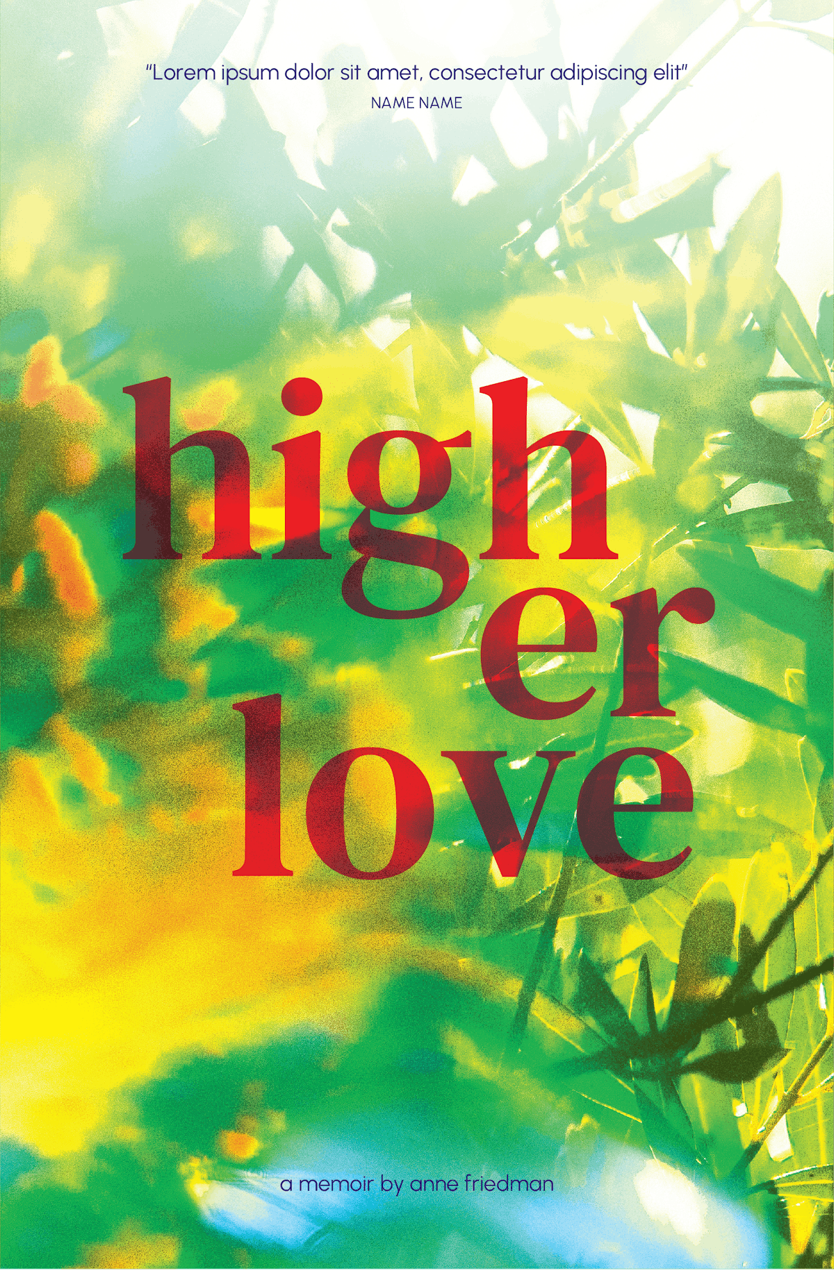
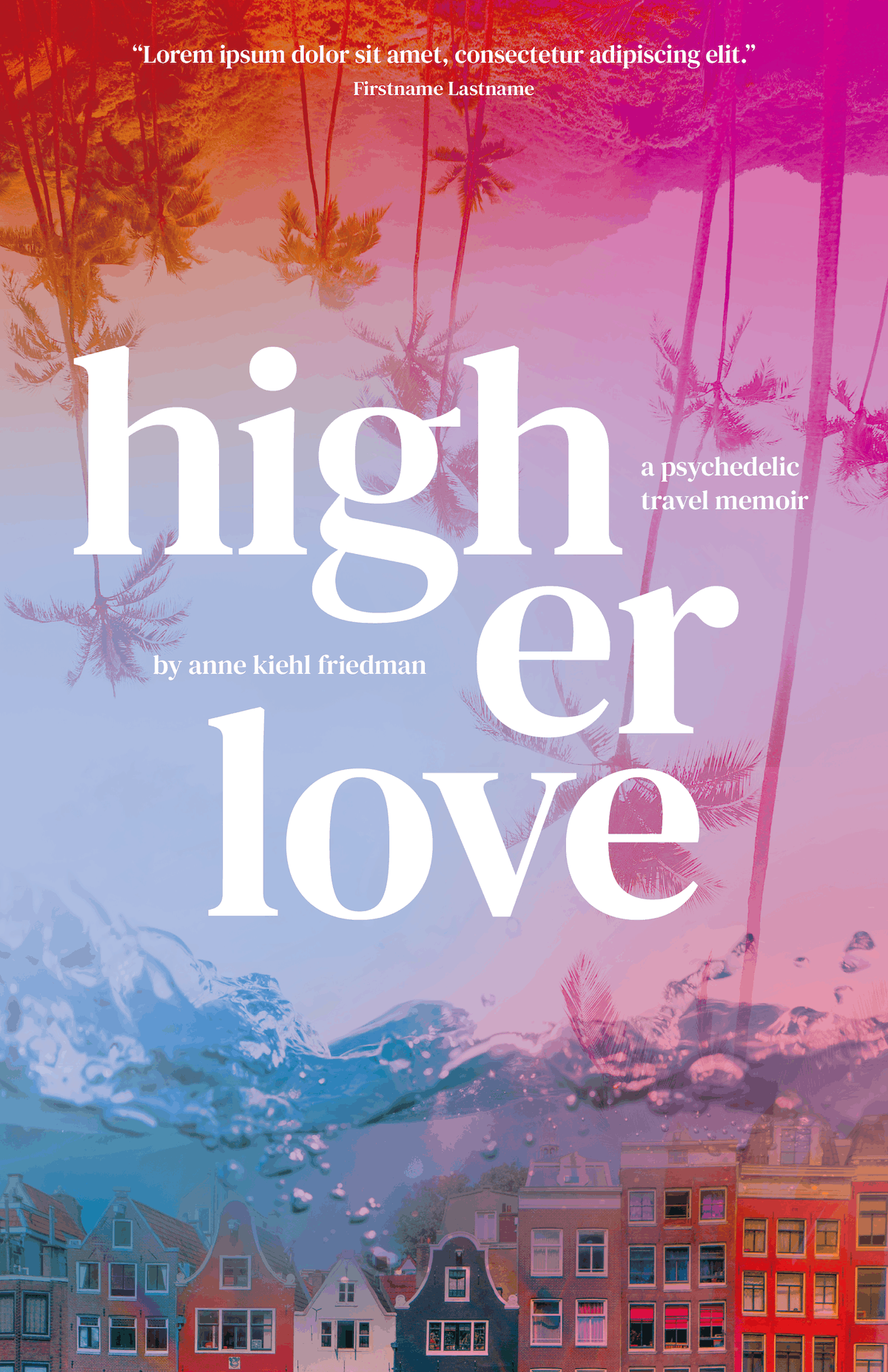
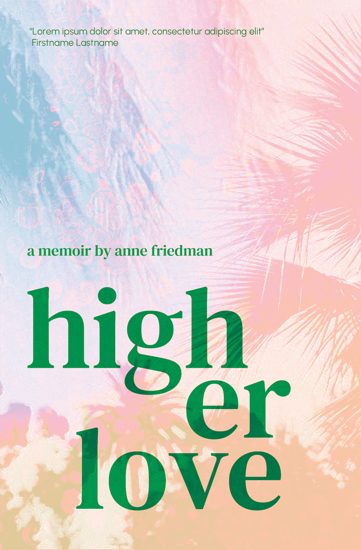
Early explorations ran the gamut, from bubblegum vectors to earthy nostalgia.
After an initial conversation with Anne about the book’s tone, significance, and themes, I provided several options for how we might bring them to life. We selected the version with the pink palms and serifed text as the direction to pursue.

The next round honed in on the visual themes and desired level of complexity.
While I loved the cinematic feel of the bold, disorienting layered photographs, Anne gravitated toward the more lyrical feel of the simpler cover, as it felt more in-tone with the book’s writing style.
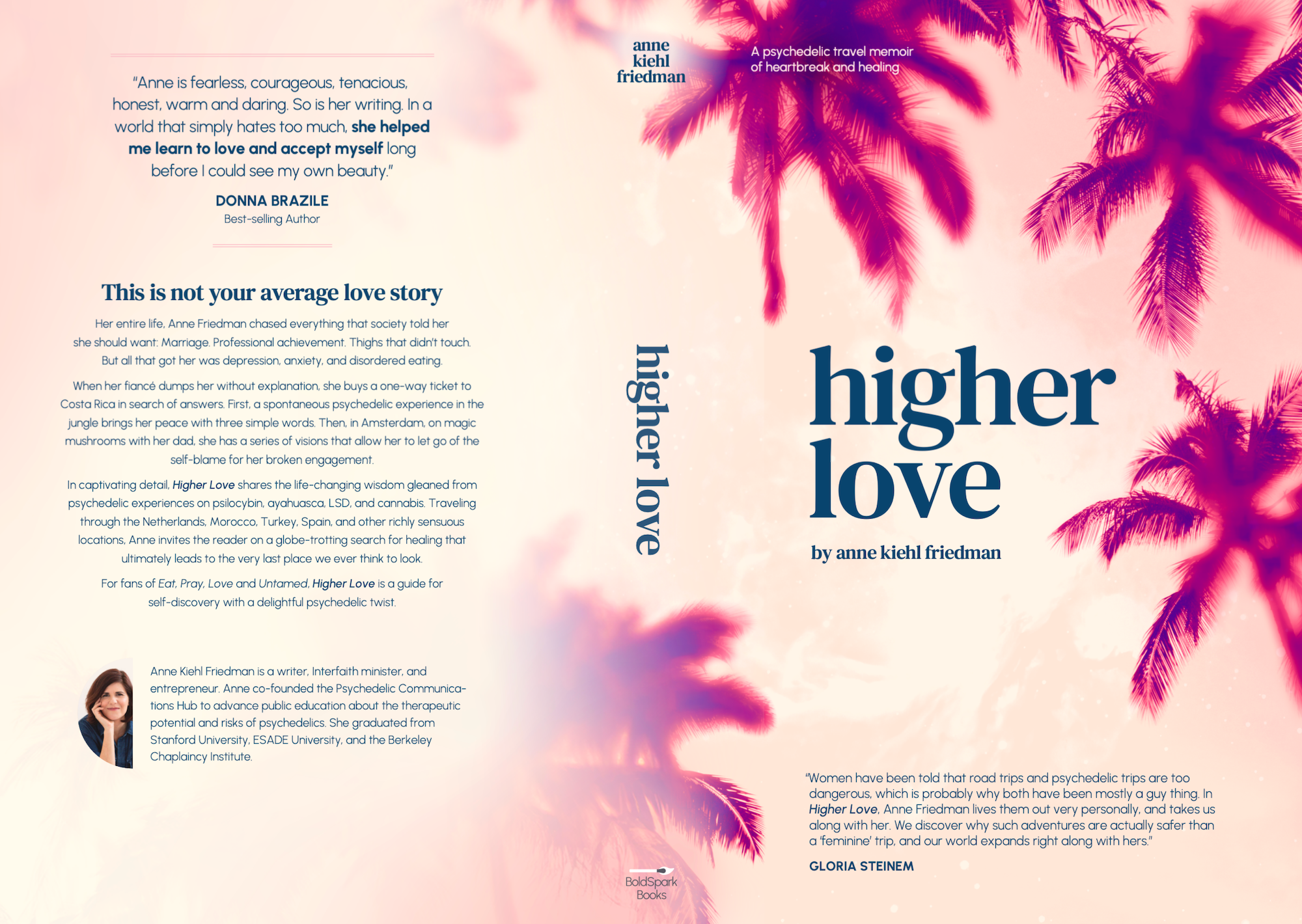
We landed on the lyrical, spacious design, translated into a beautiful hyper-feminine palette.
It was amazing to be able to bring Anne’s vision to life; I felt honored that she entrusted me with the work of designing a cover for what is, in essence, the story of her life.