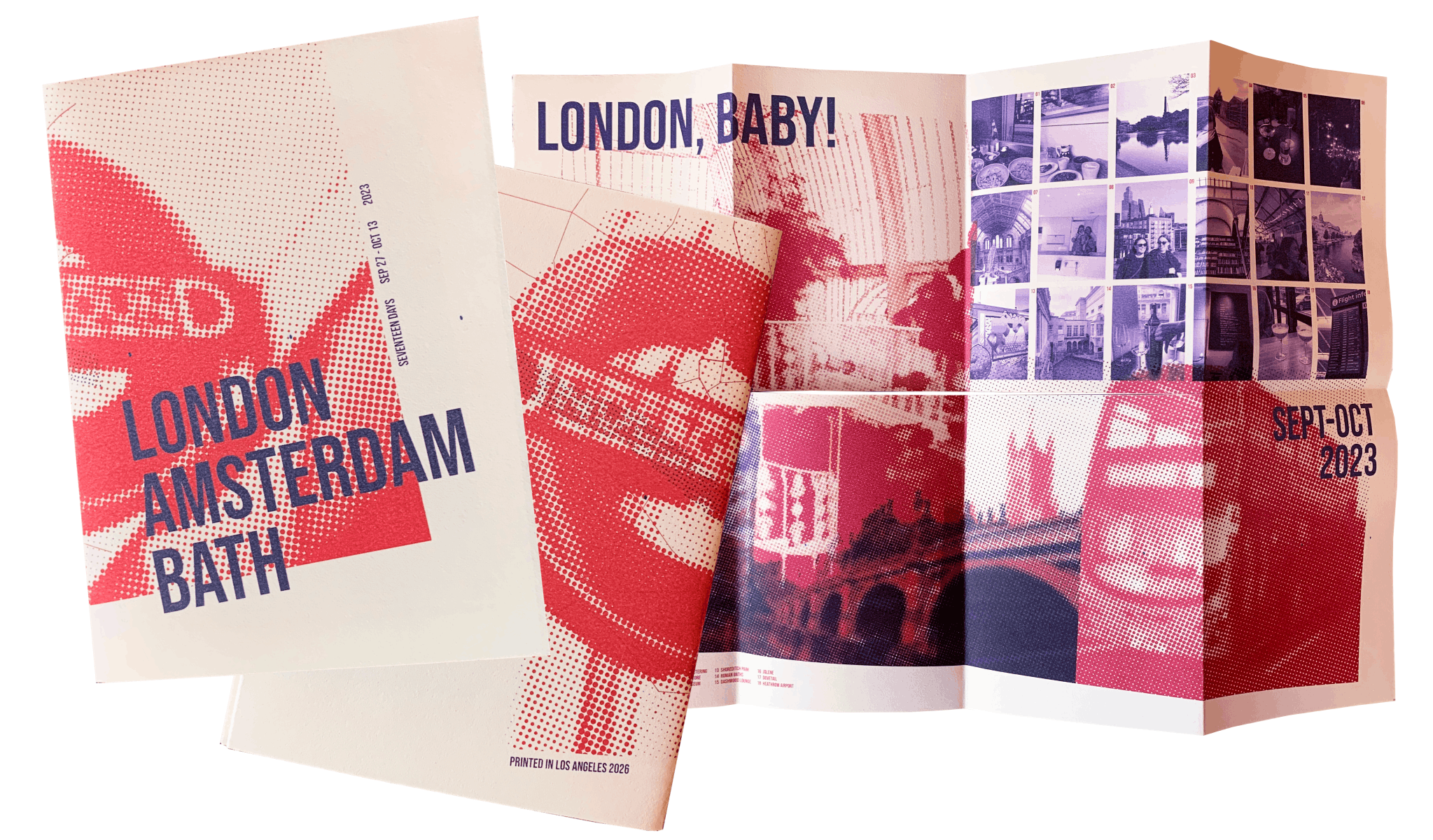
The die-cut poster booklet may be my favorite print format to design for.
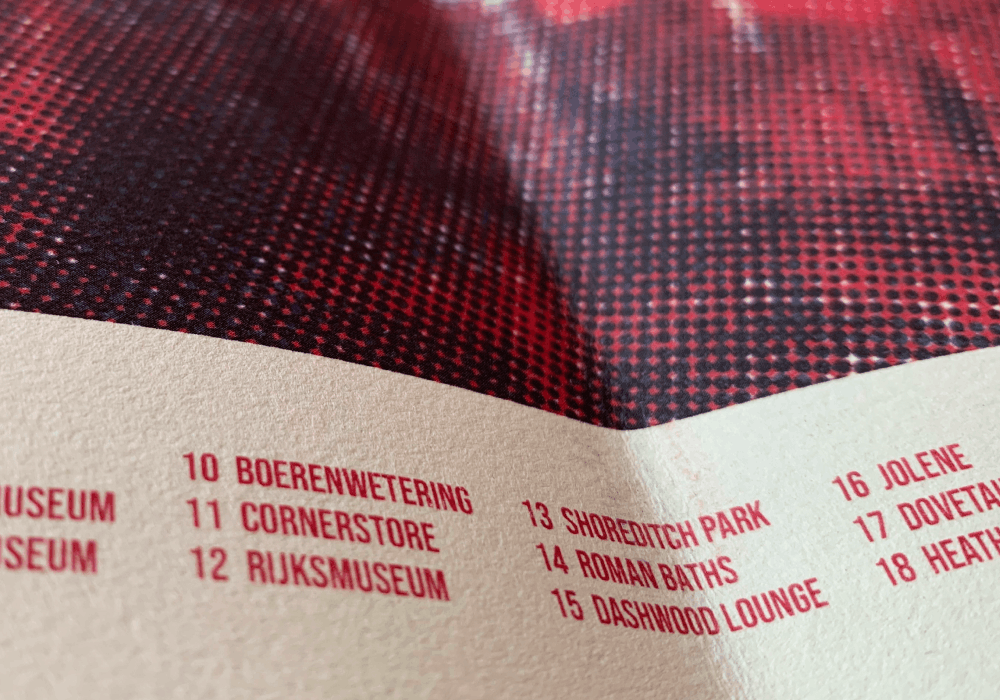
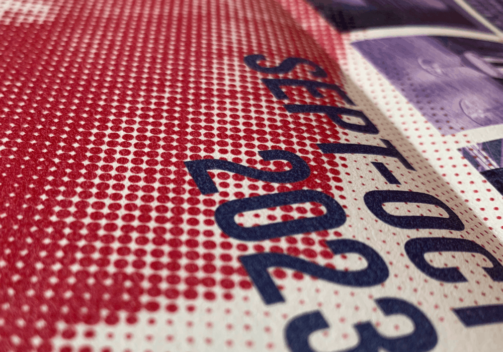
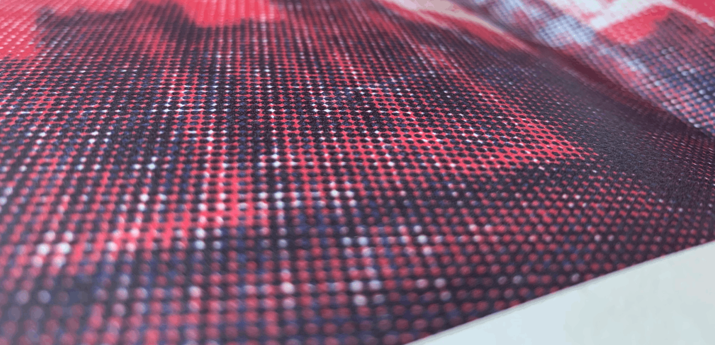
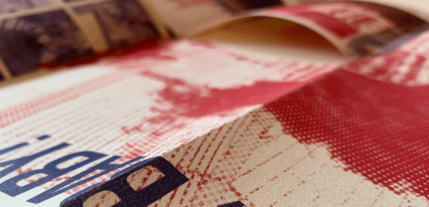
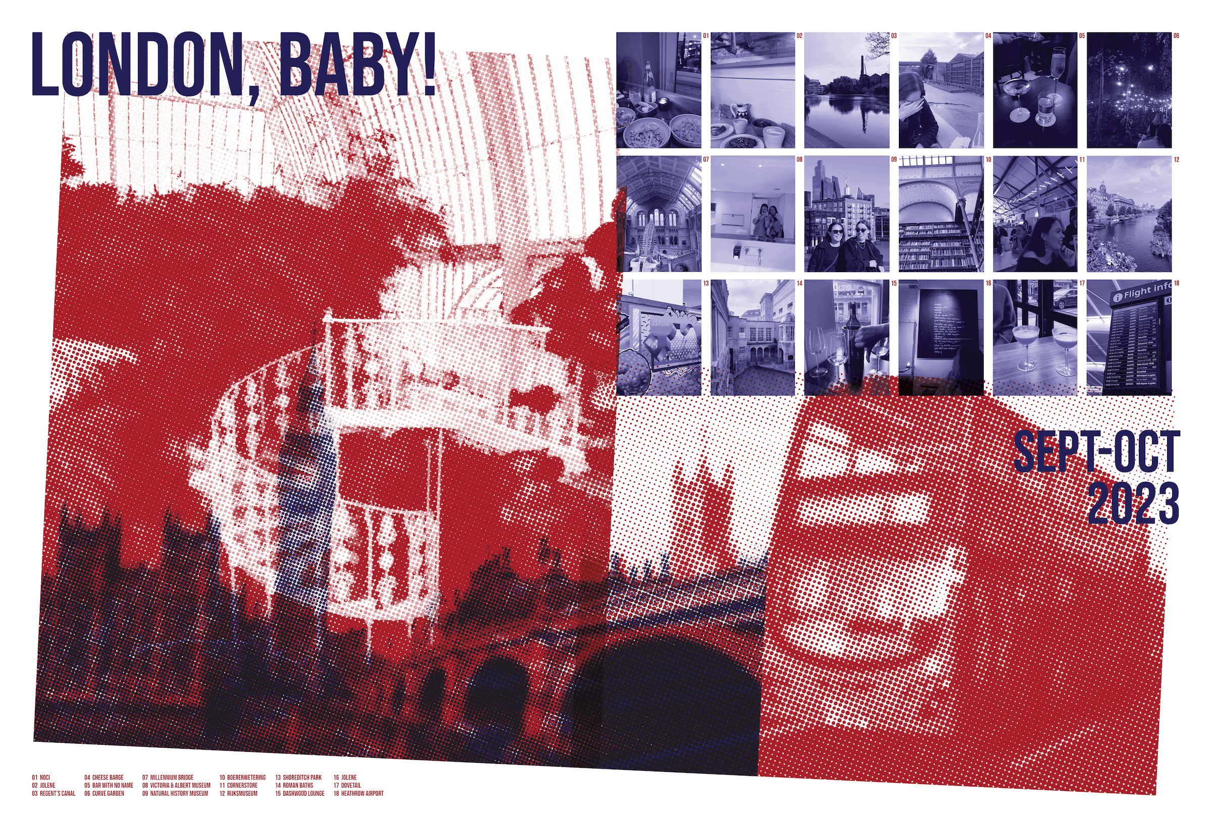
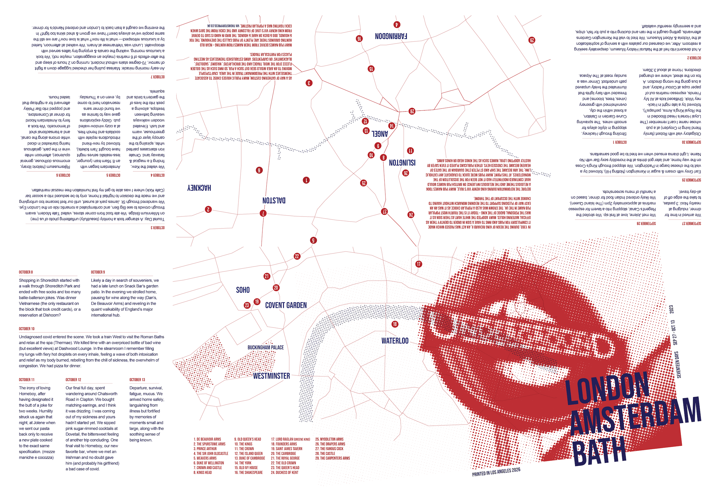
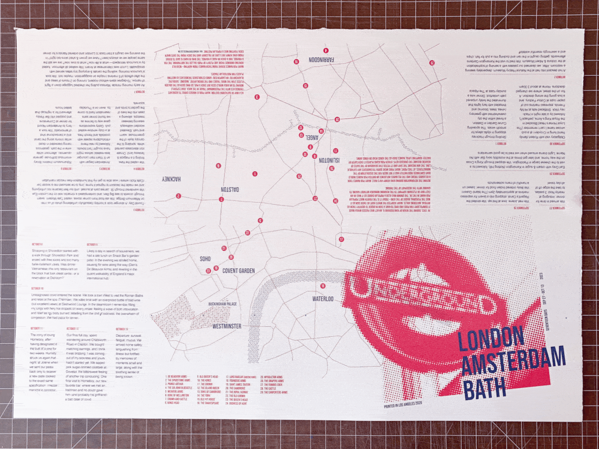
It’s functional, aesthetic, and highly tactile. I designed this special booklet to commemorate a trip to Europe I took with one of my best friends. The stylistic choices are inspired by vintage DIY pamphlets— color choices, font choices, paper selection, and page formatting. It’s meant to feel thoughtful and desirable, but not fussy or overly-precious. For instance, the design intentionally avoids full-bleed so that it can be printed without trimming, and leverages monotone halftone for large imagery to avoid pixelation issues.
Fonts: Bebas Neue, Arial
Paper: Rivas / 115 gsm / cream white
Printer: Pro Print (Pasadena)