
Abstract green squiggly shape resembling an irregular zigzag line on a transparent background.
Branding Project
Hudson Institute of Coaching
Project Brief
Purpose
Refine Hudson’s visual brand to better represent the company’s evolution from mom & pop business to tech-enabled industry leader
Story
Hudson has struggled to nail down a consistent brand that satisfies both its Professional audience, which skews more liberal and woo-woo, and its Corporate audience, which skews more conservative and data-driven. The lack of consistency made it hard to enlist outside design support, whether from contract designers or AI tools.
Goals
1. Develop a fresh look & feel that...
→
Aligns with Hudson’s established brand personality
→
Resonates with multiple diverse audiences
→
Naturally flexes across contexts and tones
2. Codify new branding in a set of guidelines to...
→
Streamline work with contract designers
→
Increase efficiency with AI design tools
Audience
1. Hudson's "Professional" Community (B2C)
→
Individuals who are looking for a meaningful life transition; they choose Hudson for their coach certification because it’s considered to be the “ivy league” of coaching schools, promising deep personal transformation and lifelong connections
→
Alumni who have previously attended Hudson’s coaching program; they return to Hudson for the tightly woven sense of community and the high-quality continuing education opportunities
Hudson's "Corporate" Clients (B2B)
→
Senior-level leaders within mid- to large-size organizations investing in coaching or coaching-related development opportunities; these individuals come to Hudson because they want to provide their people with the highest quality coaching from the provider with the most expertise, and are willing to pay a higher premium for that promise.
Roles
Designer: Marianne Wellman
Primary Stakeholders: Leaders across Marketing, Professional, Corporate, and Sales Teams
The letters M and W, stylized as a wavy, organic form with rounded peaks and valleys.
Final Brand Guide
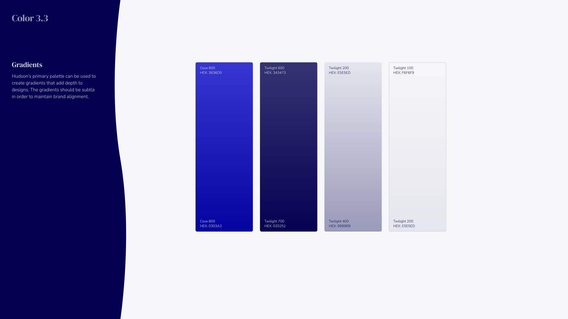
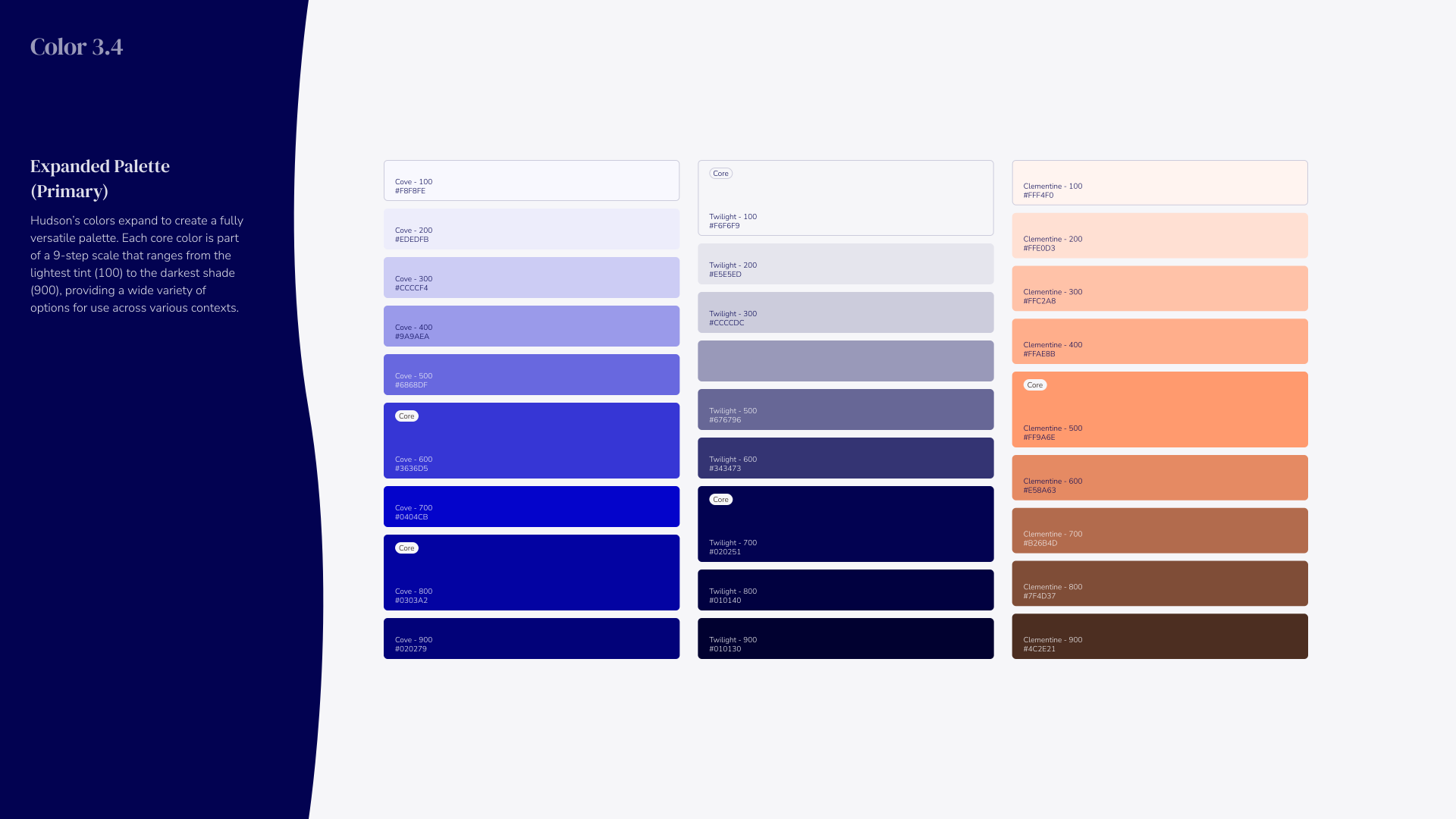
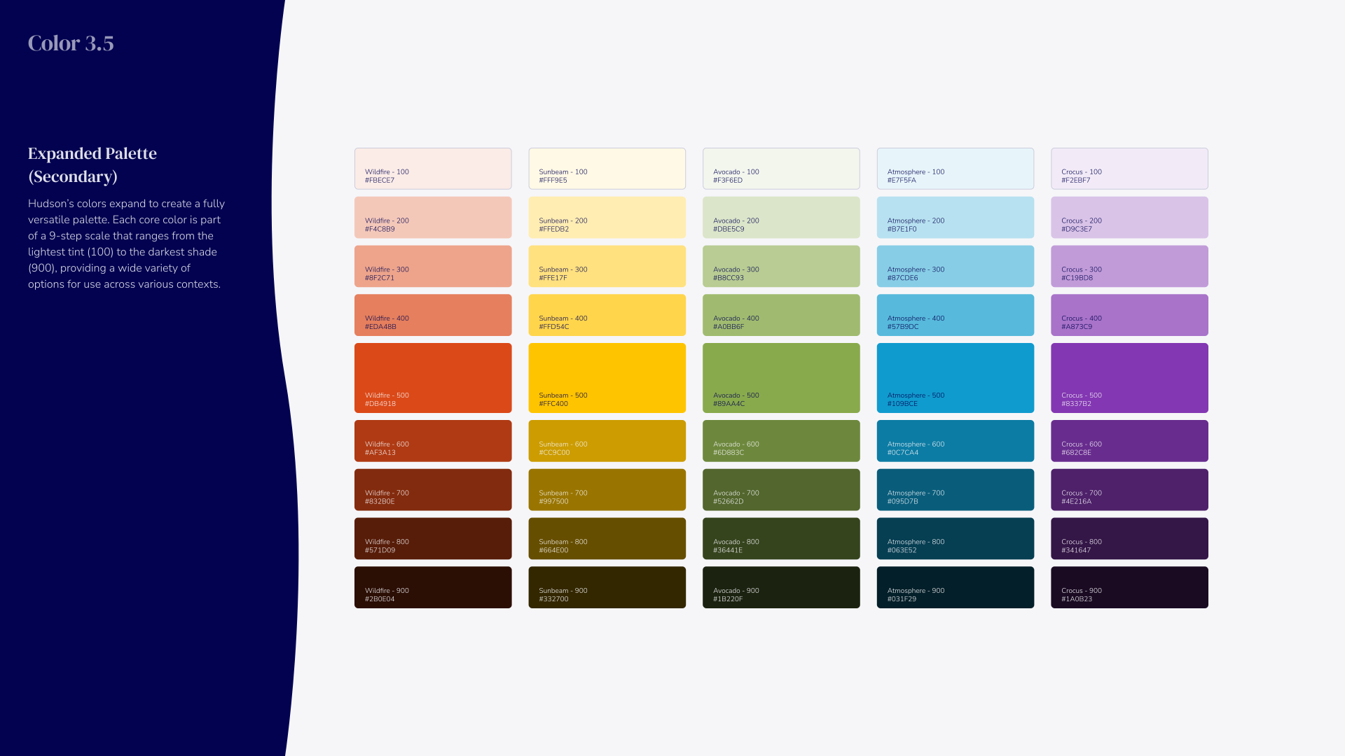
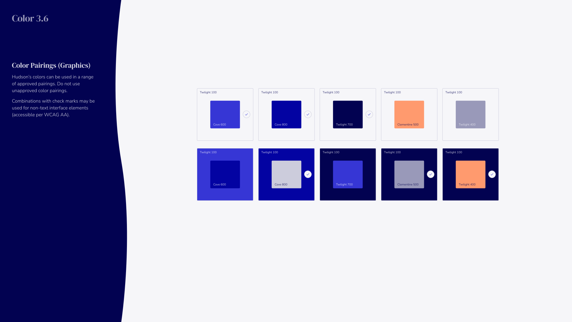
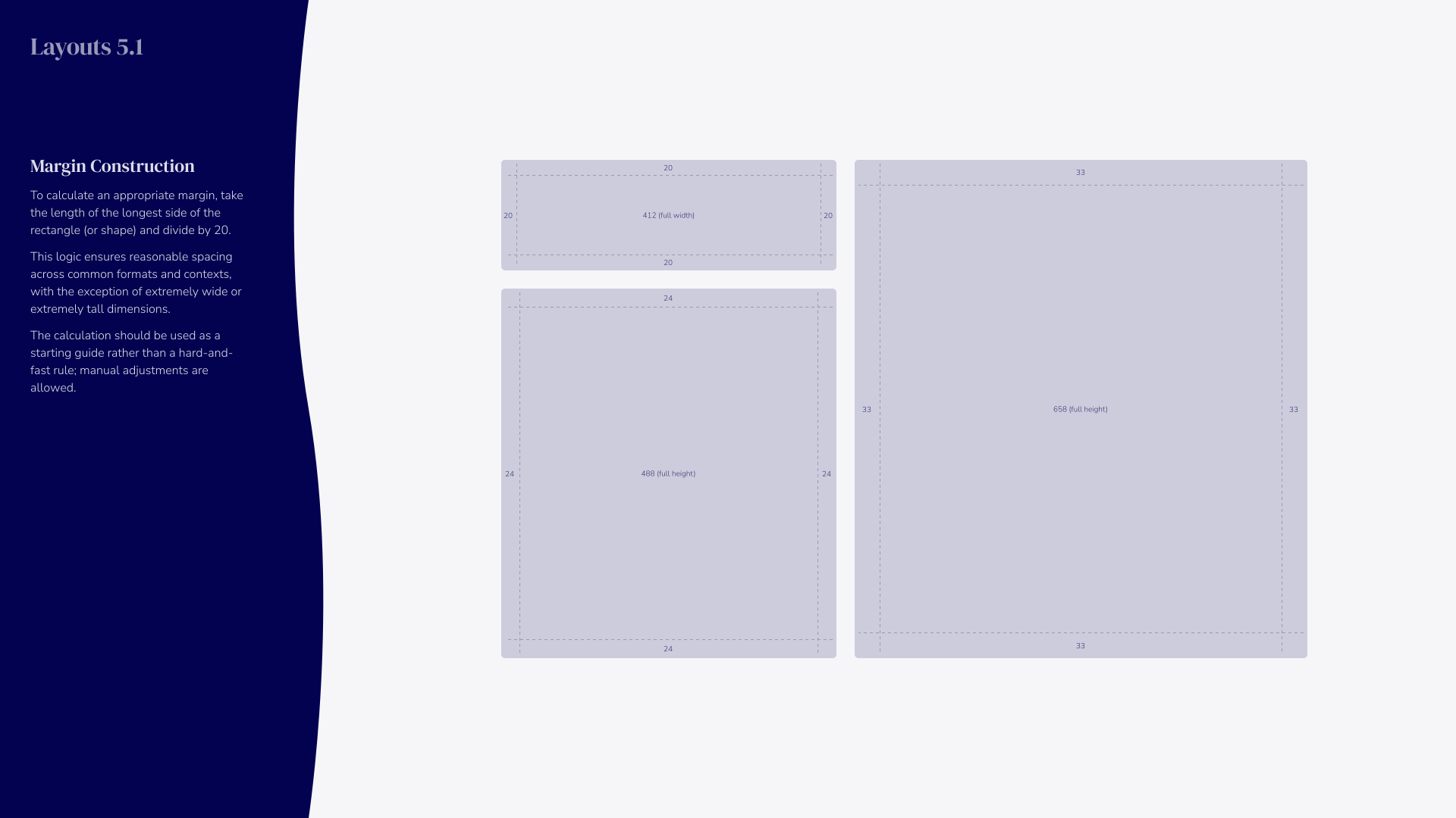
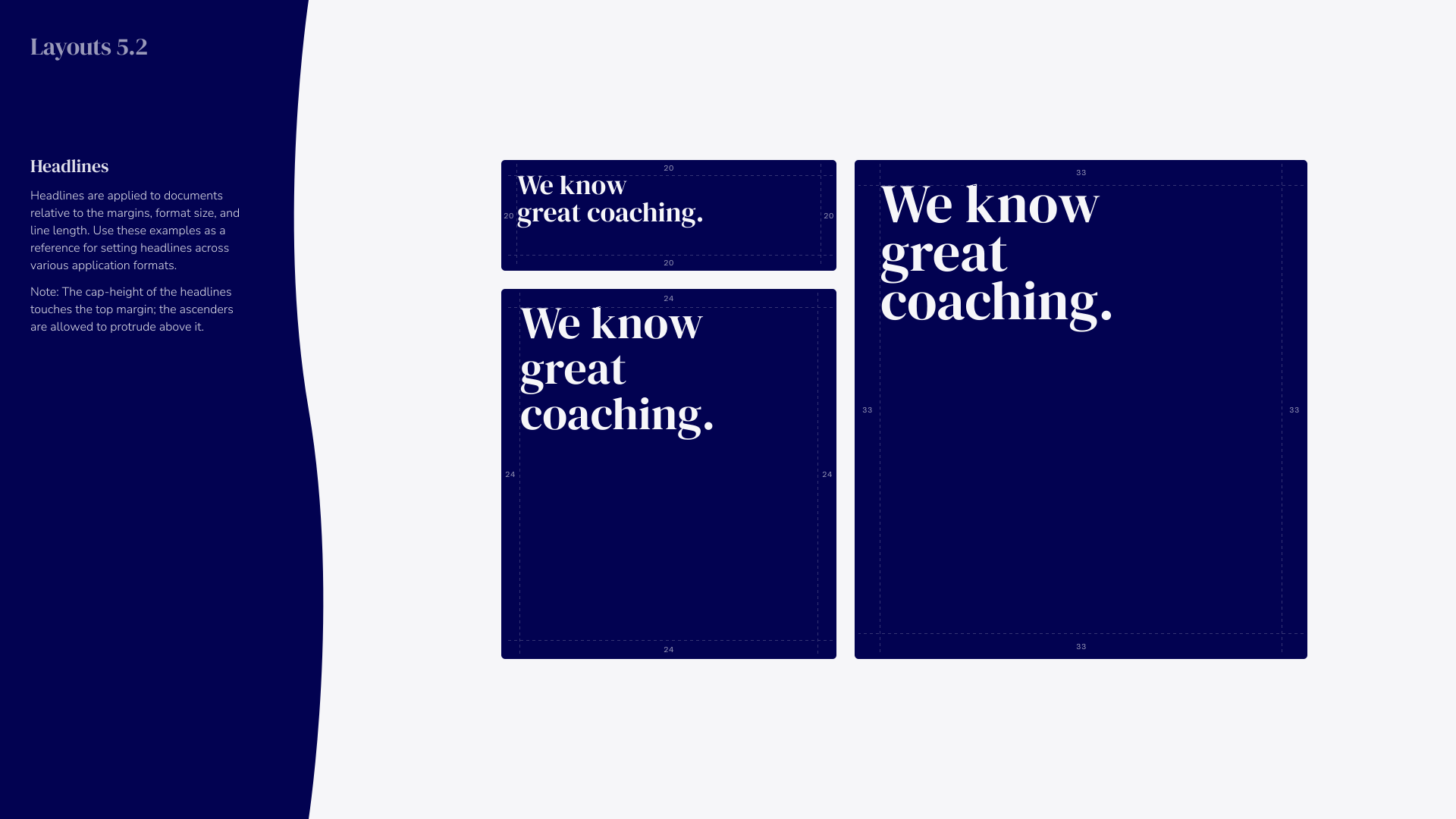
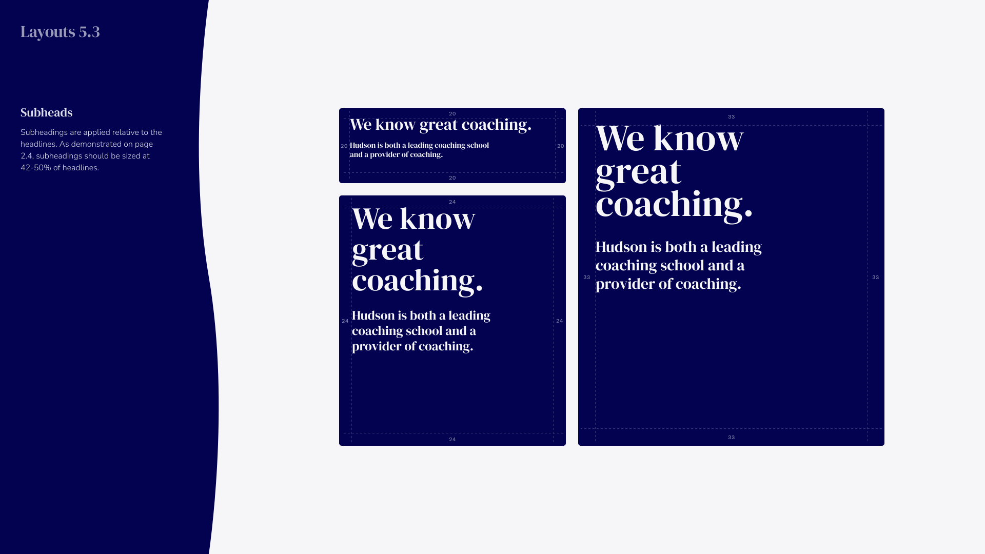
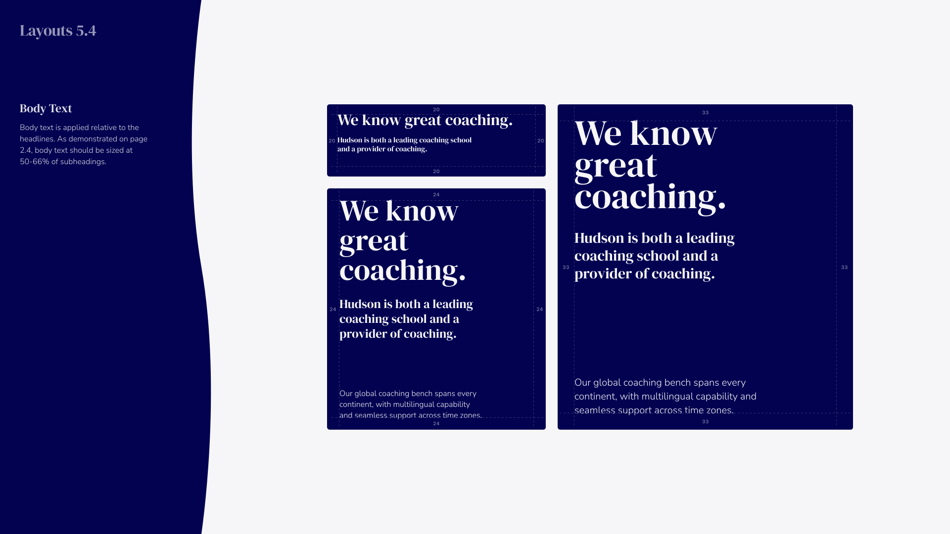
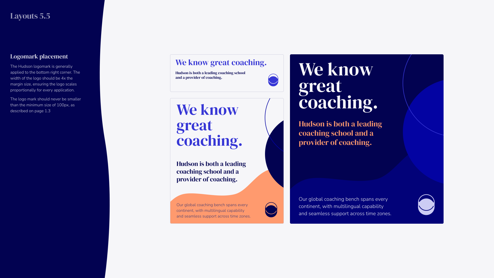
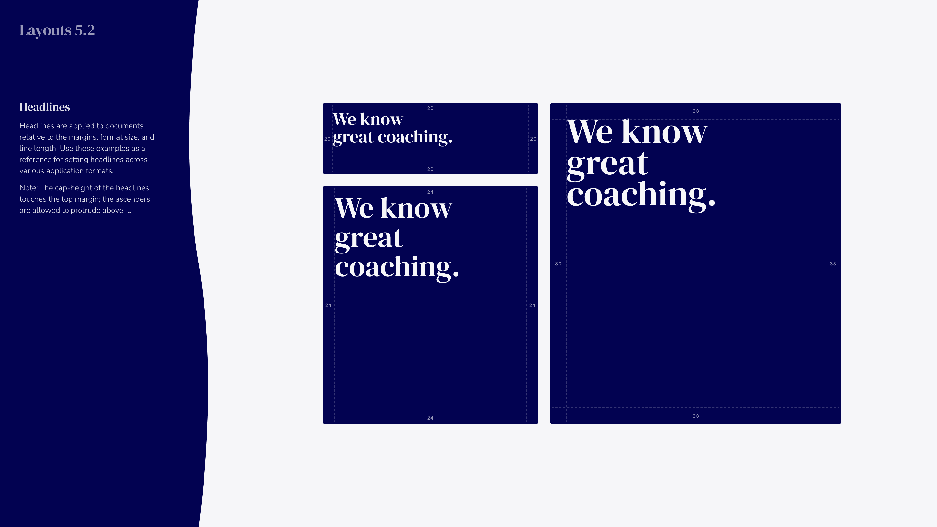
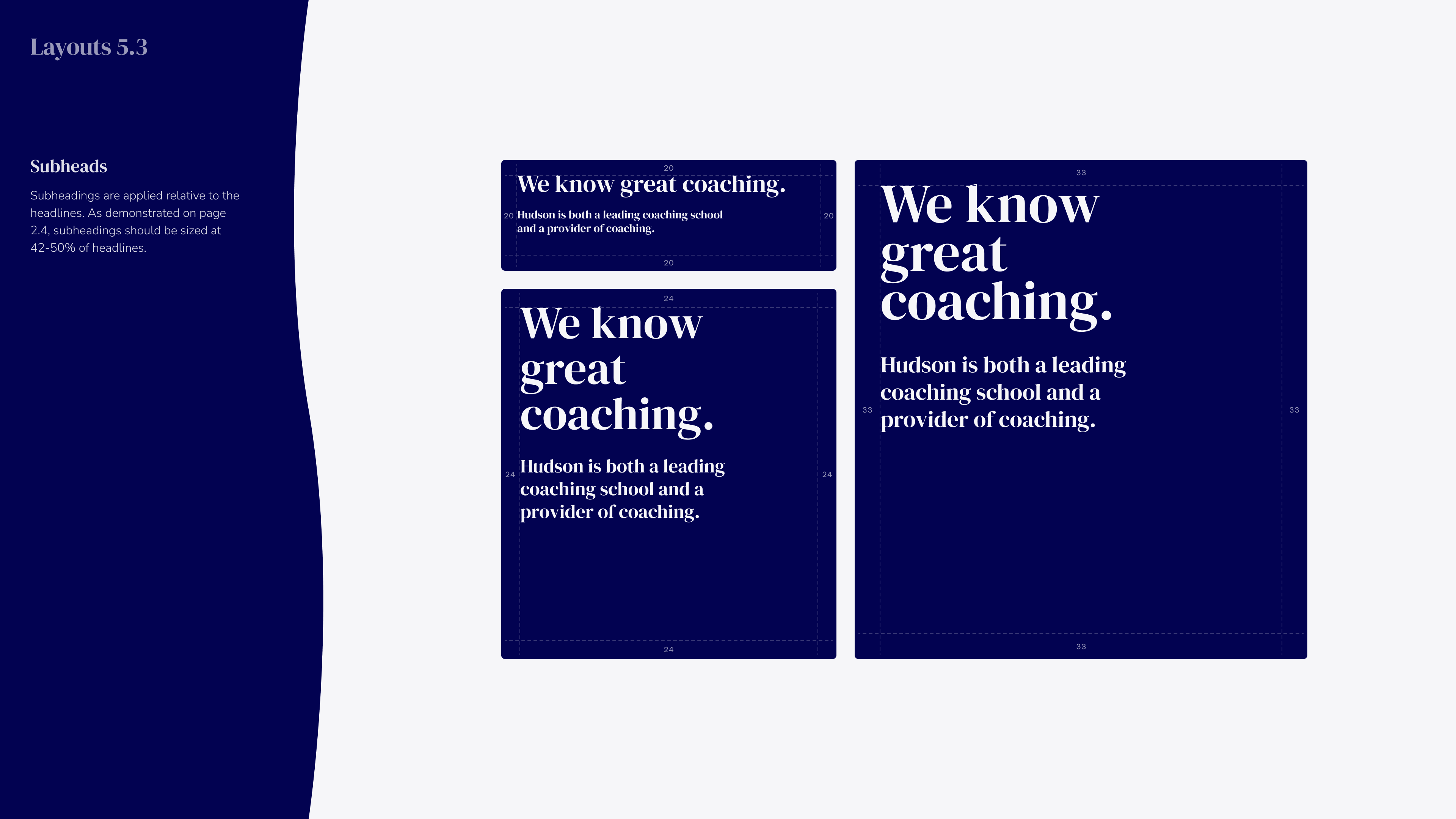
Blue background with the word HUDSON in large blue letters, the O stylized as a circle with curved lines, and below it, in orange text, Brand Guide 2026 with smaller white text saying Hudson Institute of Coaching.Text reading 'Logo 1.0' in bold blue on a light gray background with a large dark blue circle and a thin blue circle outline overlapping in the bottom left and an orange abstract shape in the top right, with 'Hudson Institute of Coaching' in small blue text in the bottom right corner.A blue circular logomark with a thick outline and a curved horizontal line inside forming an abstract eye shape, displayed on a light gray background with a dark blue sidebar containing text about logo usage.Graphic with a large blue wordmark 'HUDSON' centered on a light background, and a dark blue sidebar on the left containing white text explaining the Hudson logotype as the full, formal wordmark to be used without alterations to type, weight, or spacing.Hudson logo in bold blue letters on a light gray background, with the 'O' stylized as a circular emblem.Hudson logo in bold blue letters with stylized circular shapes defining clear space boundaries around it on a light background with a dark blue sidebar containing clear space guidelines text.Four variations of the Hudson logo showing correct color usage: white on navy, blue on white, navy on white, and blue on navy backgrounds, accompanied by text guidelines on approved colors and usage conditions.Graphic with the word 'Type' in large blue text followed by '2.0' below it, a dark blue semicircle shape on the bottom left, and an orange wavy shape on the top right, with 'Hudson Institute of Coaching' in purple text at the bottom right corner.Typography guide for DM Serif Display font featuring a large heading 'DM Serif Display', a sample headline 'We know great coaching.', and a character set of uppercase, lowercase letters, numbers, and special characters on a white background with a dark blue curved sidebar explaining the font's usage for headlines and availability in G-Suite.Typography guide showing the Nunito Sans font family as a body font for Hudson brand, with sample text, character set including uppercase, lowercase letters, numbers, and symbols, emphasizing consistent use and availability in G-Suite.Typography example labeled Type 2.3 showing different line heights: headline text 'Programmatic Coaching (Group)' at 100% line height, subhead at 120%, and body text at 140% line height with descriptions about using tighter line heights for larger type and more space for smaller text.Typography guide showing type-size relationship with headline at 120 pt, subhead at 60 pt, and body text at 40 pt, with subhead size 50% of headline and body 66% of subhead. Text example reads: 'We know great coaching. Our global coaching bench spans every continent, with multilingual capability and seamless support across time zones. Developing leaders at depth requires sustained, disciplined coaching over time. Internal Coach Certification (ICC) brings professional coaching in-house, equipping leaders to develop others through sustained, high-impact engagements.'A layout titled 'Type 2.5' with a dark blue sidebar on the left listing typography guidelines under 'What to Avoid,' including avoiding extremely tall leading, overly tight leading with crashing ascenders and descenders, overly wide tracking with floating glyphs, overly tight tracking with crashing glyphs, mixing accent colors within one body of text, and using all caps. The main area shows seven text boxes demonstrating these issues: too tall leading, too tight leading, too wide tracking, too tight tracking, multiple accent colors used, and all caps case. Each box contains the same paragraph about Hudson facilitating Quarterly Business Reviews with a Client Partner and Program Manager.Title card with the word 'Color' in large blue text and '3.0' below it on a light background, with abstract blue and peach shapes; 'Hudson Institute of Coaching' appears in the bottom right corner.Color palette chart titled 'Color 3.1' showing five vertical color swatches named Twilight 700 (dark navy blue, HEX 020251, RGB 2,2,81), Cove 600 (vivid blue, HEX 0303A2, RGB 3,3,162), Cove 400 (bright blue, HEX 3636D5, RGB 54,54,213), Clementine 500 (soft orange, HEX FF9A6E, RGB 255,154,110), and Twilight 100 (very light gray-blue, HEX F6F6F9, RGB 246,246,249). Left panel titled 'Primary Palette' describes these as Hudson's core colors for primary brand use, cautioning not to replace them with unapproved alternatives.Five vertical color blocks labeled as Hudson's secondary palette for data visualization: Wildfire (HEX DB4918, RGB 219/73/24), Sunbeam (HEX FFC400, RGB 255/196/0), Avocado (HEX 89AA4C, RGB 137/170/176), Atmosphere (HEX 109BCE, RGB 16/155/206), and Crocus (HEX 8337B2, RGB 131/55/178). Left side panel explains these colors help distinguish entities in charts, graphs, and color-coded labels.Color 3.3 section showing gradients for Hudson’s primary palette with four vertical gradient bars labeled with color names and HEX codes: Cove 600 to Cove 800, Twilight 600 to Twilight 700, Twilight 200 to Twilight 400, and Twilight 100 to Twilight 200. Accompanying text explains gradients add depth and should be subtle for brand alignment.Color palette chart titled Color 3.4 showing an expanded primary palette for Hudson with a 9-step scale for three colors: Cove, Twilight, and Clementine. Each color shade is displayed in rectangular swatches arranged vertically from lightest (100) to darkest (900) with their hex codes, such as Cove 100 #F8F8FF and Clementine 900 #4C2F21. Core colors in the scale are labeled Cove 600, Twilight 700, and Clementine 500. A sidebar text explains this palette expands Hudson’s core colors to accommodate varied uses.Color 3.3 section showing gradients for Hudson’s primary palette with four vertical gradient bars labeled with color names and HEX codes: Cove 600 to Cove 800, Twilight 600 to Twilight 700, Twilight 200 to Twilight 400, and Twilight 100 to Twilight 200. Accompanying text explains gradients add depth and should be subtle for brand alignment.Color 3.6 graphic showing approved color pairings with check marks for accessibility compliance. Pairs include Cove 600 over Cove 800, Twilight 700, Clementine 500, and Twilight 400; and reversed pairs with these colors on backgrounds of Twilight 100, Cove 600, Cove 800, Twilight 700, and Clementine 500.Color 3.7 chart showing accessible color pairings for text using Hudson's colors Cove, Twilight, and Clementine in various shades and combinations, with some pairs marked for accessibility only on large text; includes guidance text explaining legibility and WCAG AA compliance.Design guidelines titled 'Color 3.8' with a section called 'What to Avoid' listing three color use tips: avoid colors out of balance, non-approved color combinations, and inaccessible color combinations per WCAG AA. To the right are three example blocks: the first with peach and blue colors stating 'We know great coaching.' as an example of colors out of balance; the second block in brown with cream text about global coaching spanning continents as a non-approved combination; the third block in blue with black text about Hudson as a coaching school representing an inaccessible combination.Text reading Shapes 4.0 in blue on a light gray background with an abstract orange shape in the top right corner and overlapping blue and white circles in the bottom left corner, with Hudson Institute of Coaching in the bottom right.Diagram showing nine pairs of two overlapping circles arranged in a grid with three rows and three columns; each pair has one filled circle and one outlined circle with the outline always lighter. The left column pairs are dark navy blue filled with navy outlines, the middle column pairs are royal blue filled with bright blue outlines, and the right column pairs are medium blue filled with light orange outlines. A blue vertical panel on the left has text titled 'Primary Shapes' explaining the use of two similarly sized circles with fill and stroke, recommending blue-on-blue combinations generally and orange on blue for a playful feel.Three abstract blue secondary shapes on a light gray background: one vertical wavy rectangle on the left, and two organic blob-like shapes centered and right, alongside text explaining secondary shapes add organic feel, balance grid rigidity, and should be 1-2 shades lighter or darker in formal contexts.A design layout showing examples of secondary decorative shapes called Hudson's shapes placed partially within rectangular containers in various corners and edges, alongside instructions on the left describing their use to create brand connection and aesthetic appeal with interaction at container edges.Text displaying the word 'Layouts' in bold blue font above version number 5.0 on a light background with abstract dark blue and orange shapes, with 'Hudson Institute of Coaching' in small text at the bottom right.Diagram titled Layouts 5.1 showing margin construction guidelines: three rectangles with dimensions labeled and margins of 20 to 33 units around them; text explains to calculate margin by dividing the longest side length of the shape by 20 for reasonable spacing, recommending manual adjustments.Layout example titled 'Layouts 5.2' showing headline design guidelines. Three navy blue blocks on a light background contain the white headline text 'We know great coaching.' in different sizes and line lengths. On the left side, a navy column with text explains headlines are applied relative to margins, format size, and line length, noting the cap-height touches the top margin while ascenders may protrude.Layout 5.3 with a dark blue curved sidebar on the left showing the heading 'Subheads' and text explaining subheadings should be sized at 42-50% of headlines. On the right, three navy blue rectangles show the phrase 'We know great coaching.' with the subtext 'Hudson is both a leading coaching school and a provider of coaching.' in different font sizes and arrangements, illustrating subheading scaling relative to headlines.Layout 5.4 illustrating body text size relative to headlines with three text boxes in dark blue. Each box contains the headline 'We know great coaching.' followed by smaller text, showing different font sizes: 20, 24, and 33 point for headline and body text. On the left, a note says body text should be 50-66% the size of subheadings.Three layout examples with the headline 'We know great coaching.' Each includes the subtext 'Hudson is both a leading coaching school and a provider of coaching.' The smaller layouts feature a circular logo mark in the bottom right corner. The largest layout has additional text about global coaching presence and multilingual support, with dark blue and peach color accents. On the left, instructions explain the logo mark placement should be bottom right and at least 100px wide.
Lorem ipsum dolor sit amet, consectetur adipiscing elit, sed do eiusmod tempor incididunt ut labore et dolore magna aliqua. Ut enim ad minim veniam, quis nostrud exercitation ullamco laboris nisi ut aliquip ex ea commodo consequat.
'HUDSON' written in bold blue capital letters with a stylized circular design inside the 'O', on a dark blue background; below in orange text is 'Brand Guide 2026' and under that in smaller white text 'Hudson Institute of Coaching'.
A minimalist presentation slide with the word 'Logo' in large blue serif font and '1.0' below it, abstract blue and orange shapes in corners, and 'Hudson Institute of Coaching' in small blue text at the bottom right.
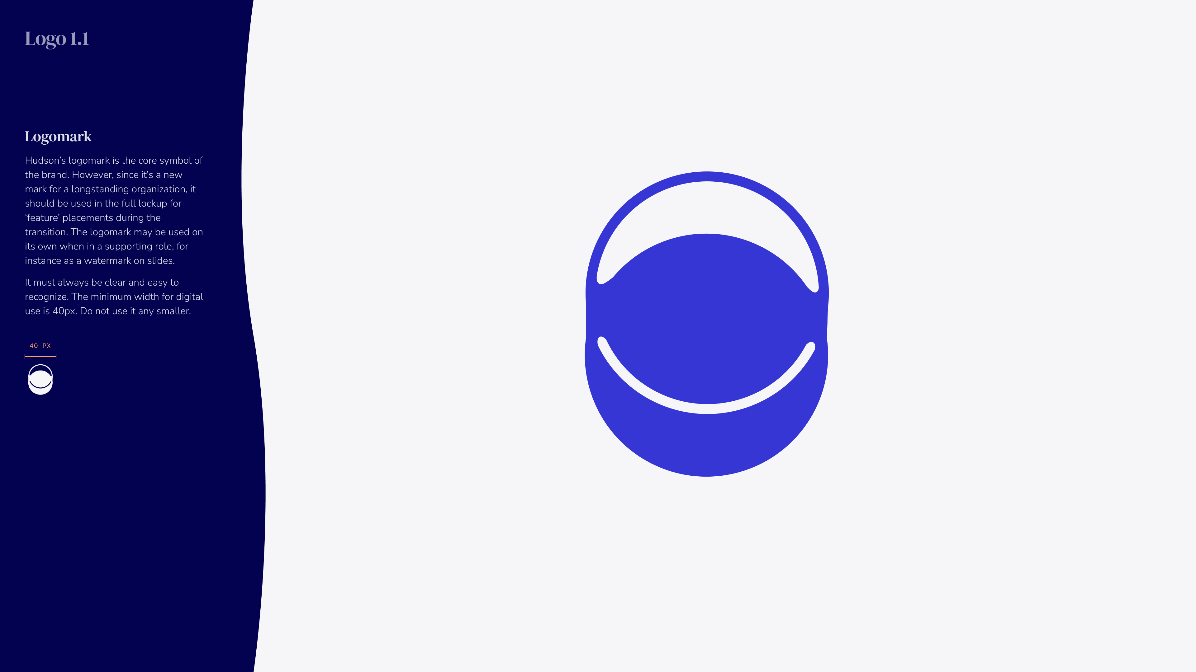
Abstract blue logomark consisting of a solid circle with two curved lines forming a smile shape inside and an arch above it, on a light gray background with a dark blue vertical panel on the left containing descriptive text about the logomark and usage guidelines.
The word HUDSON in bold, blue uppercase letters centered on a light background, with a dark blue curved panel on the left containing small white text titled 'Logo 1.2' and a description of the logotype usage and guidelines.
Blue HUDSON logo with a stylized circular design replacing the letter O, showing two wave shapes inside the circle on a light gray background.
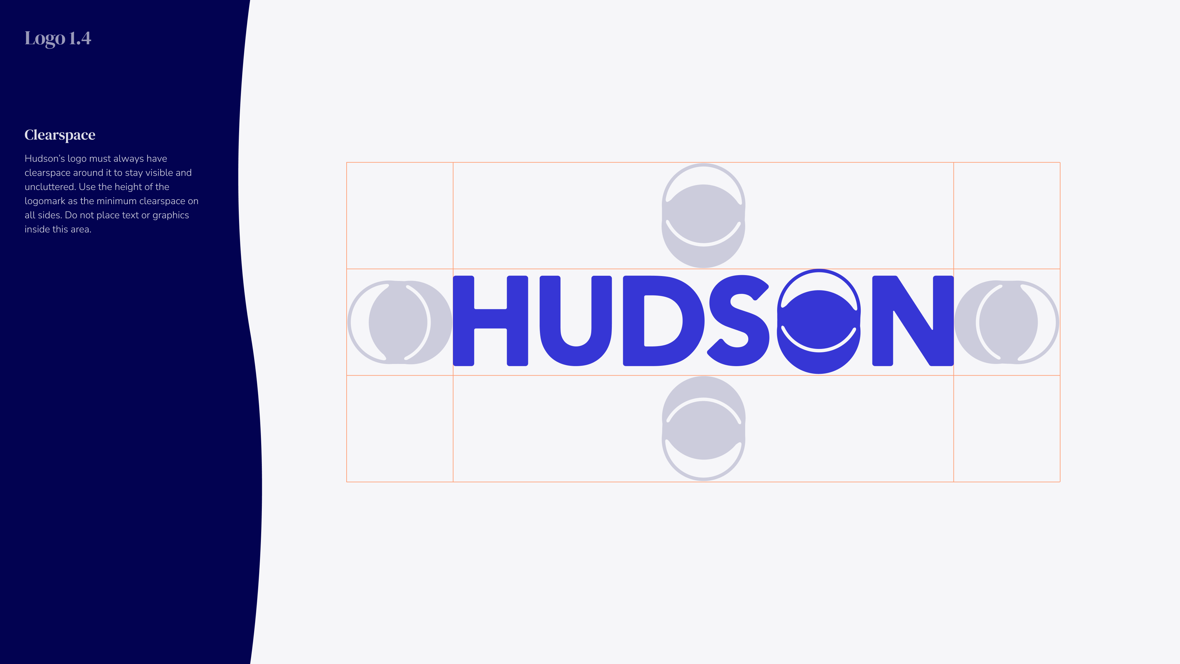
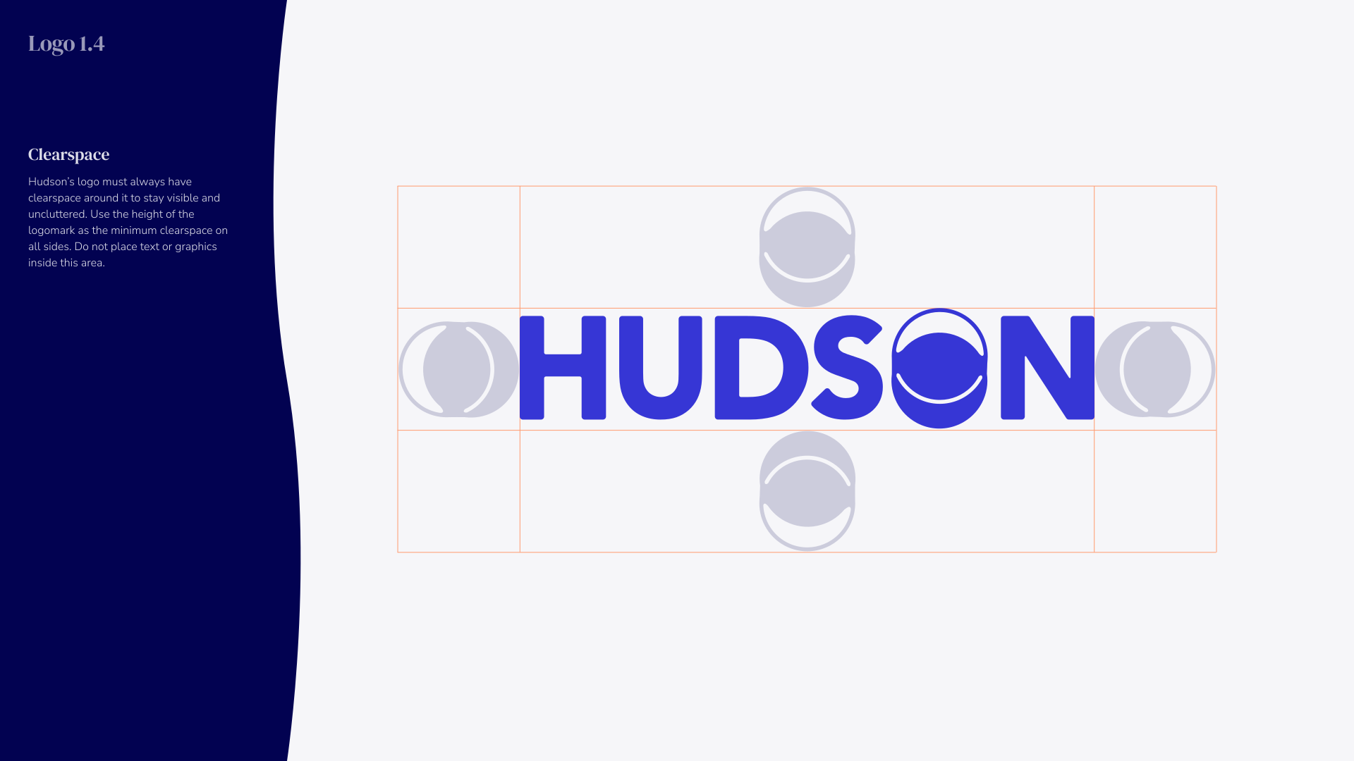
The Hudson logo in blue uppercase letters with a wave design inside the letter O, surrounded by a clear space marked by circular guides on each side and above and below, shown on a light background with a dark blue panel on the left containing text about the logo's clear space.
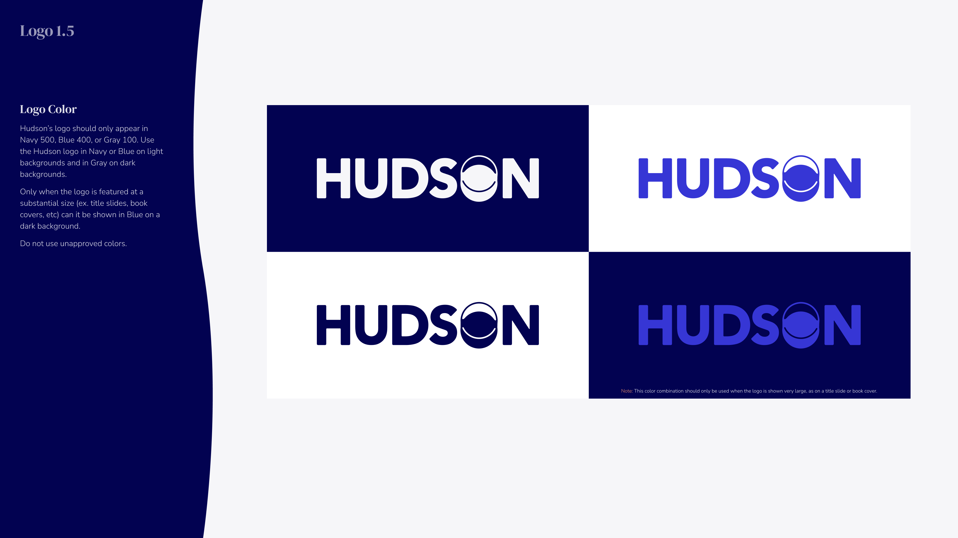
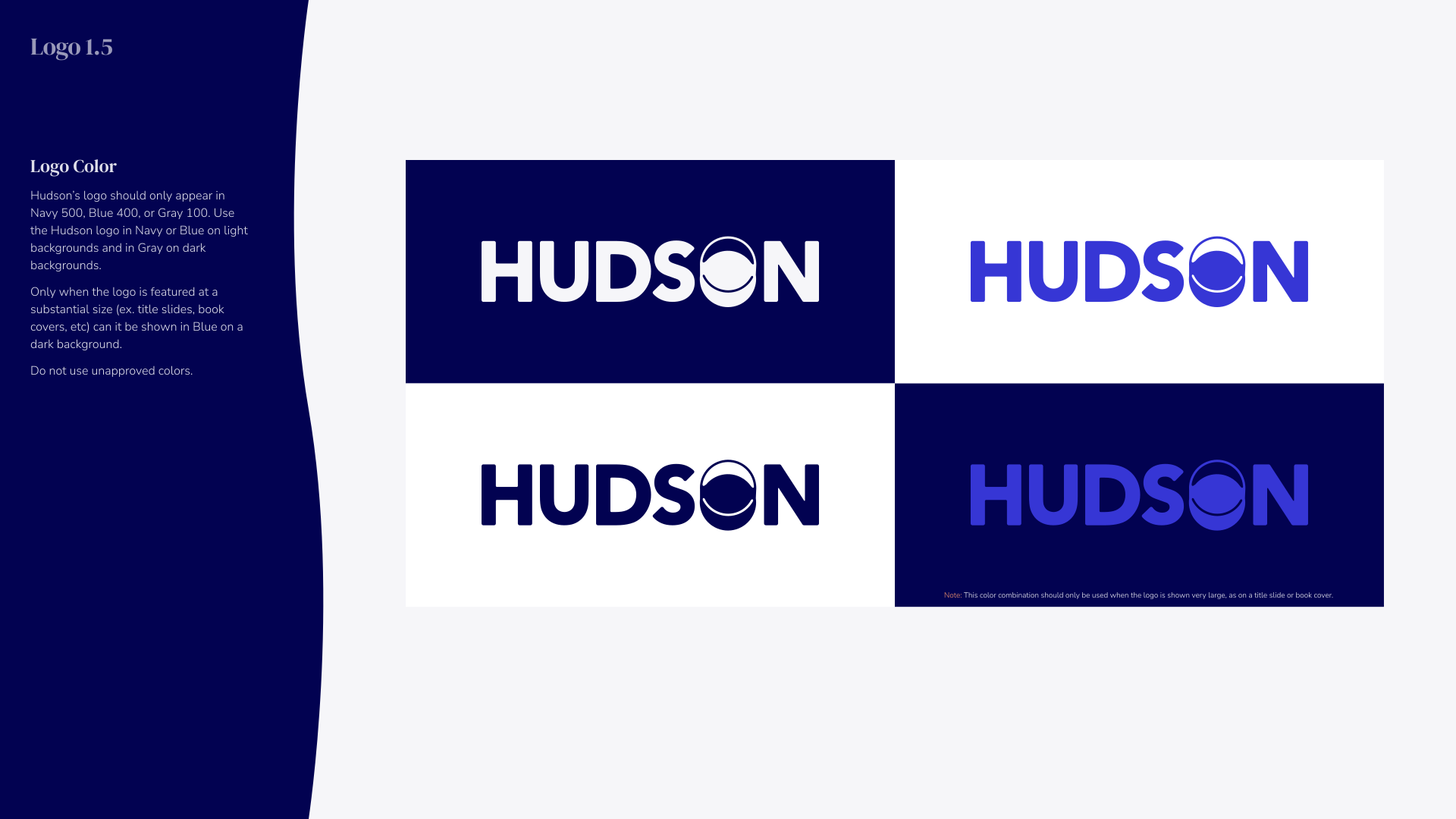
Four variations of the HUDSON logo showing different color combinations: white on navy blue, blue on white, navy blue on white, and purple on navy blue, demonstrating approved logo color usage on light and dark backgrounds.
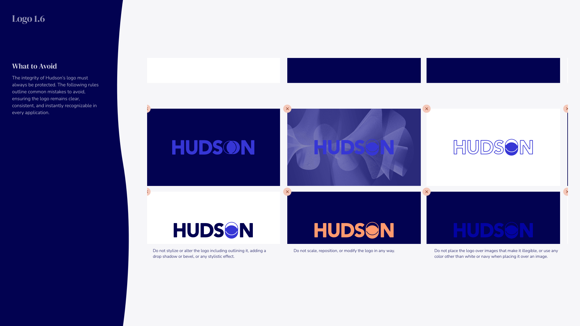
Guidelines titled 'Logo 1.6 What to Avoid' showing six examples of the HUDSON logo with errors to avoid: illegible color combinations, different colors for logotype and logomark, unapproved colors, stylizing or outlining with effects, scaling or modifying, and placing over images or inappropriate colors that reduce legibility.
Digital slide with the text 'Type 2.0' in blue on a light background with abstract orange and dark blue circle shapes on the corners, and 'Hudson Institute of Coaching' in small blue text at the bottom right.
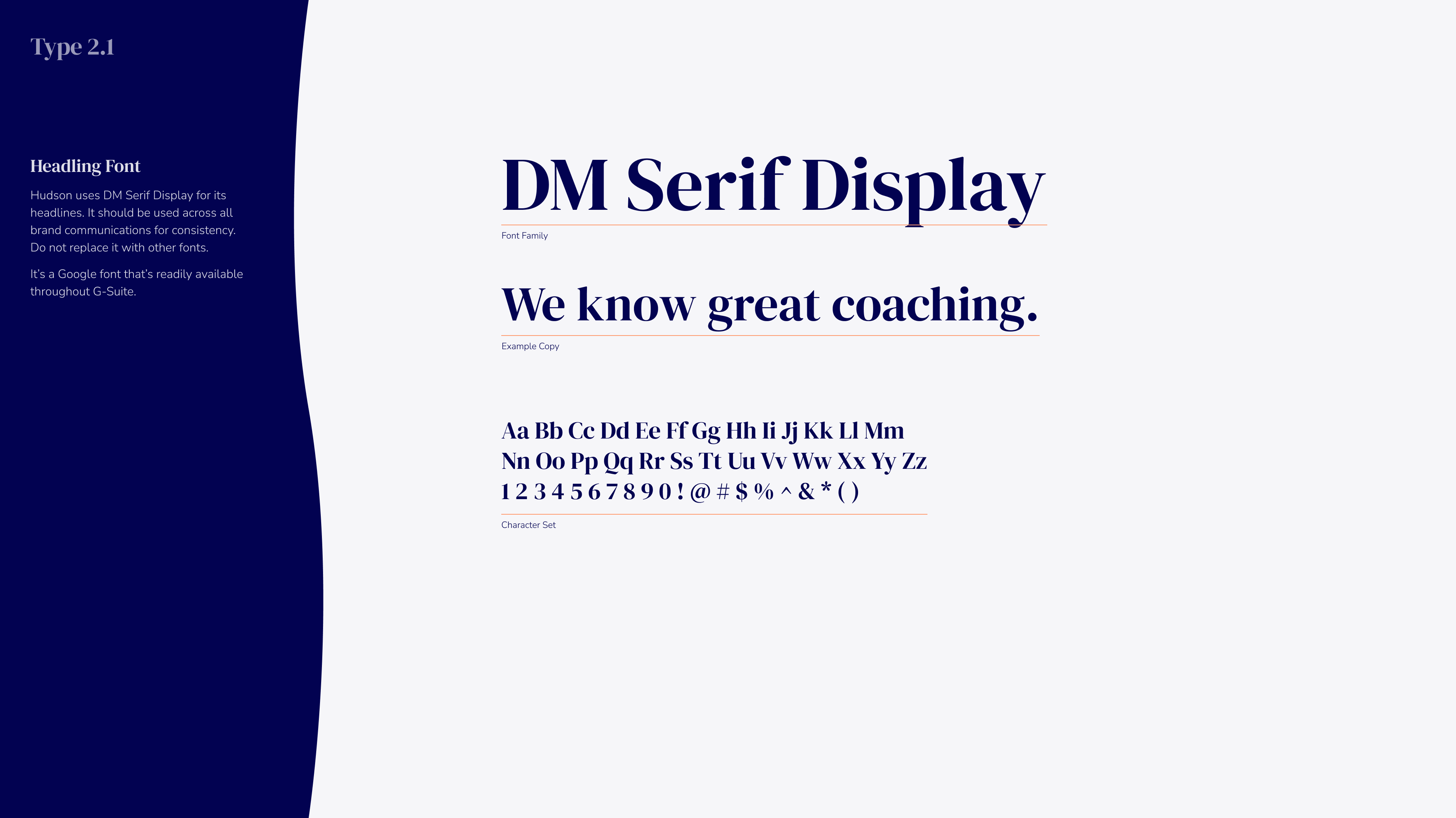
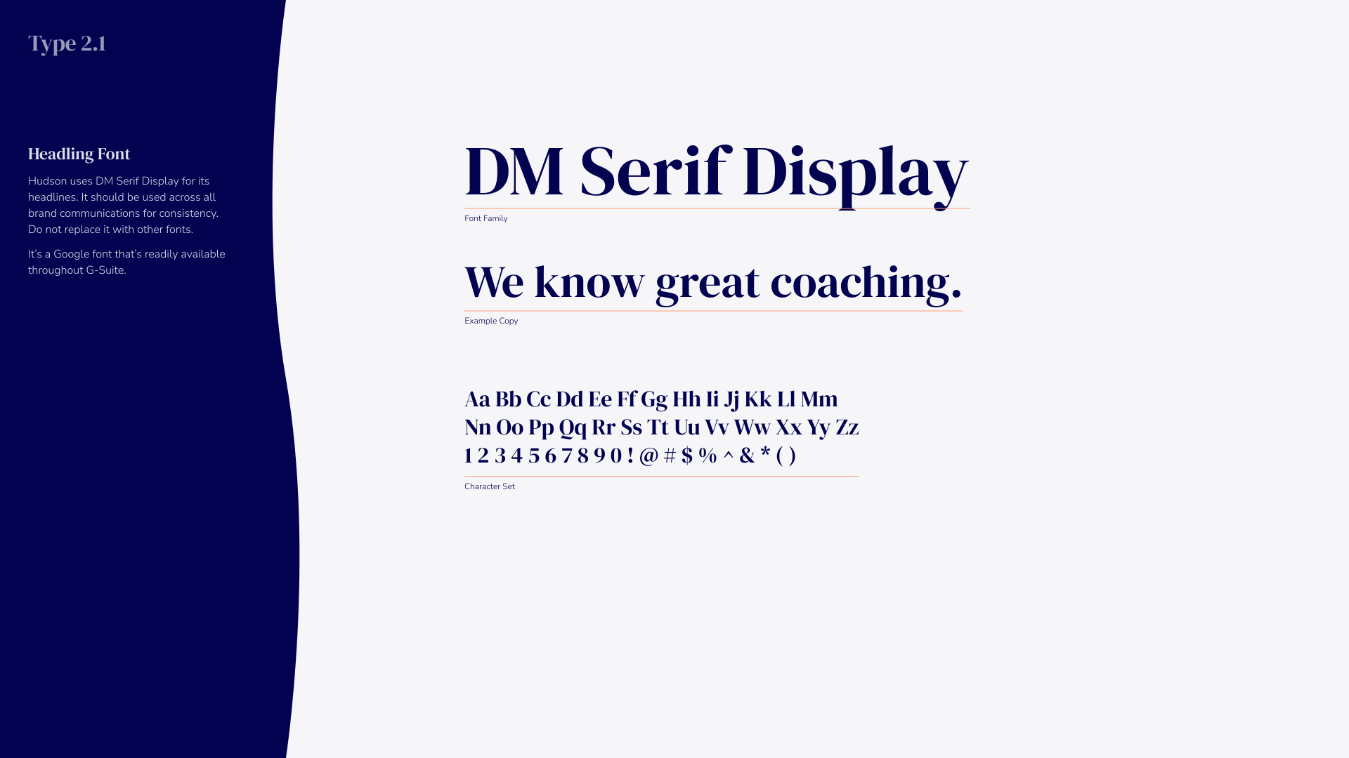
Typography sample titled Type 2.1 showing DM Serif Display font with heading, example copy text 'We know great coaching.', and a character set of uppercase, lowercase letters, numbers, and symbols. Instructions note to use DM Serif Display for headlines consistently, avoiding other fonts, and that it is a Google font available in G Suite.
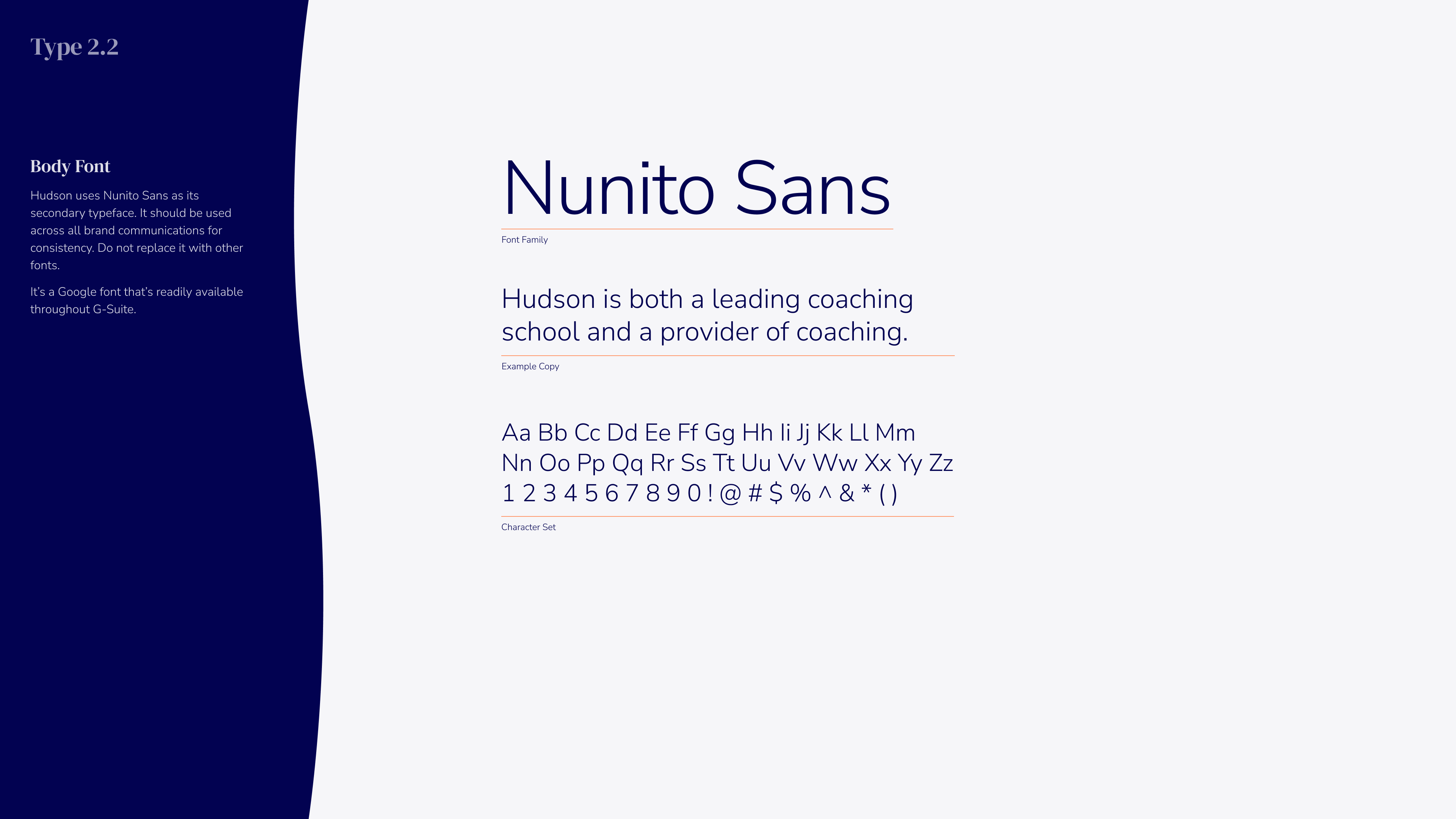
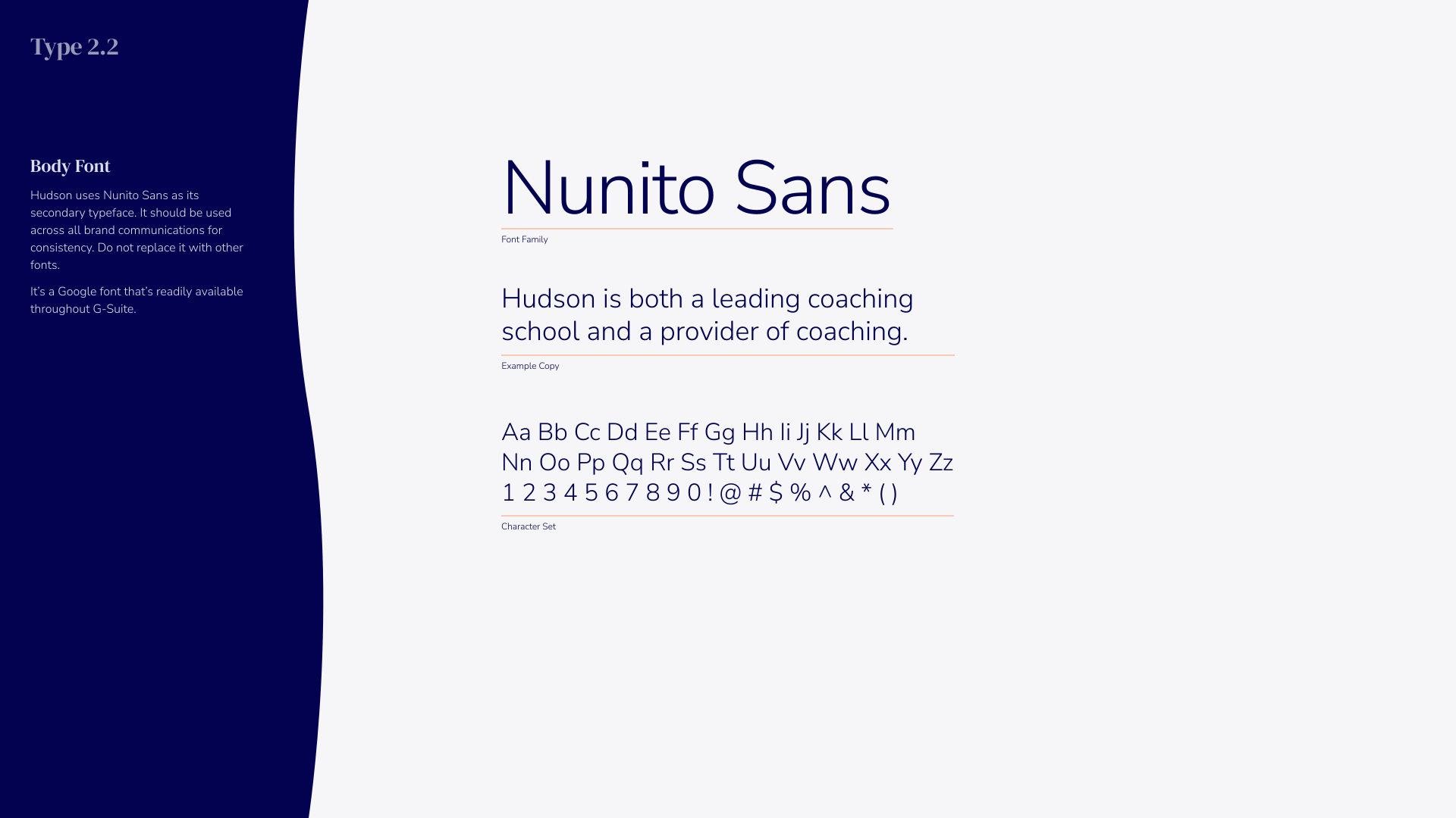
Typography sample of Nunito Sans font showing a heading, body text about Hudson as a coaching school, example copy, and a character set including uppercase, lowercase letters, and numbers.
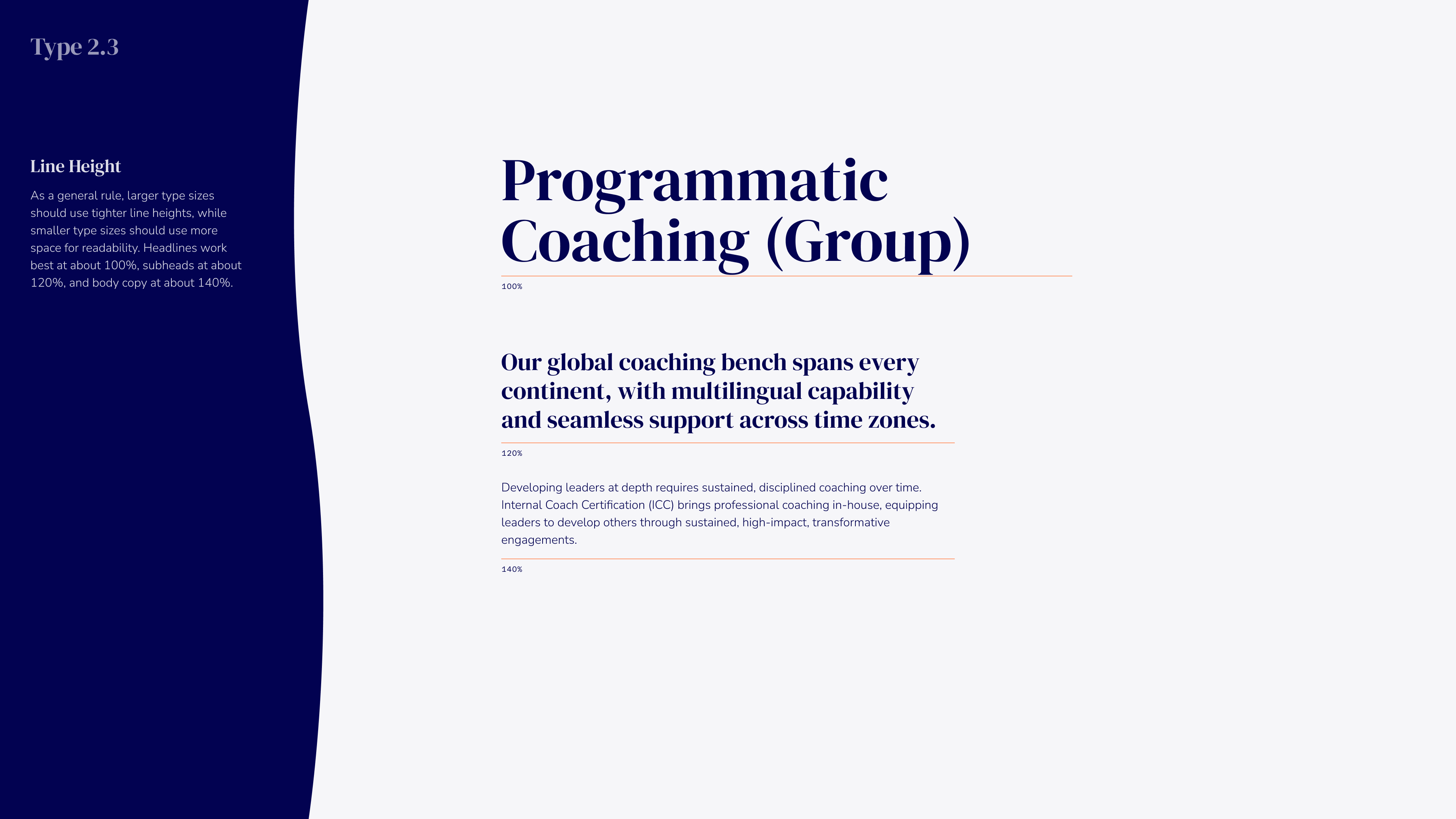
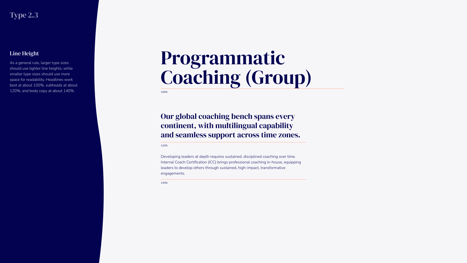
Page titled 'Programmatic Coaching (Group)' with text on line height guidance for type sizes on the left and description in the center about a global coaching bench spanning every continent with multilingual capability and seamless time zone support.
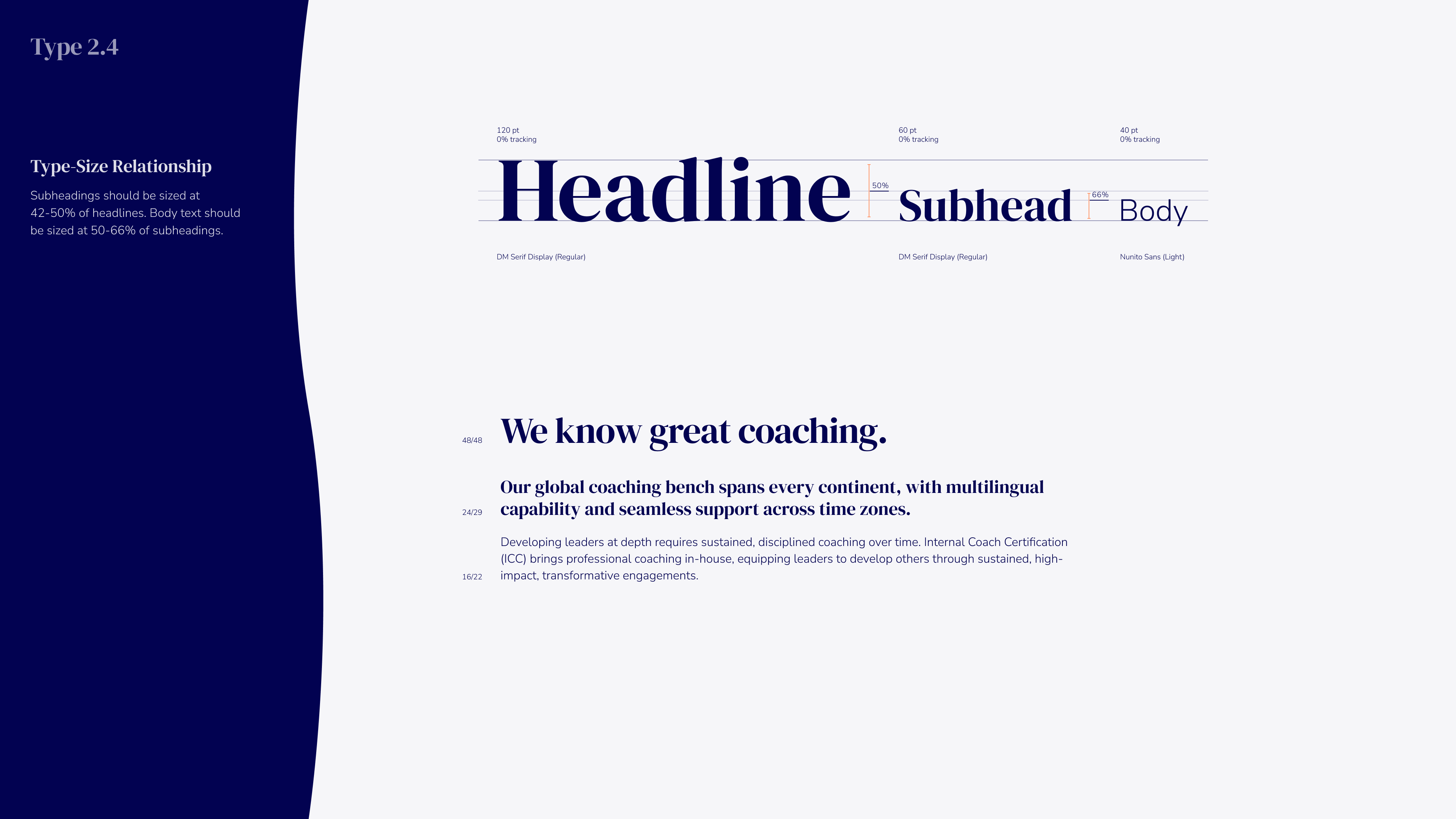
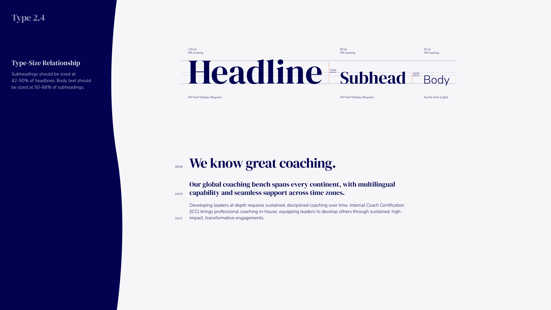
Typography guideline displaying Type 2.4 size relationship with headline sized at 128 px, subhead at 60 px, and body text at 40 px, showing proportions of headline, subhead, and body text sizes. Example text reads: 'We know great coaching.' followed by bolded supporting text about a global coaching bench spanning continents with multilingual capability and seamless time zone support, then smaller explanatory text about sustained, disciplined coaching and internal coach certification for professional development.
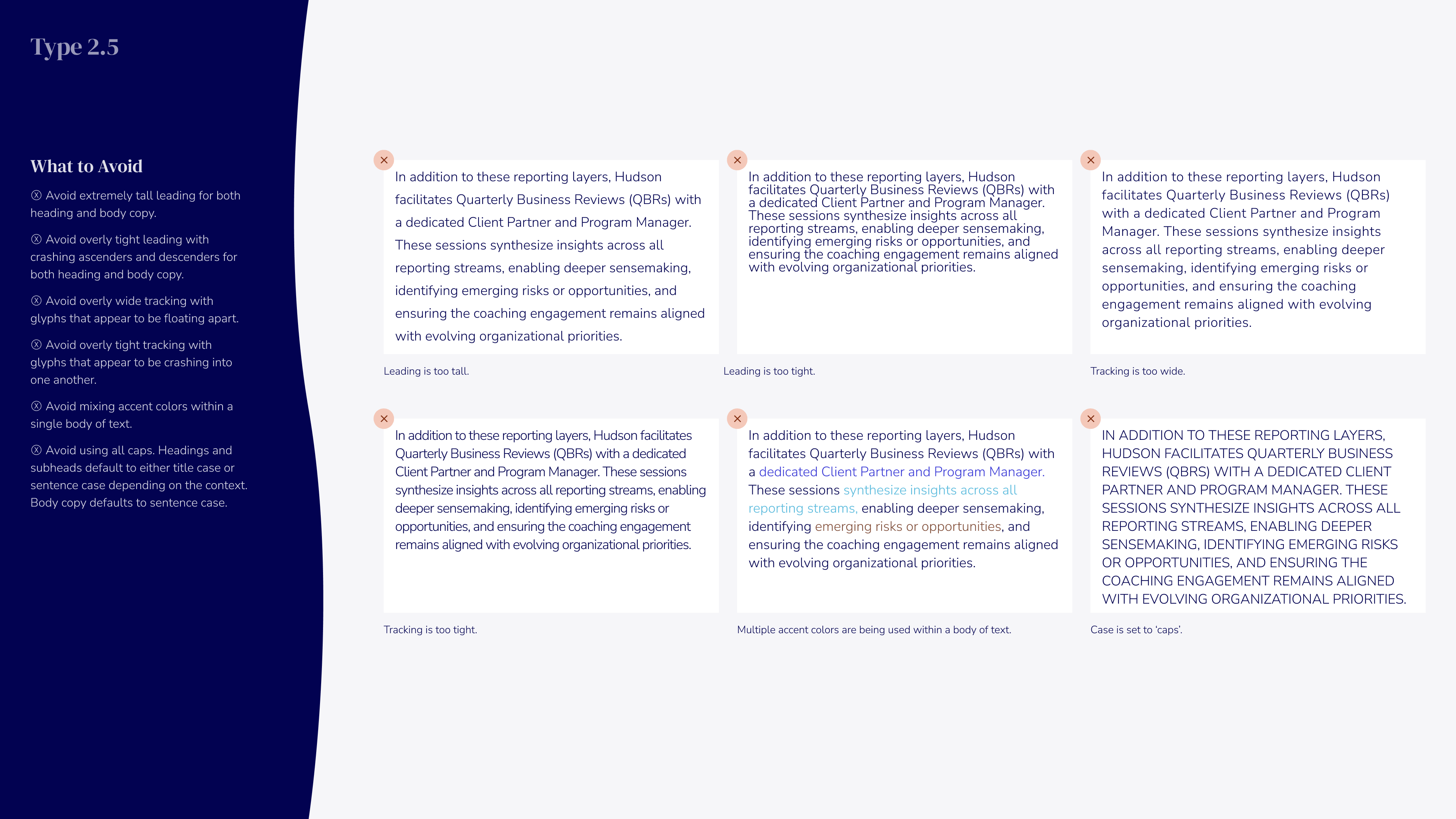
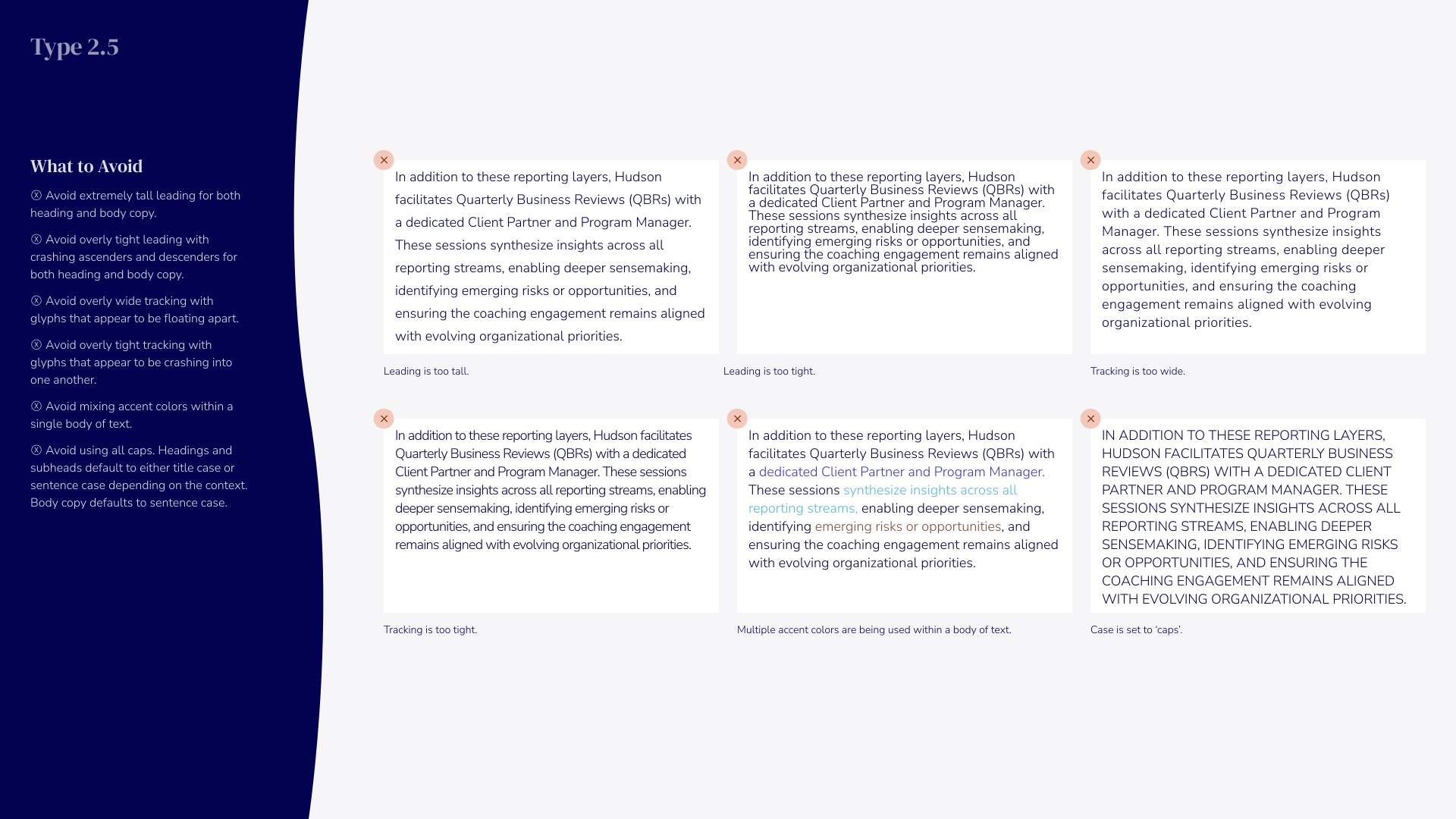
Graphic titled 'Type 2.5' showing guidelines on what to avoid in text formatting, including examples with annotations highlighting issues like extreme tail leading, tracking being too tight or too wide, use of multiple accent colors, mixing accent colors within text, and inappropriate capitalization.
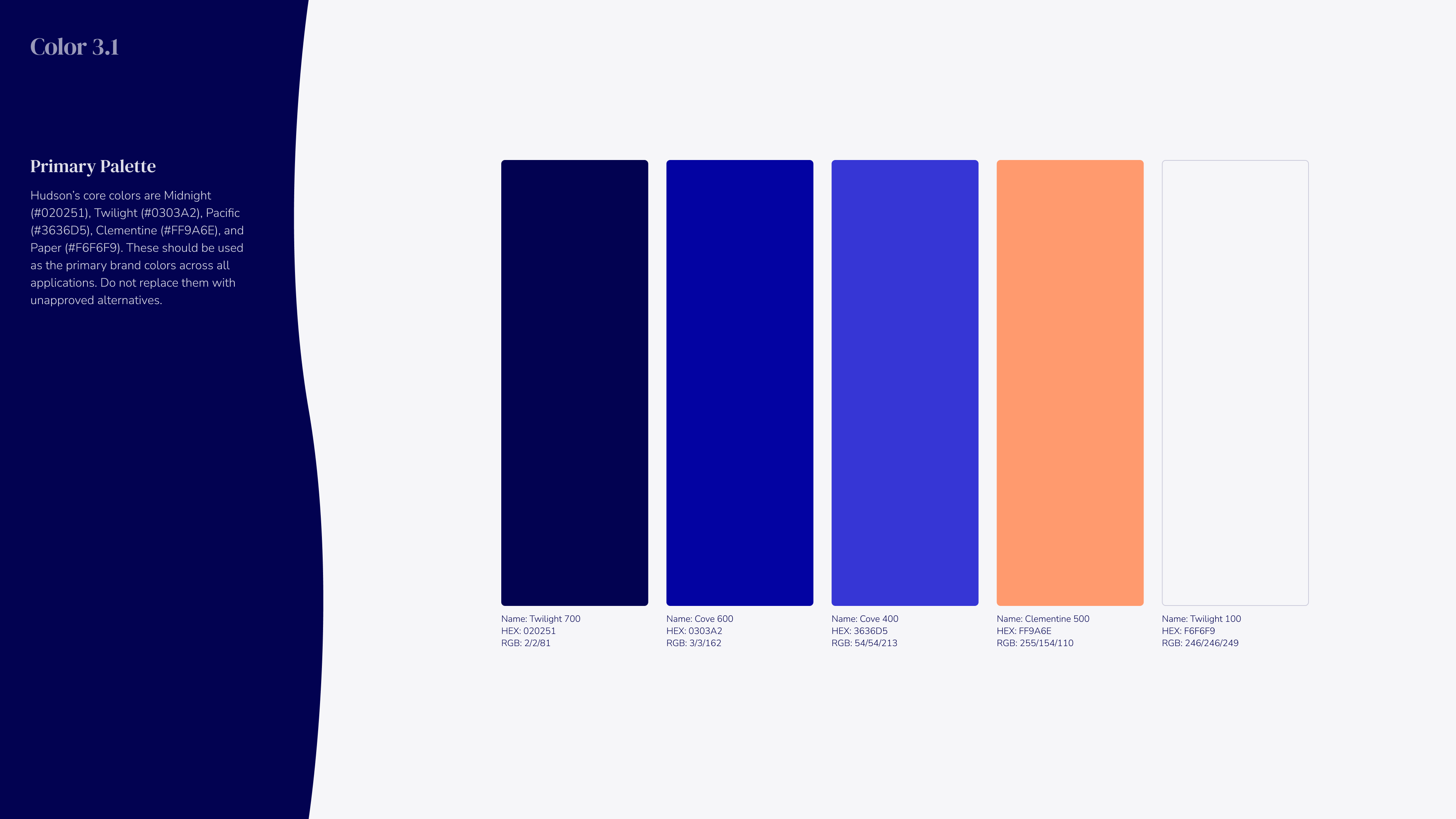
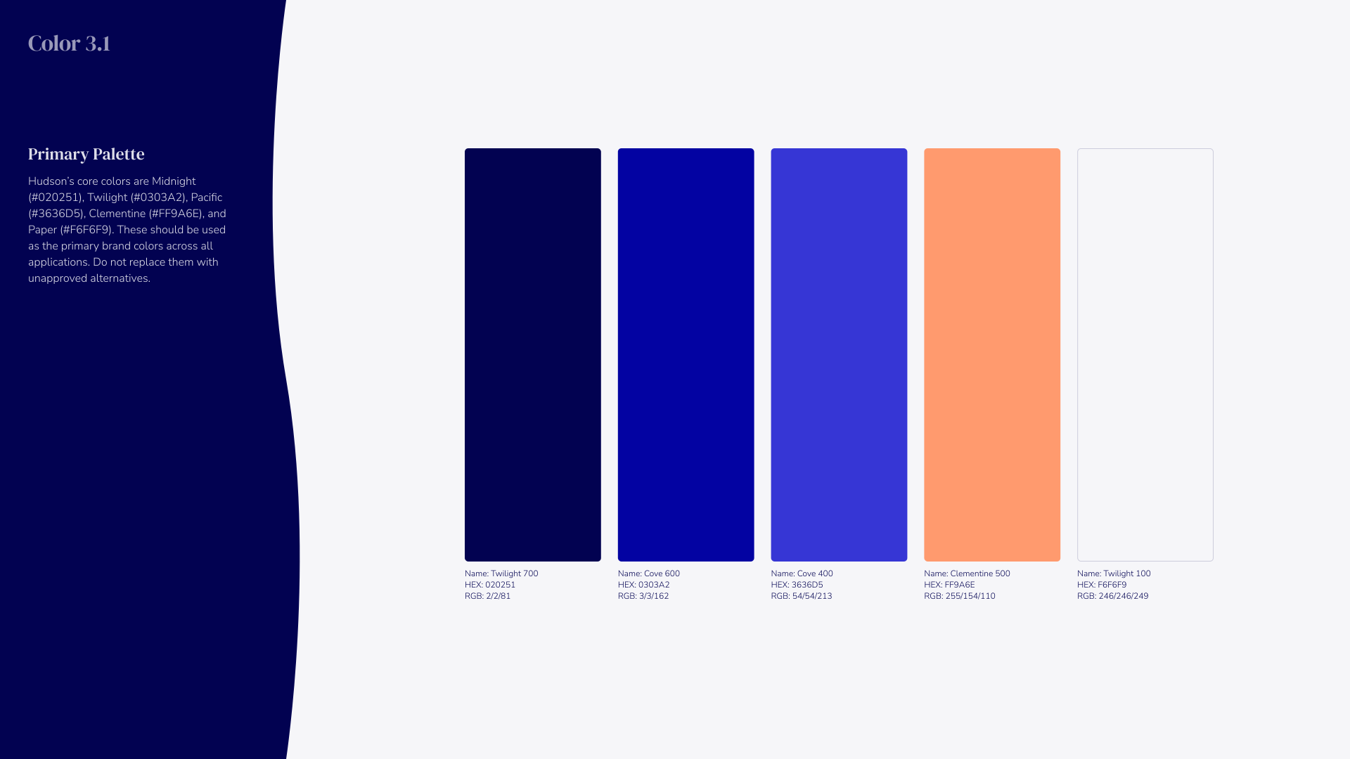
Color palette titled Color 3.1 showing six rectangular swatches horizontally: Midnight navy (#020251), Twilight blue (#030A92), Cove blue (#363D96), Clementine orange (#FF9A6E), and two lavender shades Twilight 700 and Twilight 100 with respective HEX and RGB codes listed beneath each swatch. Left side contains text about Hudson's core colors and their usage.
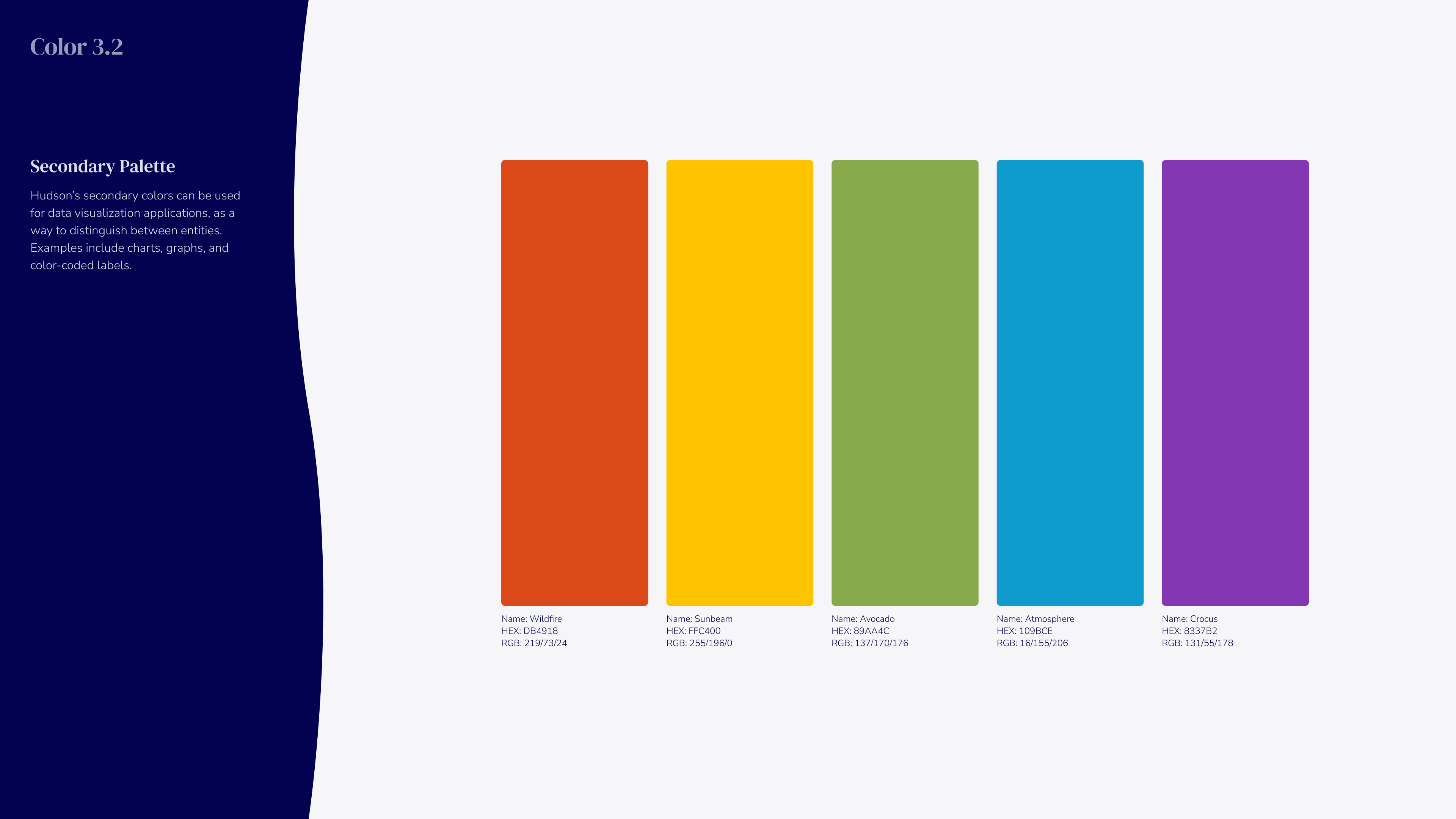
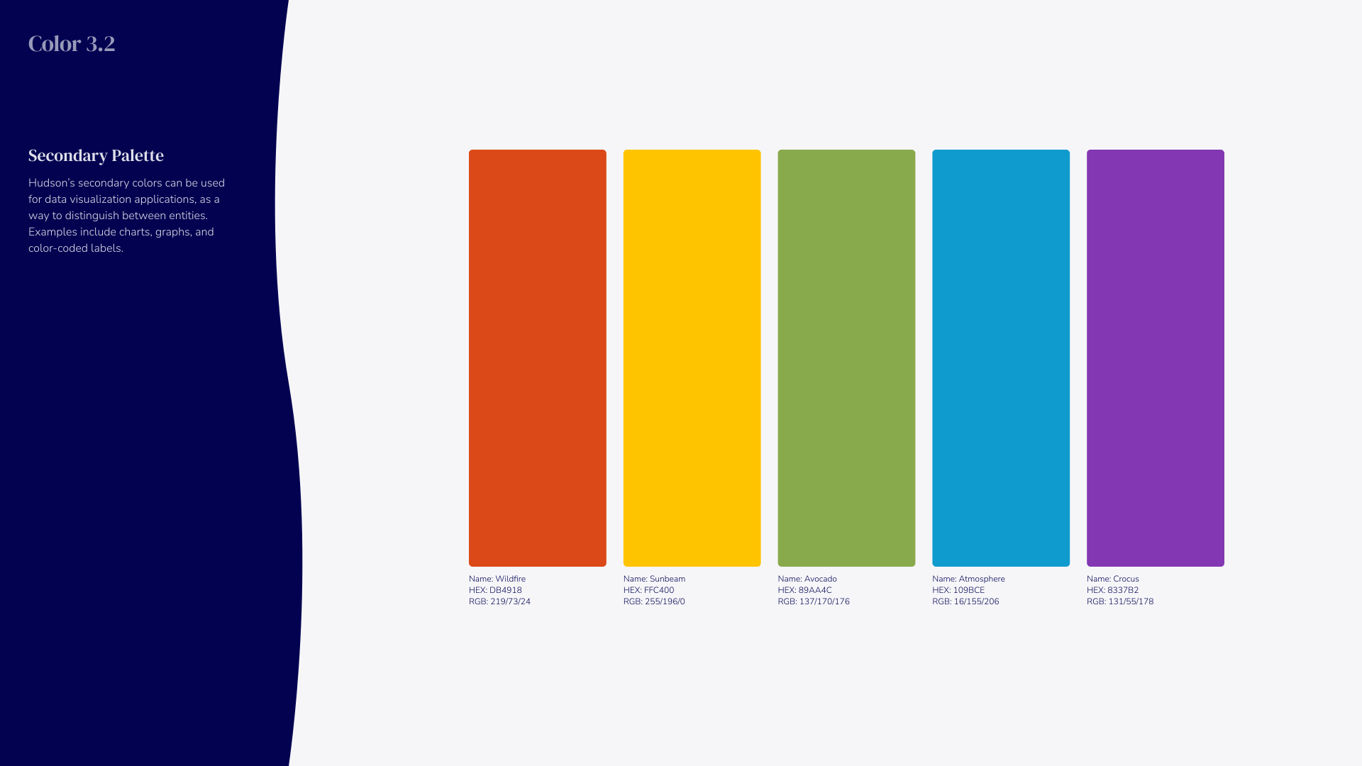
Color 3.2 Secondary Palette with five vertical color swatches named Wildlife (HEX D64B19, RGB 214/75/25), Sunbeam (HEX FFC400, RGB 255/196/0), Avocado (HEX 839A4C, RGB 131/154/76), Atmosphere (HEX 10B9CE, RGB 16/185/206), and Crucas (HEX 8337B2, RGB 131/55/178) arranged from left to right on a light background. Text on the left explains the use of secondary colors in data visualization for distinguishing entities.
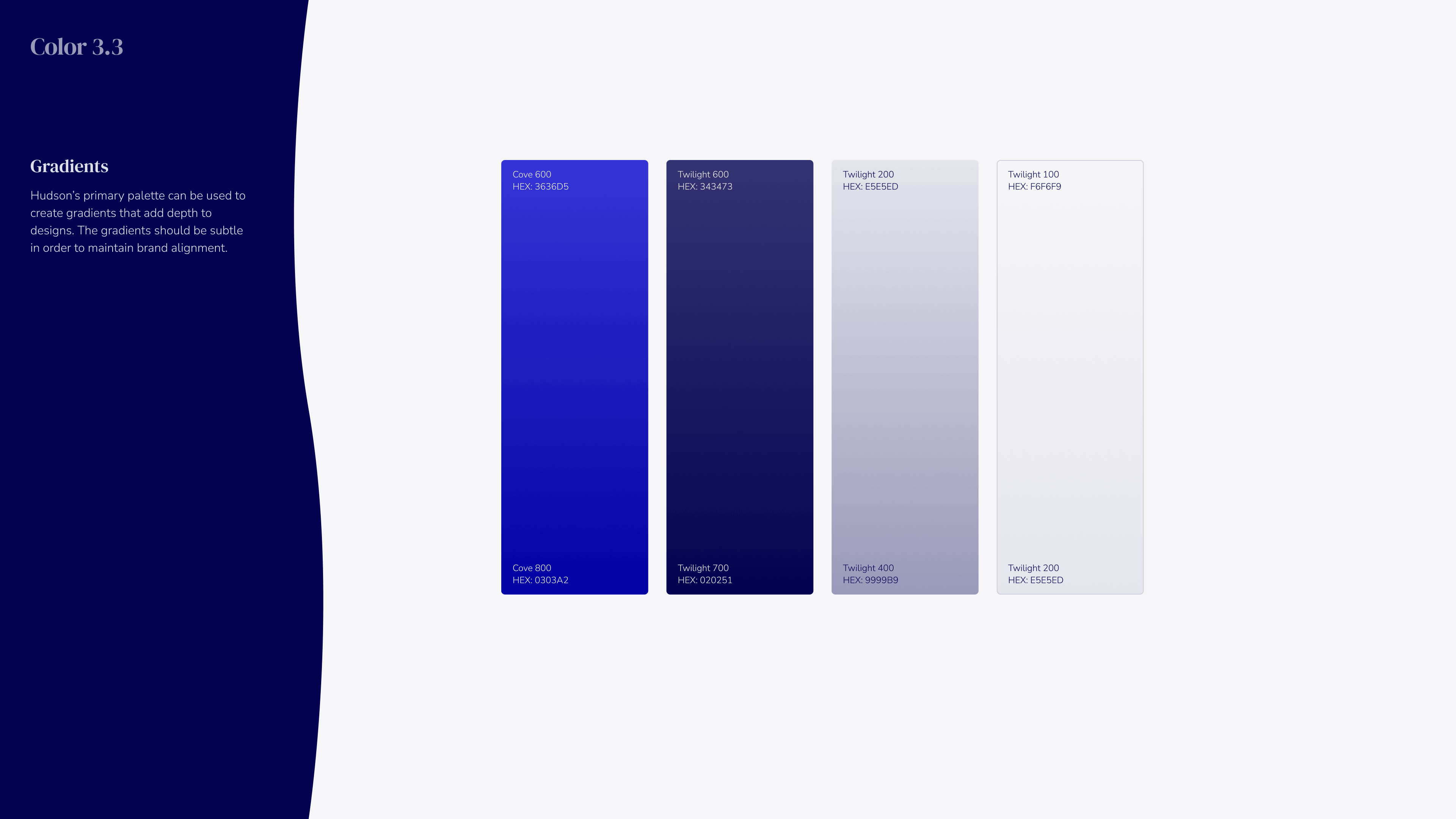
Design palette titled Color 3.3 showing gradients with blue and purple tones labeled Cove 600 and 800 (HEX #2832D6, #0303A2) and Twilight shades 600, 700, 200, 400, 100, 200 with corresponding HEX values from dark navy (#252671) to light grayish blue (#E9E5ED). Text explains the gradients add depth to designs while maintaining brand alignment.
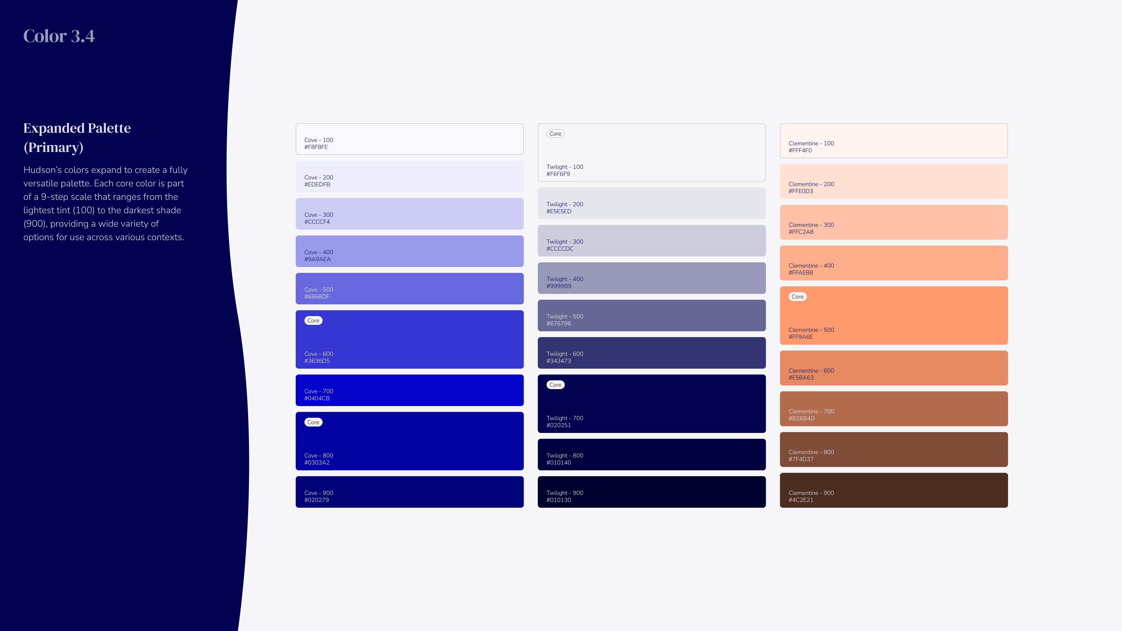
Color palette chart titled 'Color 3.4' with expanded primary palette displaying three main color groups in vertical columns: blue shades from light (Core 100) to dark (Core 900), gray shades labeled Twilight from 100 to 900, and orange shades labeled Clementine from 100 to 900, each with corresponding hex color codes and a brief description on the left about Hudson's color system and scale.
Color 3.5 Expanded Palette (Secondary) showing six color categories: Walnut, Sunburn, Avocado, Atmosphere, and Crocus, each with nine shades ranging from light to dark with hex color codes. Walnut colors range from light peach #FCE0DC to dark brown #511D0B. Sunburn colors range from pale yellow #FFEFDB to dark brown #612700. Avocado colors go from light green #F1F3D0 to dark olive #1F2309. Atmosphere colors range from pale blue #E7F1F9 to dark navy #0C1219. Crocus colors go from light lavender #F2E7F7 to deep purple #1B0A22. The palette is arranged in six vertical columns of swatches with labels for each shade.
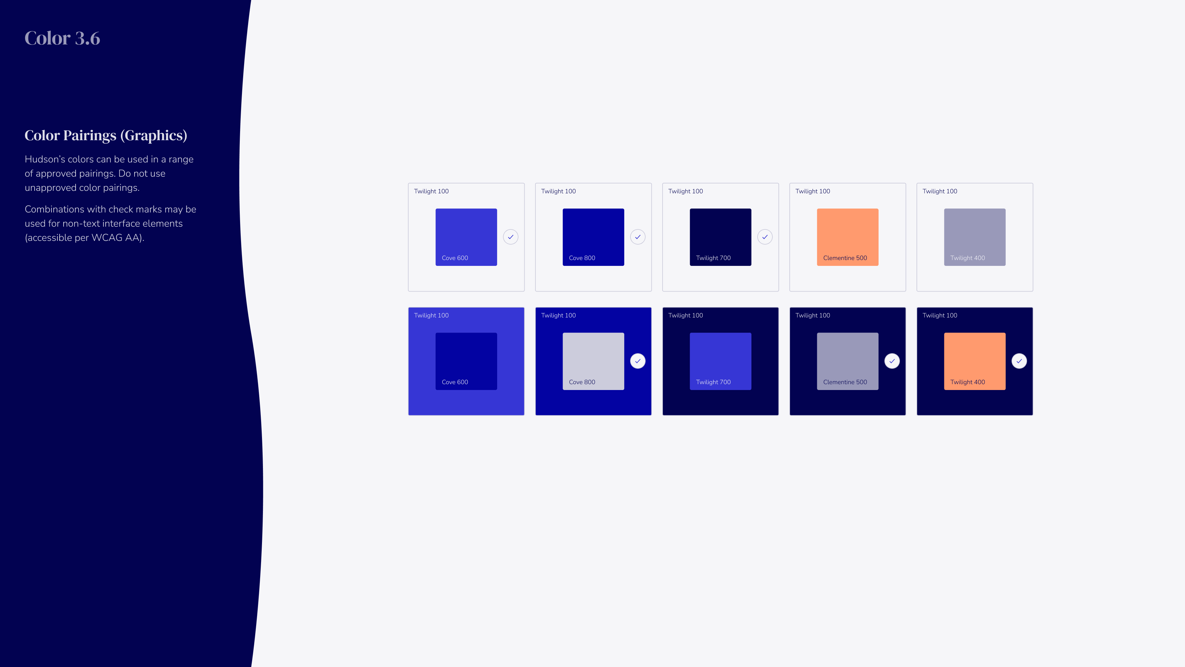
Color pairing chart showing combinations of Hudson's colors including Cove 600, Cove 800, Twilight 700, Clementine 500, and Twilight 400 with check marks indicating approved accessible pairings in graphic blocks.
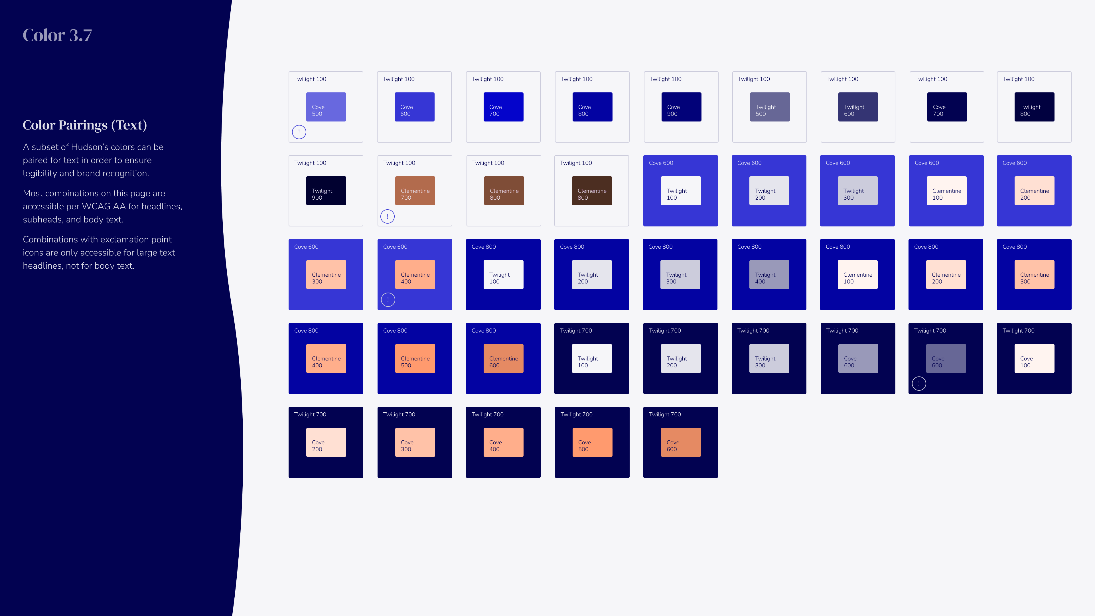
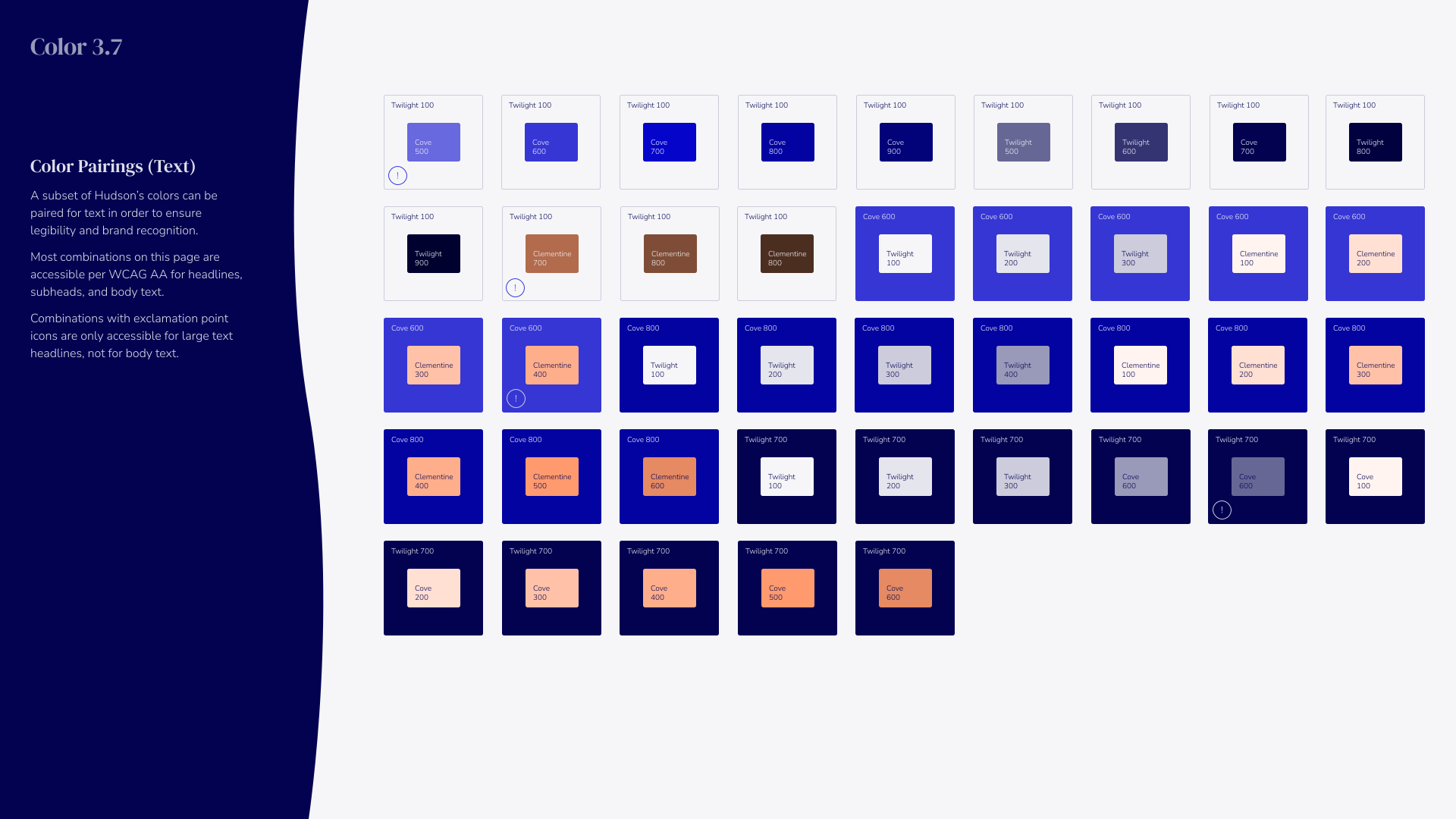
Color 3.7 palette showcasing text color pairings of Hudson’s colors in rectangular swatches labeled with color names like Twilight, Cove, and Clematis in various shades from 100 to 900, arranged in rows on a white background with a dark blue panel on the left explaining usage guidelines for accessible text and icon pairings.
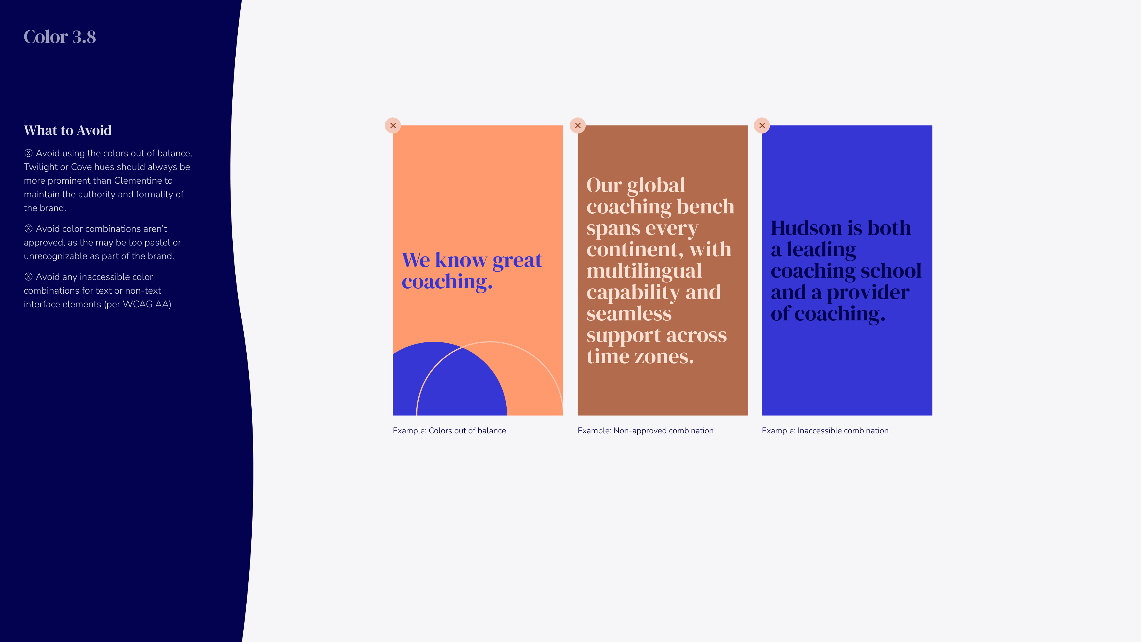
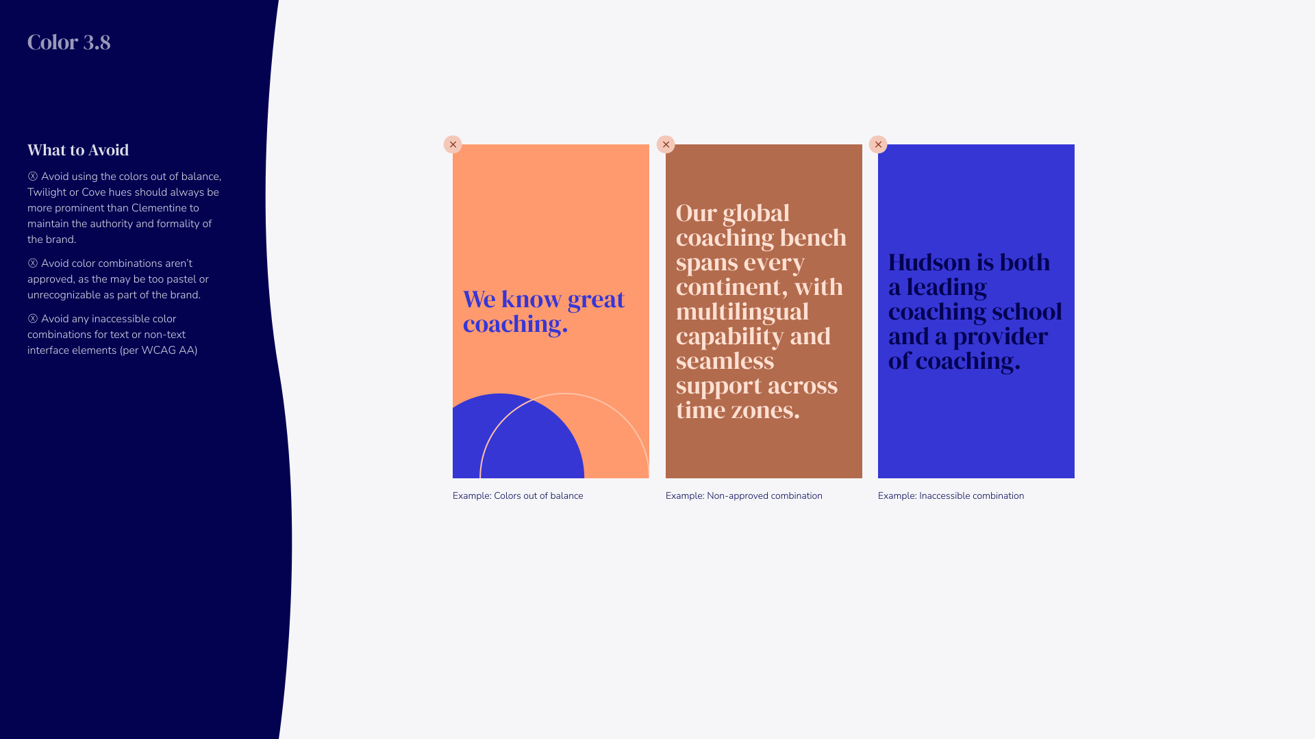
Color 3.8 guidelines on avoiding poor color combinations in branding, showing three example colored rectangles with text to illustrate mistakes: a peach box with blue text labeled 'We know great coaching.' example of colors out of balance; a brown box with white text on global coaching bench example of non-approved combination; and a blue box with dark blue text on coaching school example of inaccessible combination; dark blue sidebar with text explaining to avoid colors out of balance, unapproved combinations, and inaccessible colors for text or non-text interface elements.
Typography design with the word 'Shapes' in large blue text, and '4.0' below it on a light background, with abstract curved orange and blue shapes in the corners, and 'Hudson Institute of Coaching' text at the bottom right.
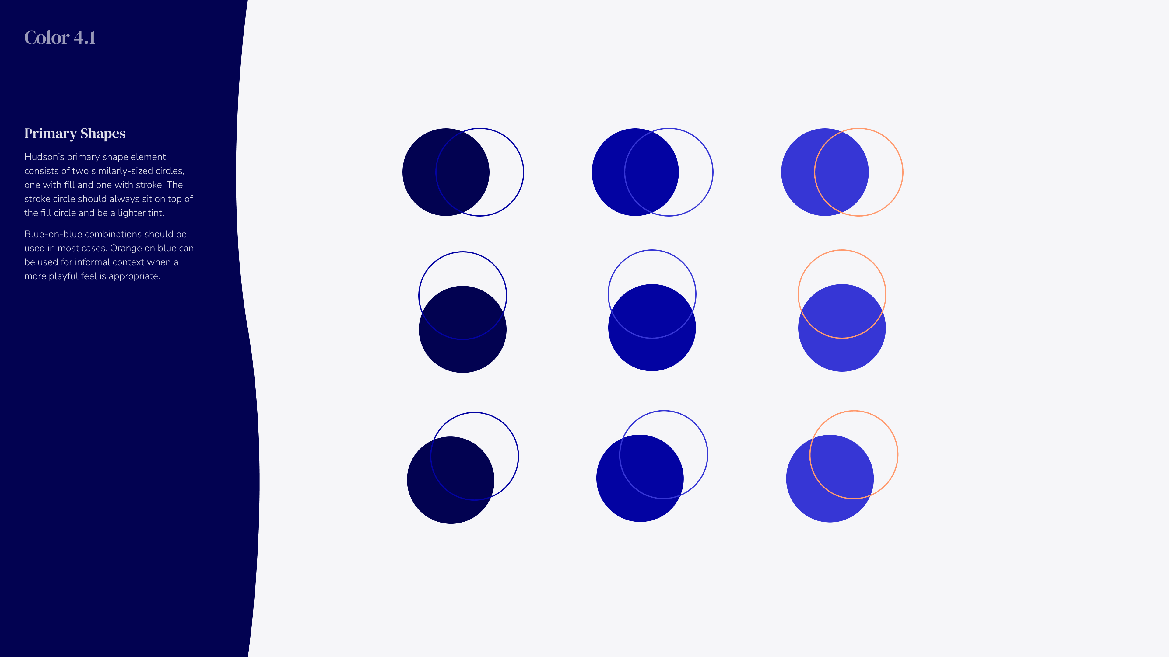
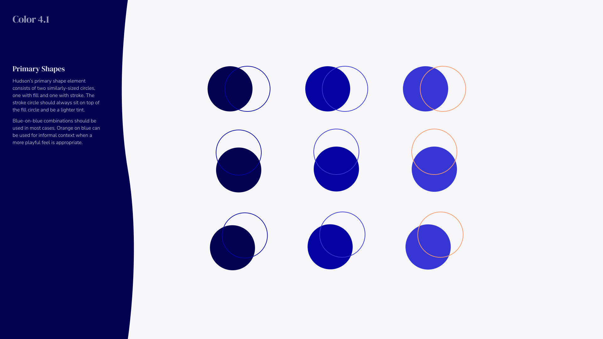
Graphic titled 'Color 4.1' showing Hudson's primary shapes of two similarly sized circles: one filled, one stroked, in rows of blue and orange combinations illustrating color overlay effects with fill circle below stroke circle, mainly in blue shades, on a light gray background with dark blue curved sidebar containing explanatory text.
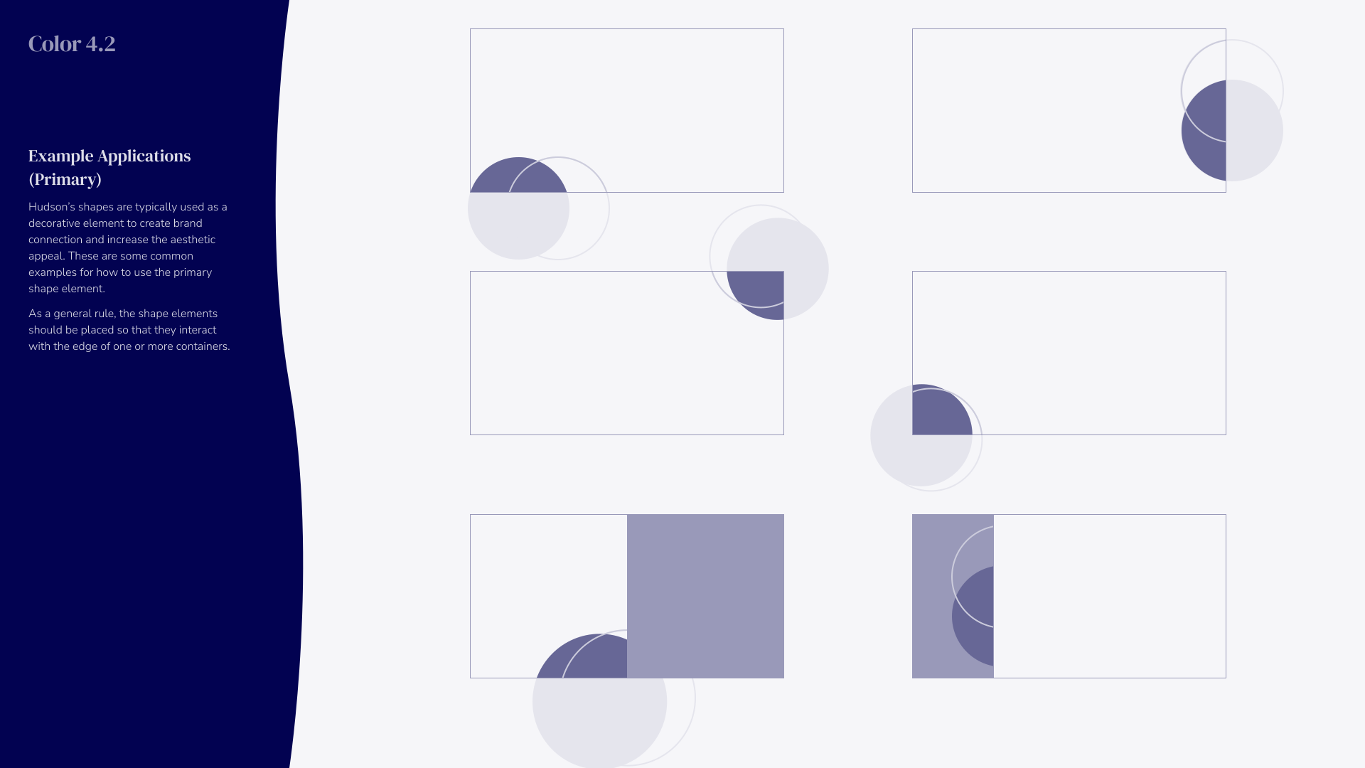
Graphic showing six examples of primary shape elements used in design, featuring rectangles with dark blue and translucent circular shapes positioned to interact with container edges, alongside text explaining their use for brand connection and aesthetic appeal.
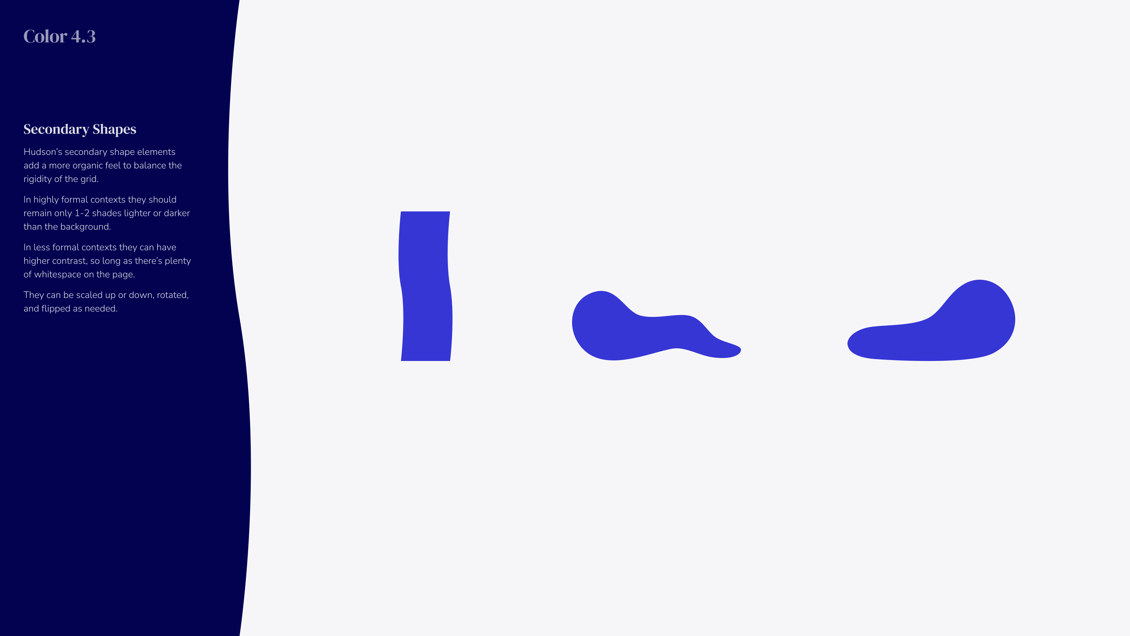
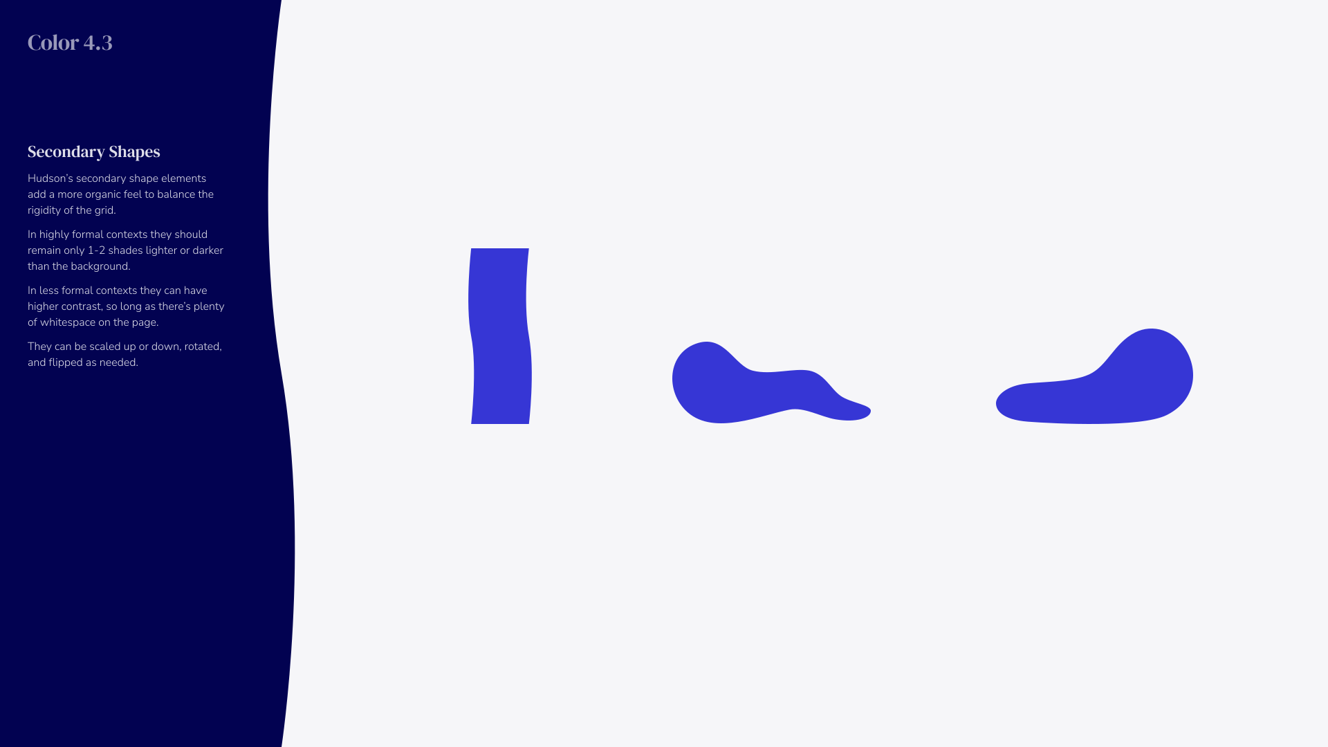
Graphic with dark blue vertical curved shape on left and three irregular blue organic shapes spaced horizontally on a light gray background, accompanied by text explaining 'Secondary Shapes' with guidelines on color contrast and usage.
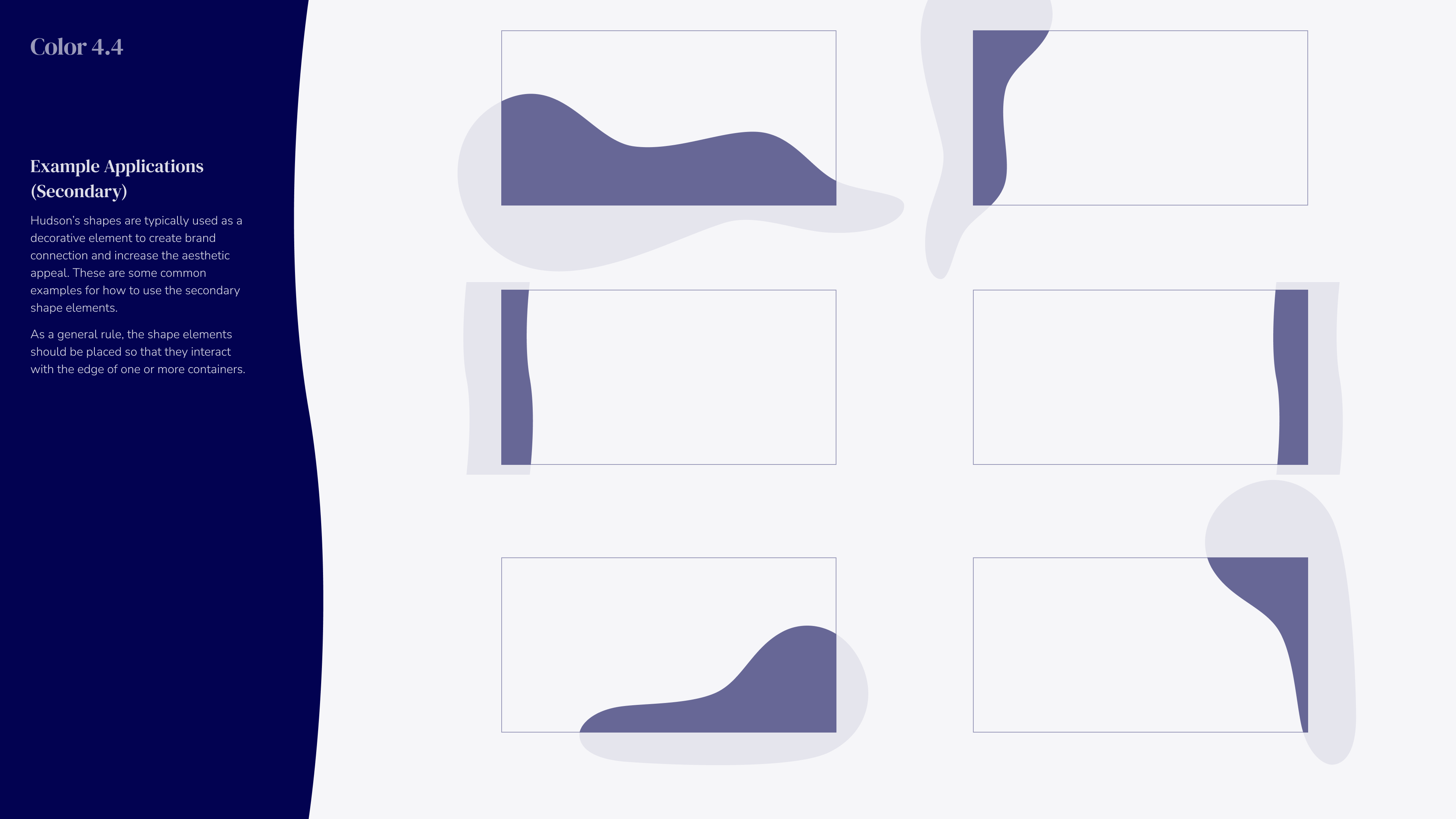
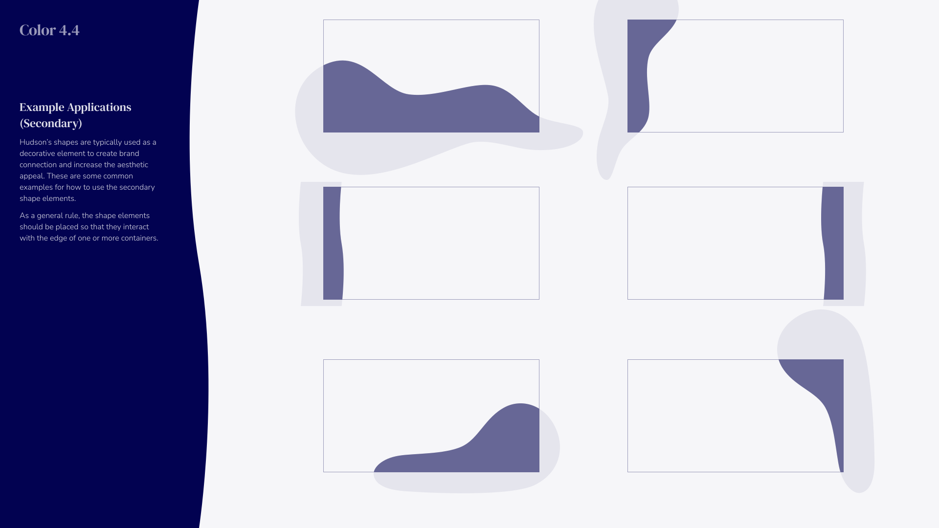
Example applications of decorative secondary shape elements in six rectangular containers with varying organic purple shapes interacting with container edges on a light background, alongside text explaining their use in brand connection and aesthetic appeal.
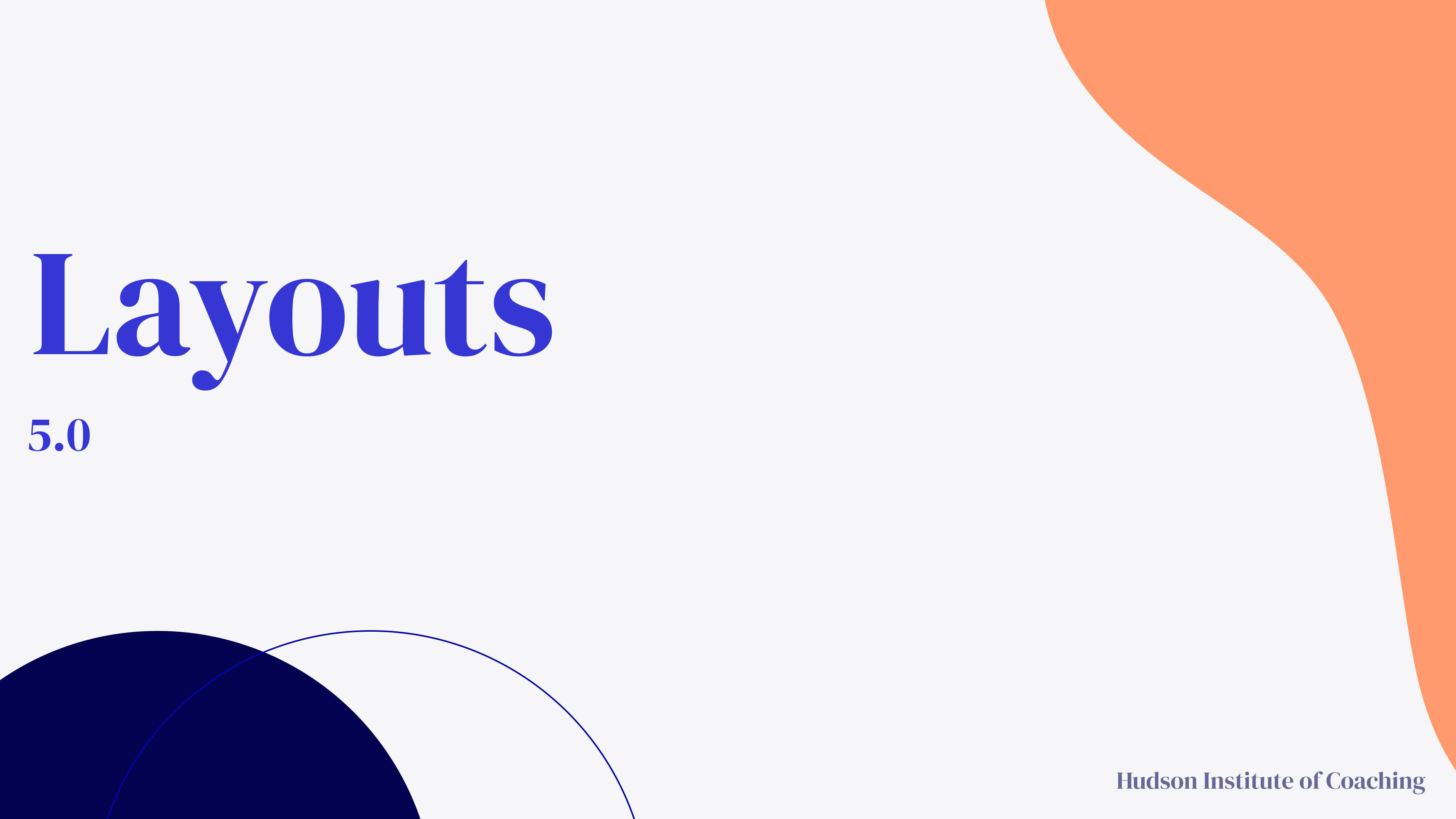
Title slide with the word 'Layouts' in large blue text, version 5.0 below it, abstract curved shapes in navy blue and peach, and 'Hudson Institute of Coaching' in small text at the bottom right.
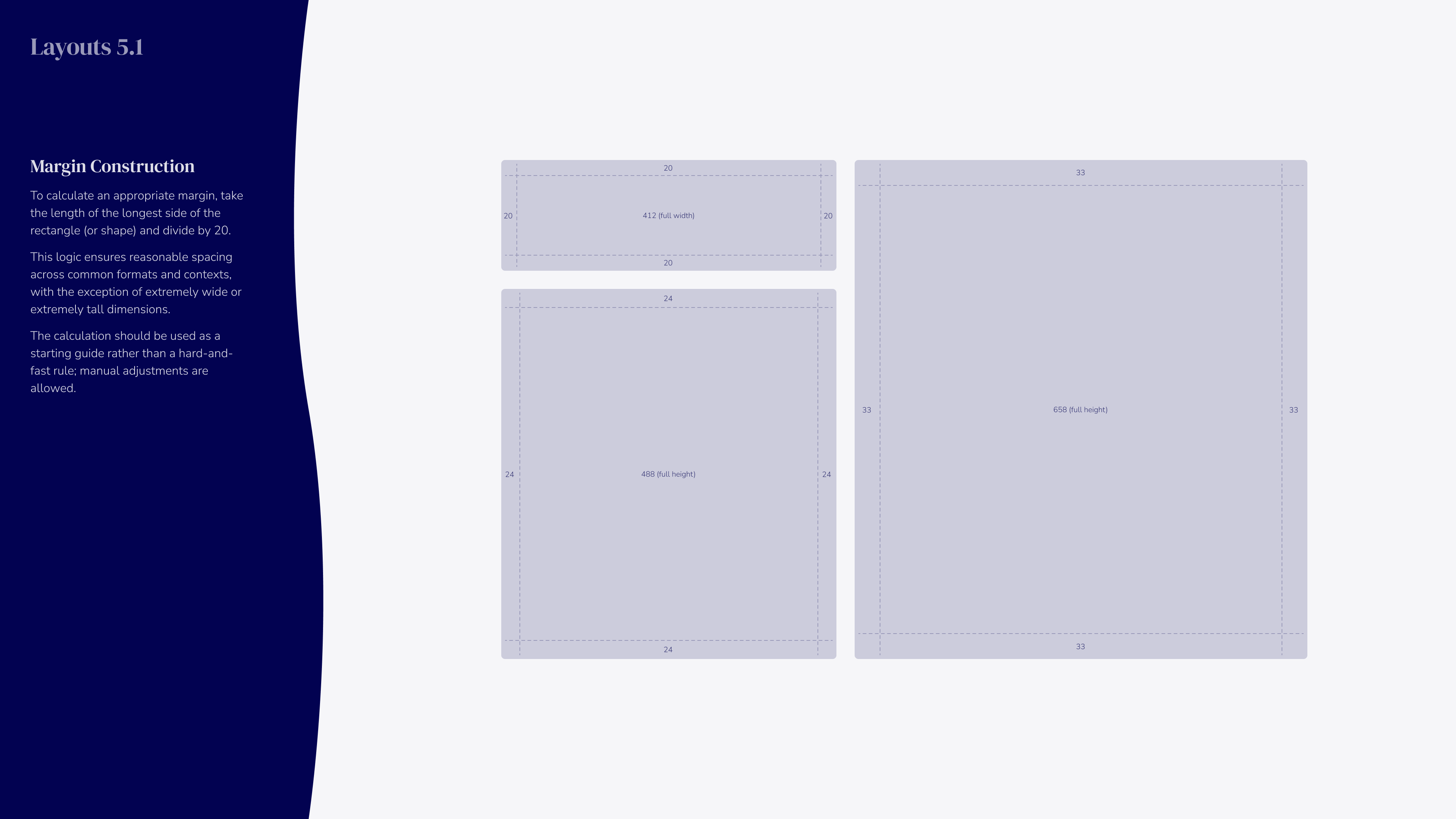
Diagram titled 'Layouts 5.1' illustrating margin construction for rectangles with dimensions labeled; includes instructions to calculate margin by dividing the longest side by 20 for consistent spacing across formats and contexts, with examples of rectangles measuring 412 width by 20 height, 480 height by 24 width, and 650 height by 33 width, shown with margins and grid lines.
Layout 5.2 headline size examples titled 'We know great coaching.' displayed in three boxes of varying sizes to illustrate different font sizes and text alignment with margin and line length references on a dark blue and light gray background.
Layout 5.3 showing typographic sizes for subheads with examples of the phrase 'We know great coaching.' and descriptive text, illustrating sizing at 42-50% of headline size.
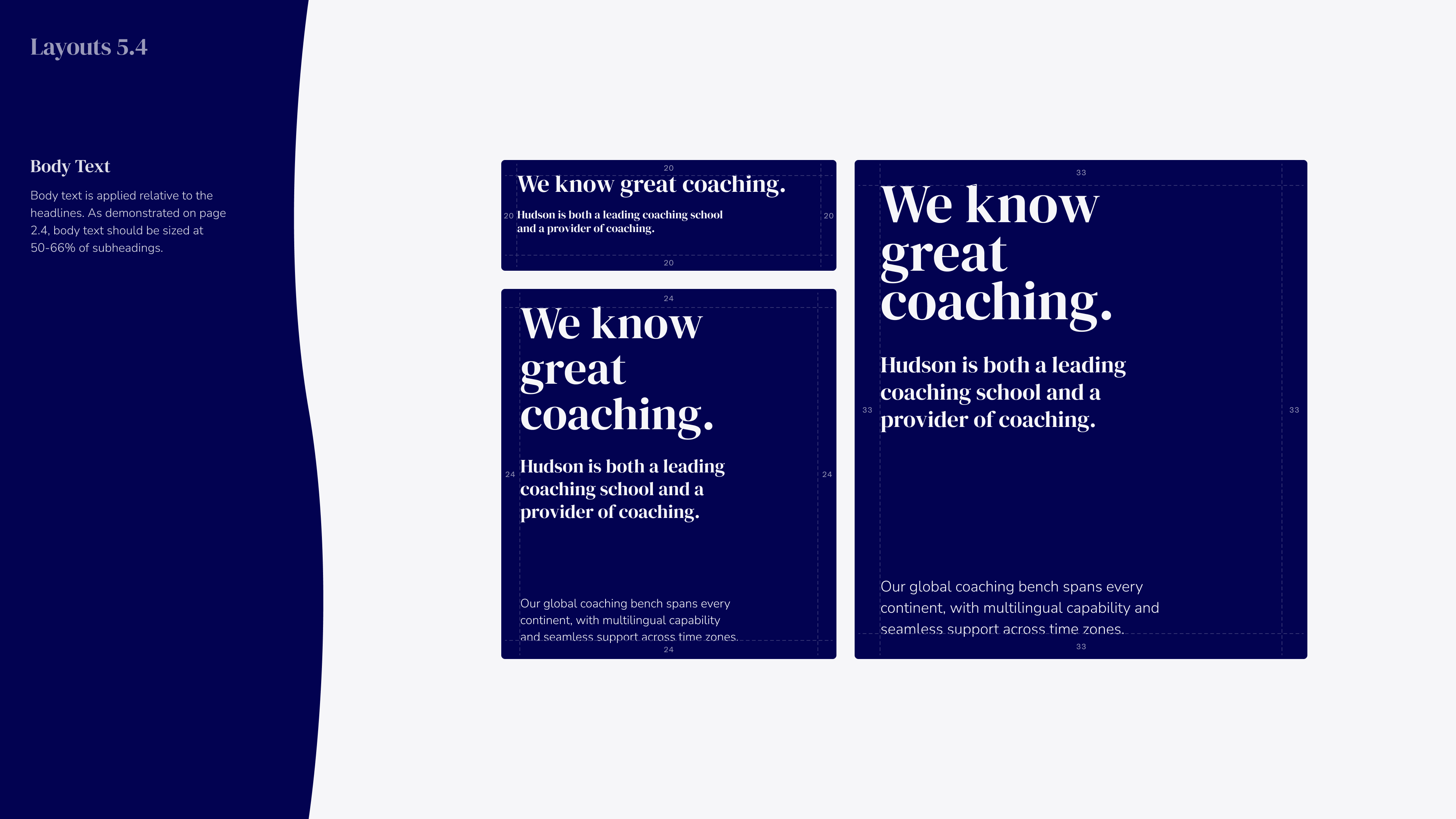
Illustration showing text layout examples labeled 'Layouts 5.4' with body text guidance stating body text should be sized at 50-66% of subheadings. The layouts display the phrase 'We know great coaching.' and describe Hudson as a leading coaching school and provider with global, multilingual support spanning every continent.
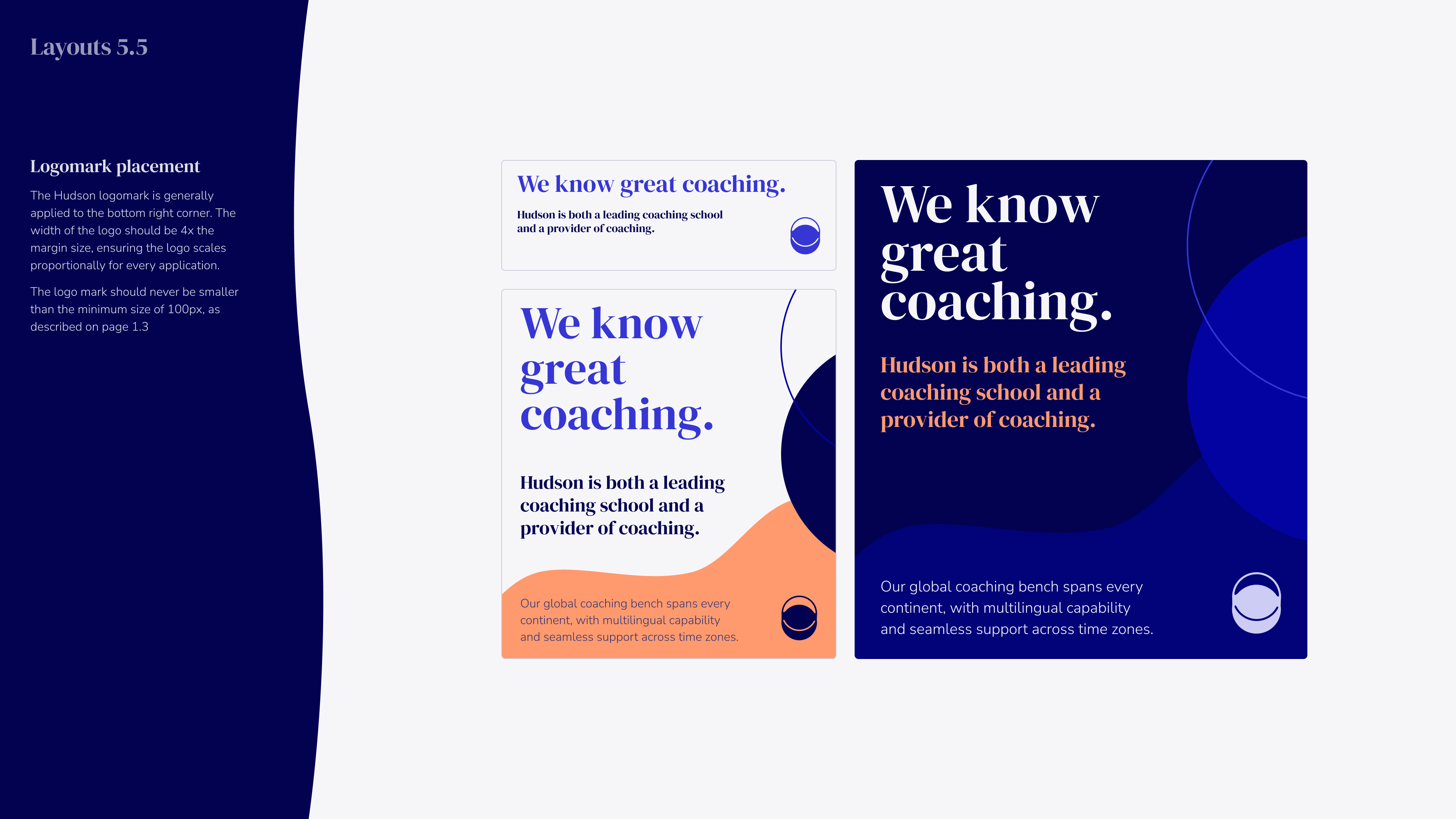
Three variations of a coaching brand layout featuring the tagline 'We know great coaching.' with text stating 'Hudson is both a leading coaching school and a provider of coaching.' Each design includes a logo mark and a note about global coaching bench with multilingual and time zone support, displayed on backgrounds of white, white with orange accent, and dark blue.
←
→
Brand Background
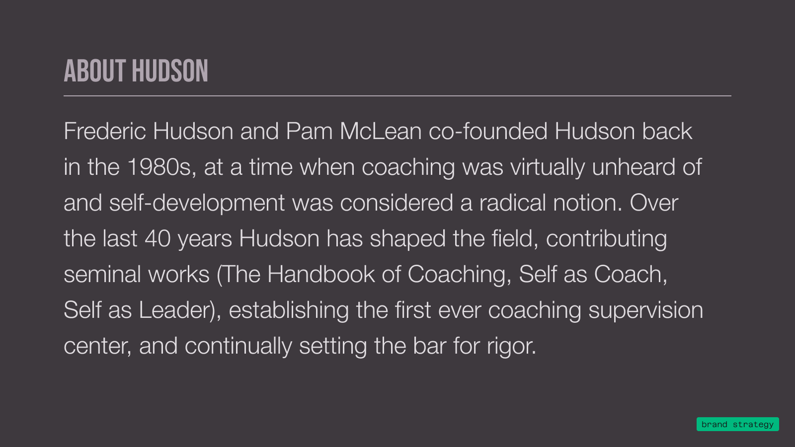
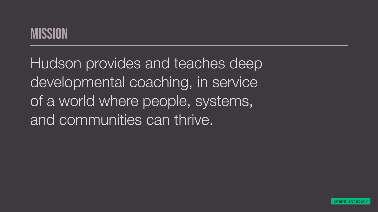
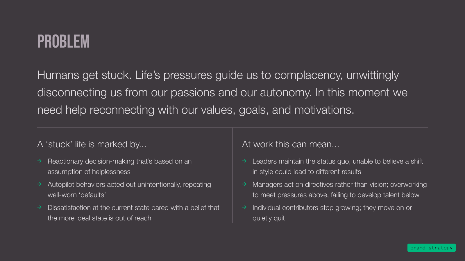
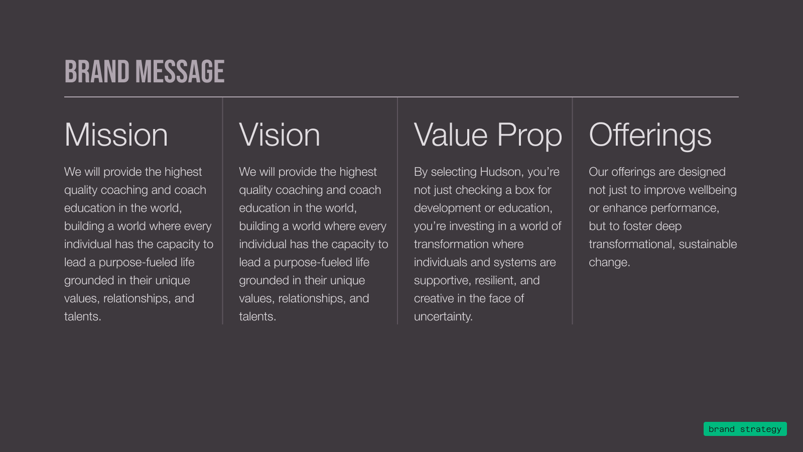
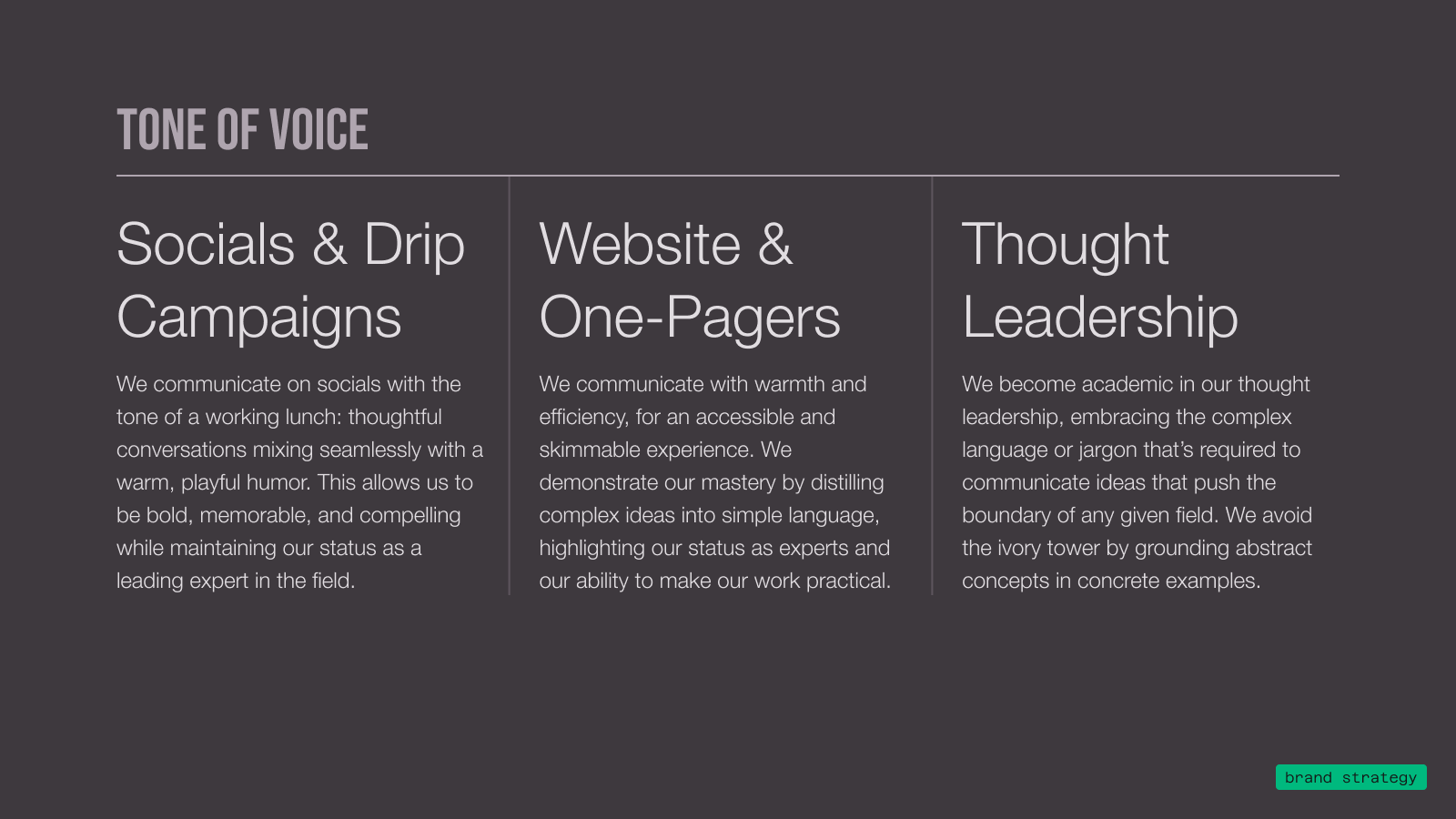
Text on dark background reading 'Who is Hudson?' in green and 'Defining the Brand' in large white capital letters, with a wavy black shape at the bottom.Text on a dark background titled 'ABOUT HUDSON' describing Frederic Hudson and Pam McLean co-founding Hudson in the 1980s when coaching was uncommon and self-development was radical, with the company shaping the coaching field over 40 years through seminal works and establishing the first coaching supervision center.Text on dark background stating the mission: Hudson provides and teaches deep developmental coaching to help people, systems, and communities thrive.Text on dark background titled 'VISION' stating: To provide the highest quality coaching and coach education in the world, building a world where every individual has the capacity to lead a purpose-fueled life grounded in their unique values, relationships, and talents.Text on dark background titled 'UNSPOKEN TRUTH' with message: Every individual has a magical, passionate life waiting for them; coaching is the tool that brings it to their fingertips.Text blocks outlining three values: Rigorous Quality emphasizes prioritizing service quality through rigorous coach training and crafted curriculum; Academic Expertise highlights over 40 years of leadership in coaching as an expert in professional development; Boundless Curiosity celebrates knowledge, human eccentricity, play in adulthood, and lifelong learning commitment.Text titled 'Audience Personas' divided into two columns: 'Coaching School' describes participants aged 35-65 in life transition seeking rigorous education and networking. Bulleted points include Hudson evangelists for life, tight-knit coach network, seeking rigorous academic program. 'Corporate Programs' describes buyers near top of organizational hierarchy (SVP+), in L&D, seeking proven programs to deliver results and advance careers. Bullets include searching for proven solutions, motivated by ROI/data, and acting as conduit for information sharing across the organization.Text slide titled 'Problem' explaining that humans get stuck due to life's pressures, leading to disconnection from passions and autonomy, needing help to reconnect with values, goals, and motivations. A 'stuck' life includes reactionary decision-making based on helplessness, unintentional autopilot behaviors repeating defaults, and dissatisfaction believing a better state is unreachable. At work, this means leaders maintain status quo, managers follow directives without vision and overwork, and contributors stop growing or quit quietly.Brand message divided into four columns: Mission and Vision both state providing the highest quality coaching and education worldwide to empower individuals to lead purpose-driven lives based on unique values, relationships, and talents. Value Prop emphasizes selecting Hudson means investing in transformative support, resilience, and creativity amid uncertainty. Offerings focus on fostering deep transformational, sustainable change beyond wellbeing and performance.Tone of Voice chart divided into three sections explaining communication styles: Socials & Drip Campaigns use a tone like a working lunch with thoughtful conversations and playful humor to be bold and memorable; Website & One-Pagers communicate with warmth and efficiency for an accessible, skimmable experience, simplifying complex ideas to show expertise and practicality; Thought Leadership uses academic language and jargon to push boundaries while grounding abstract concepts with concrete examples.

Lorem ipsum dolor sit amet, consectetur adipiscing elit, sed do eiusmod tempor incididunt ut labore et dolore magna aliqua. Ut enim ad minim veniam, quis nostrud exercitation ullamco laboris nisi ut aliquip ex ea commodo consequat.
Graphic with dark background and black abstract wave shape, text reads 'Who is Hudson? Defining the Brand' in white and teal.
Text block titled 'About Hudson' describing how Frederic Hudson and Pam McLean co-founded Hudson in the 1980s when coaching was rare, and how over 40 years Hudson shaped the coaching field with key works, the first coaching supervision center, and setting standards for rigor.
Text on a dark background titled 'MISSION' stating: Hudson provides and teaches deep developmental coaching, in service of a world where people, systems, and communities can thrive.
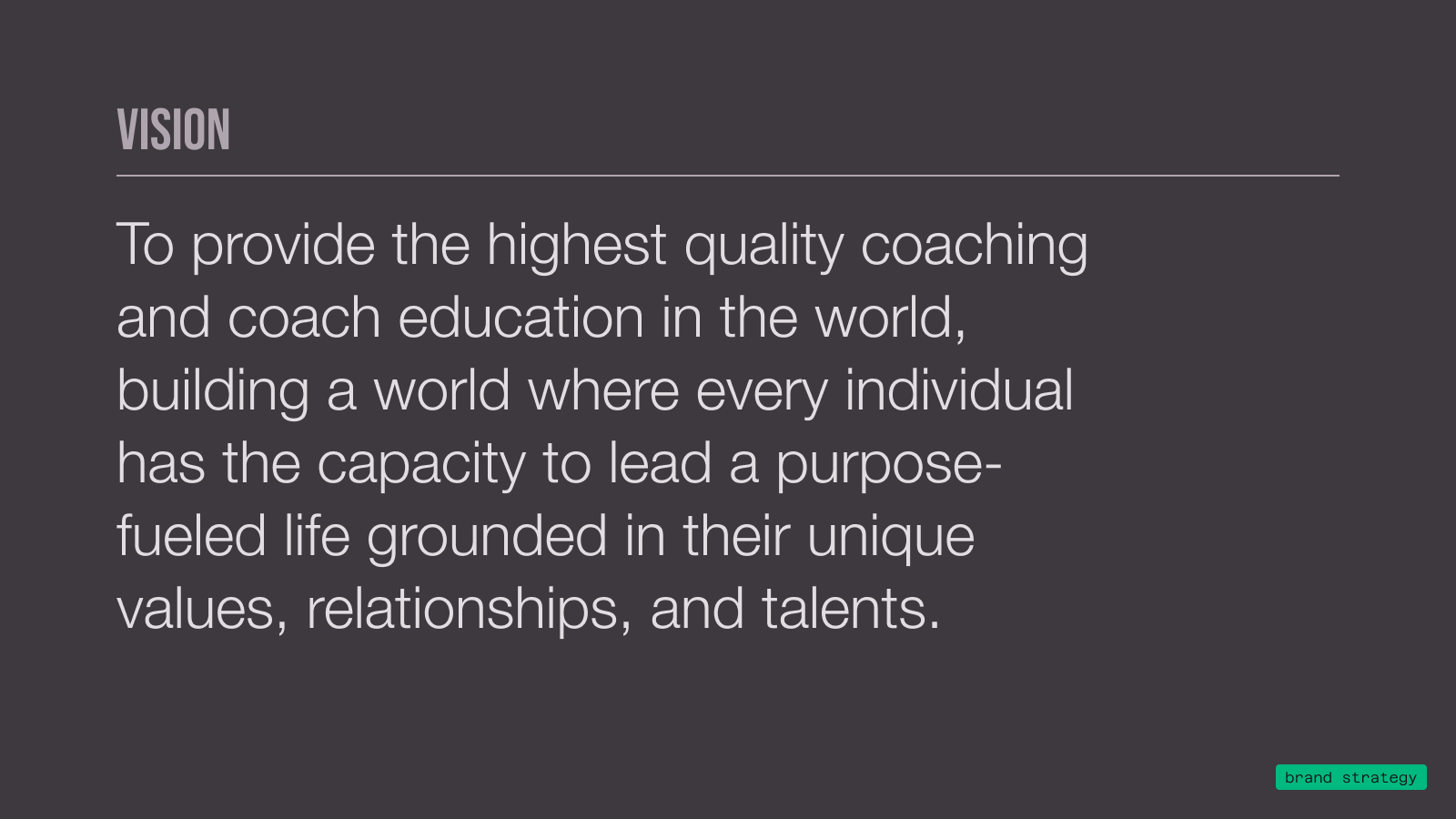
Text on dark background titled 'VISION' stating: To provide the highest quality coaching and coach education in the world, building a world where every individual can lead a purpose-fueled life grounded in their unique values, relationships, and talents.
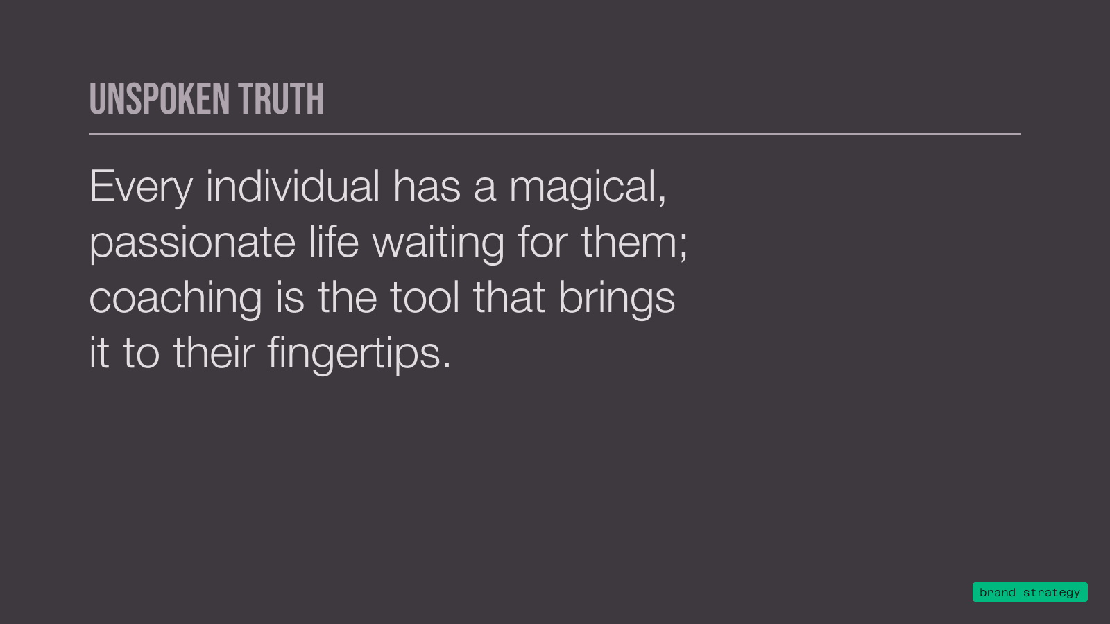
Text on dark background reading: 'UNSPOKEN TRUTH. Every individual has a magical, passionate life waiting for them; coaching is the tool that brings it to their fingertips.'
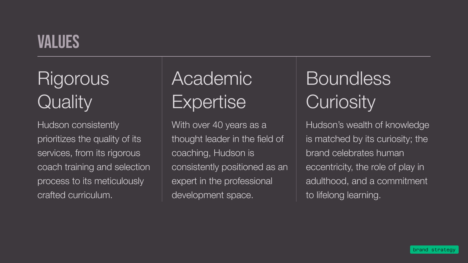
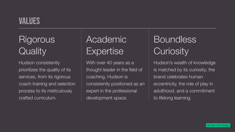
Three-panel text layout titled 'VALUES' describing Hudson's core principles: Rigorous Quality with a focus on quality services and curriculum; Academic Expertise highlighting over 40 years as a coaching thought leader and professional development expert; Boundless Curiosity emphasizing knowledge, human eccentricity, play in adulthood, and lifelong learning commitment.
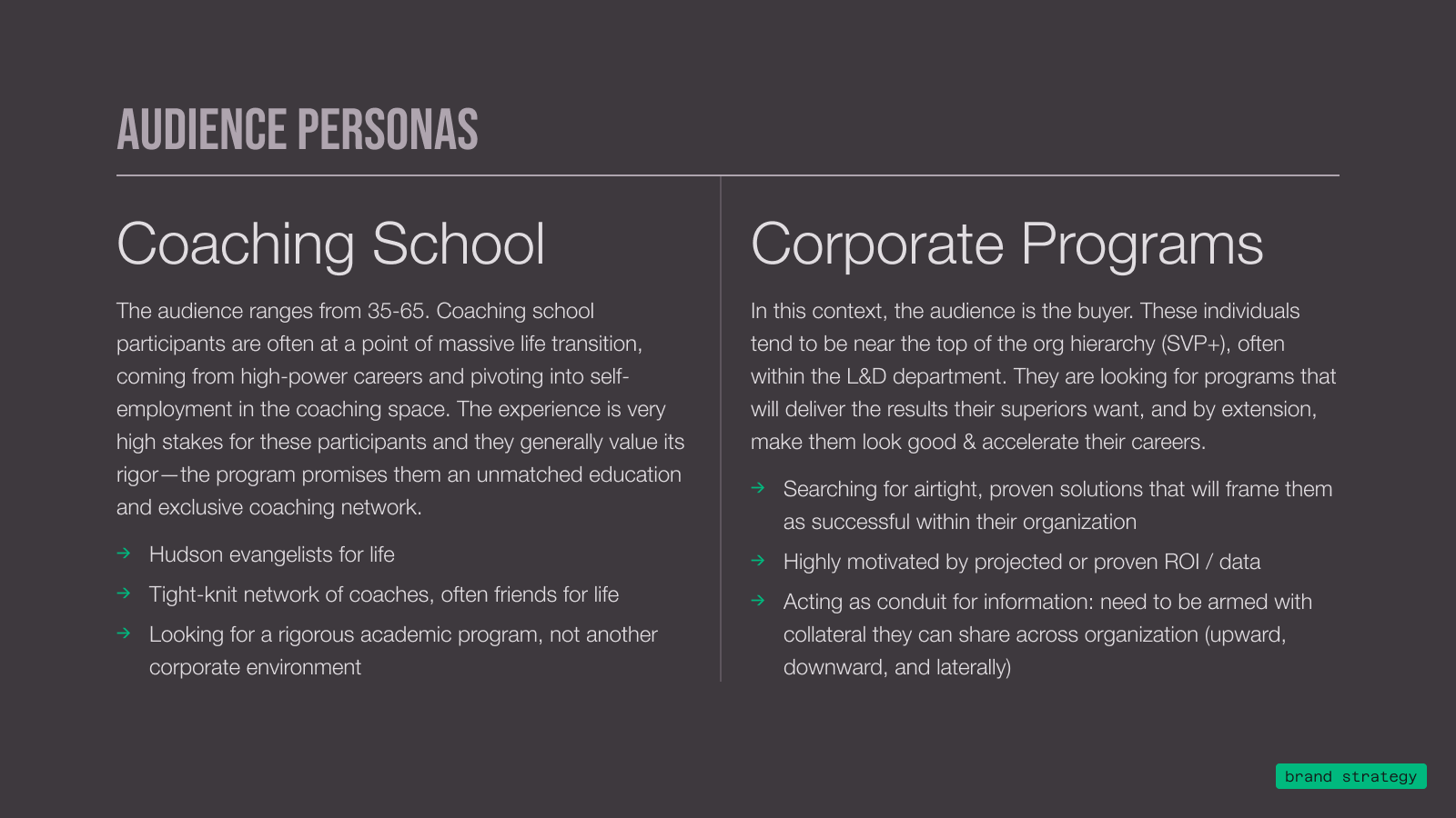
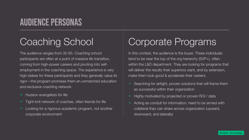
Text titled Audience Personas comparing Coaching School and Corporate Programs. Coaching School targets ages 35-65 transitioning from high-power careers to coaching, valuing rigorous education and network, with traits like Hudson evangelists, tight-knit coach networks, and desire for rigorous academic programs. Corporate Programs target buyers at top org levels in L&D departments, seeking proven solutions with measurable ROI to advance careers and share info across organizations.
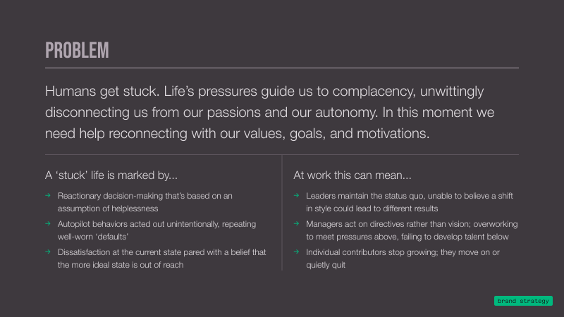
Text titled 'PROBLEM' explaining that humans get stuck due to life's pressures leading to complacency and disconnection from passions and autonomy, needing reconnection with values, goals, and motivations. A stuck life includes reactionary decision-making based on helplessness, autopilot behaviors repeating defaults, and dissatisfaction believing ideal state is out of reach. At work, this means leaders maintain status quo fearing style changes, managers act on directives over vision and overwork, and contributors stop growing or quit quietly.
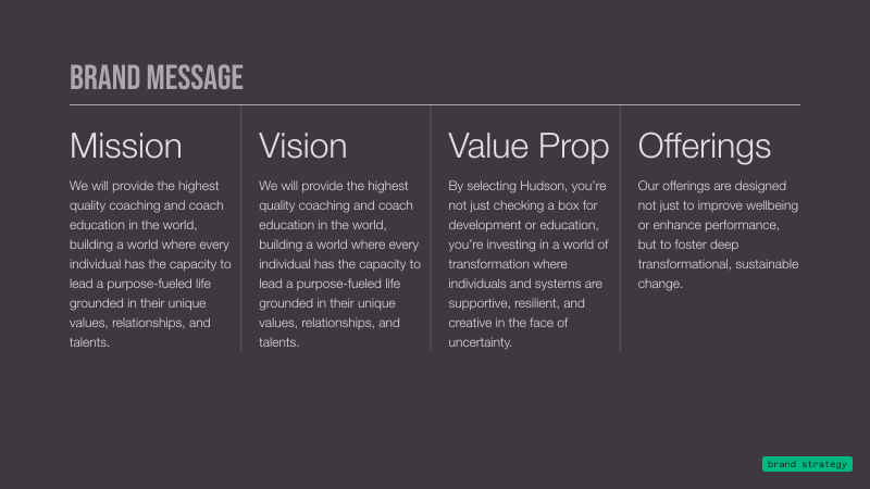
Brand Message divided into four columns: Mission, Vision, Value Prop, and Offerings. Mission and Vision state providing highest quality coaching and education to build a world where individuals lead purpose-fueled lives grounded in unique values and talents. Value Prop explains investing in transformation with supportive, resilient, and creative individuals and systems amid uncertainty. Offerings focus on fostering deep transformational, sustainable change beyond wellbeing and performance.
Text on dark background reading: 'UNSPOKEN TRUTH. Every individual has a magical, passionate life waiting for them; coaching is the tool that brings it to their fingertips.'
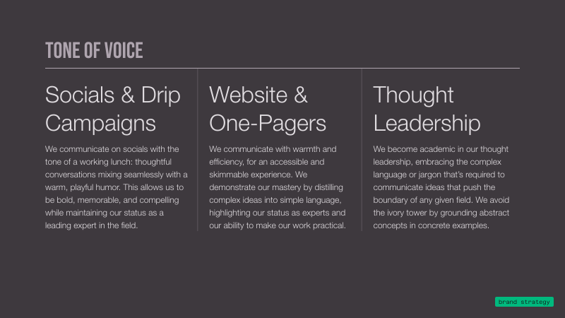
Graphic titled 'Tone of Voice' with three columns describing communication styles: 'Socials & Drip Campaigns' emphasizes thoughtful, playful conversations to be memorable and compelling; 'Website & One-Pagers' highlights warmth and efficiency, distilling complex ideas into simple language for practical communication; 'Thought Leadership' advocates avoiding jargon and grounding abstract concepts in concrete examples to push boundaries in thought leadership. A small label in the bottom right reads 'brand strategy.'
←
→
Legacy Branding
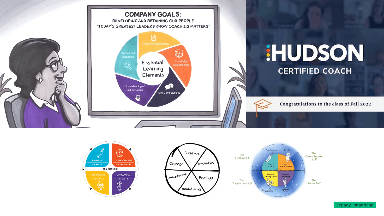
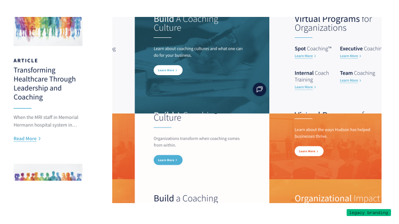
Text on dark background reading 'Where did we start? Original visuals' with a curved black shape on the top right corner.Presentation slide titled 'Legacy Brand Challenge #1' focusing on 'Inaccessible Colors, No Expanded Palette' explaining that three of five core colors failed WCAG AA accessibility standards when paired with white, no expanded palette was created or implemented, and image overlays used with the primary palette also failed accessibility guidelines.A webpage layout showing sections on leadership and coaching, including an article titled 'Transforming Healthcare Through Leadership and Coaching' with a colorful silhouette group image, virtual programs for organizations with coaching types like Spot, Executive, Internal Coach Training, and Team Coaching, and two sections titled 'Build A Coaching Culture' and 'Organizational Impact' with learn more buttons on each section.Slide titled 'Legacy Brand Challenge #2' discussing inconsistent visual language, stating brand visuals originated in the 1980s with co-founders, grew without enough structure for consistency, explored various visual styles, aimed for a balanced tone between corporate, human, academic, relatable, bold, thoughtful, innovative, and institutional, and faced challenges that led to mismatched styles diluting the visual brand and undermining company credibility.Illustration of a person with glasses looking thoughtfully at a presentation board displaying a circular diagram titled 'Company Goals' about developing and retaining people through coaching. The diagram segments show Essential Learning Elements: Coaching Methodology, Knowledge Competencies, Skill Competencies, Understanding of Self-as-Coach, and Practice and Integration. Next to it, a screen shows 'HUDSON CERTIFIED COACH' with congratulations to the Fall 2022 class. Below, three circular diagrams display different conceptual models: one with four phases titled Go For It, The Doldrums, Getting Ready, Cocooning; another with segments labeled Presence, Empathy, Feelings, Boundaries, Embodiment, Courage; and a third with related phases and mini-transitions labeled similarly. A green label in the bottom right says 'legacy branding.'Slide titled 'Legacy Brand Challenge #3' focusing on 'Lack of Gravitas' with five bullet points outlining issues: visual brand lacks expected gravitas, company only uses wordmark without a standalone symbol, Hudson's academic leadership role is visually absent, typography and visuals feel meek not confident, and color palette uses bright primaries that don't fit modern corporate style.Website section titled Develop Yourself featuring three program options: LifeForward, a workshop for professionals ready for change; Hudson Coach Certification, a research-based and ICF-accredited curriculum; and Continuous Learning, offering graduates lifetime access to additional programs and resources, each with a Learn More button.
Lorem ipsum dolor sit amet, consectetur adipiscing elit, sed do eiusmod tempor incididunt ut labore et dolore magna aliqua. Ut enim ad minim veniam, quis nostrud exercitation ullamco laboris nisi ut aliquip ex ea commodo consequat.
Dark background with curved black shape in the top right corner and text reading 'WHERE DID WE START?' in teal above 'ORIGINAL VISUALS' in large white letters.
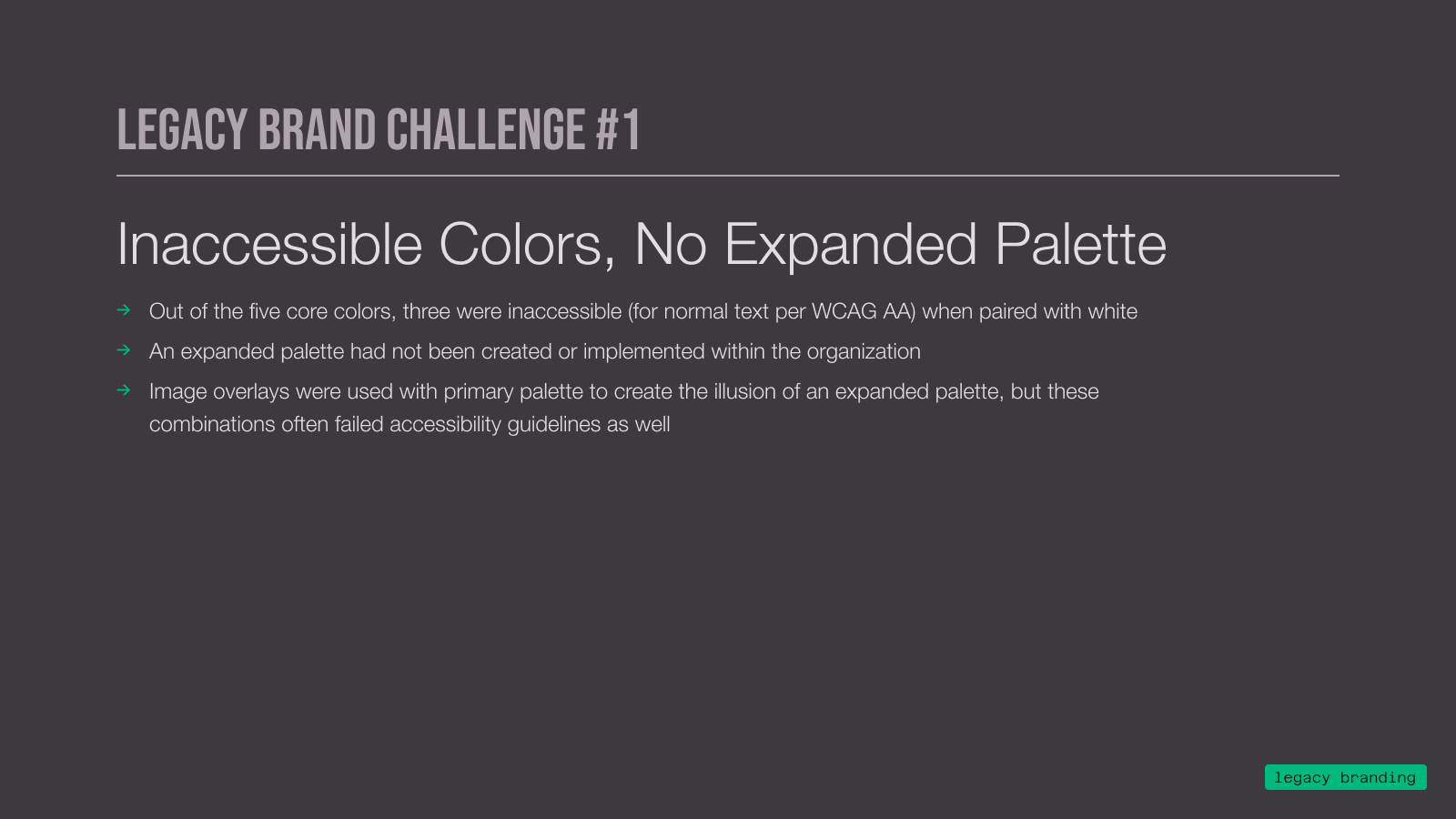
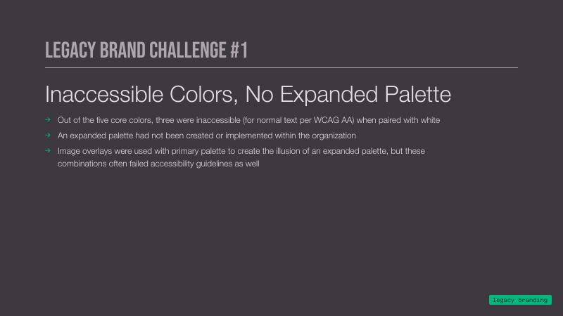
Slide titled Legacy Brand Challenge #1 discussing inaccessible colors and no expanded palette, noting three of five core colors were inaccessible with white text, no expanded palette was created or implemented, and image overlays with primary palette created an illusion of an expanded palette but failed accessibility guidelines.
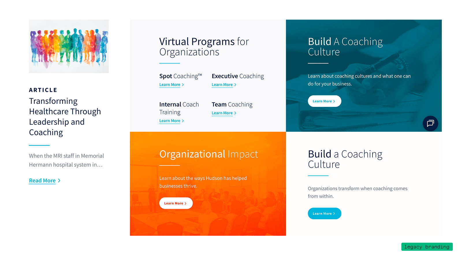
Several collaged screenshots showing inaccessible color combinations like white text on light blue background and white text on an orange gradient background
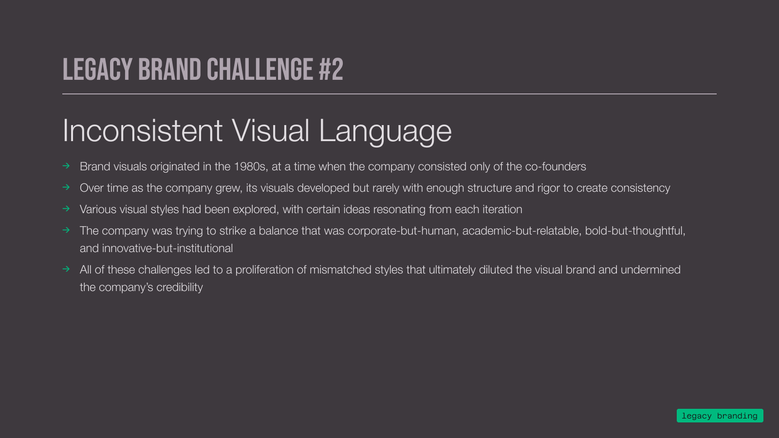
Presentation slide titled 'Legacy Brand Challenge #2' about inconsistent visual language, listing challenges from brand visuals originating in the 1980s, inconsistent development over time, explored visual styles, balancing corporate and human elements, to proliferation of mismatched styles undermining brand credibility, on a dark gray background.
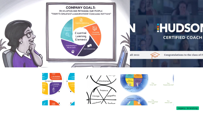
Several collaged screenshots showing different versions of the Hudson's methodology models, highlighting inconsistencies across brand assets
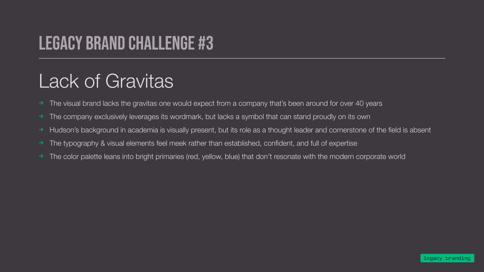
Presentation slide titled 'Legacy Brand Challenge #3' with the subtitle 'Lack of Gravitas' listing five points about a visual brand lacking gravitas, leveraging only a wordmark without a strong symbol, absence of thought leadership despite academic background, meek typography and visual elements, and a color palette of bright primaries not resonating with modern corporate world.
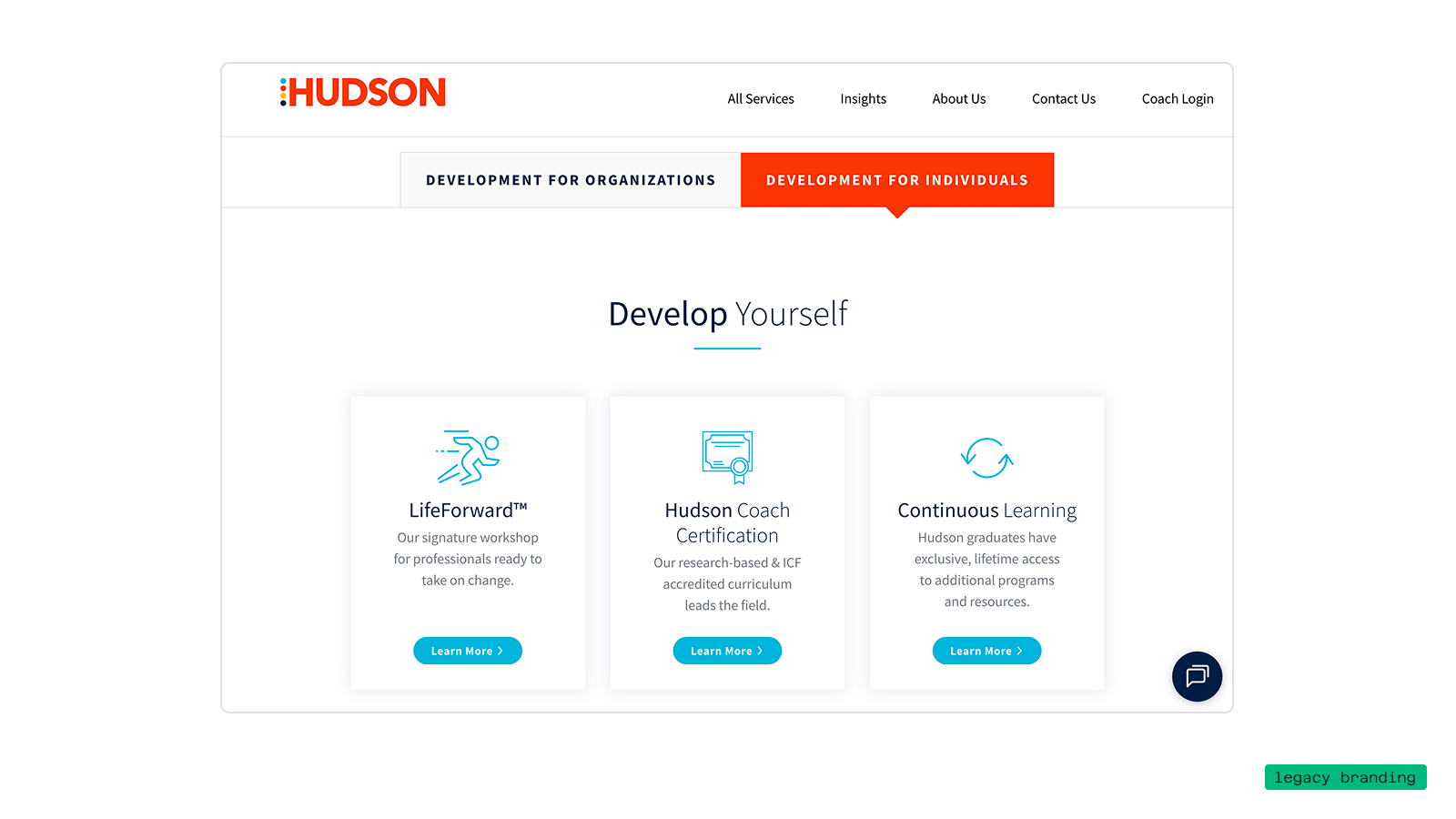
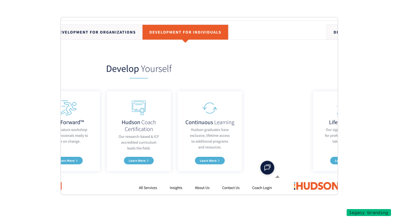
Screenshot of Hudson's website section titled 'Develop Yourself' featuring three offerings: LifeForward workshop for professionals, Hudson Coach Certification with research-based ICF curriculum, and Continuous Learning with exclusive lifetime access and additional resources. Navigation links at top include All Services, Insights, About Us, Contact Us, and Coach Login. Two tabs highlight Development for Organizations and Development for Individuals, with the latter selected.
←
→
New Approach
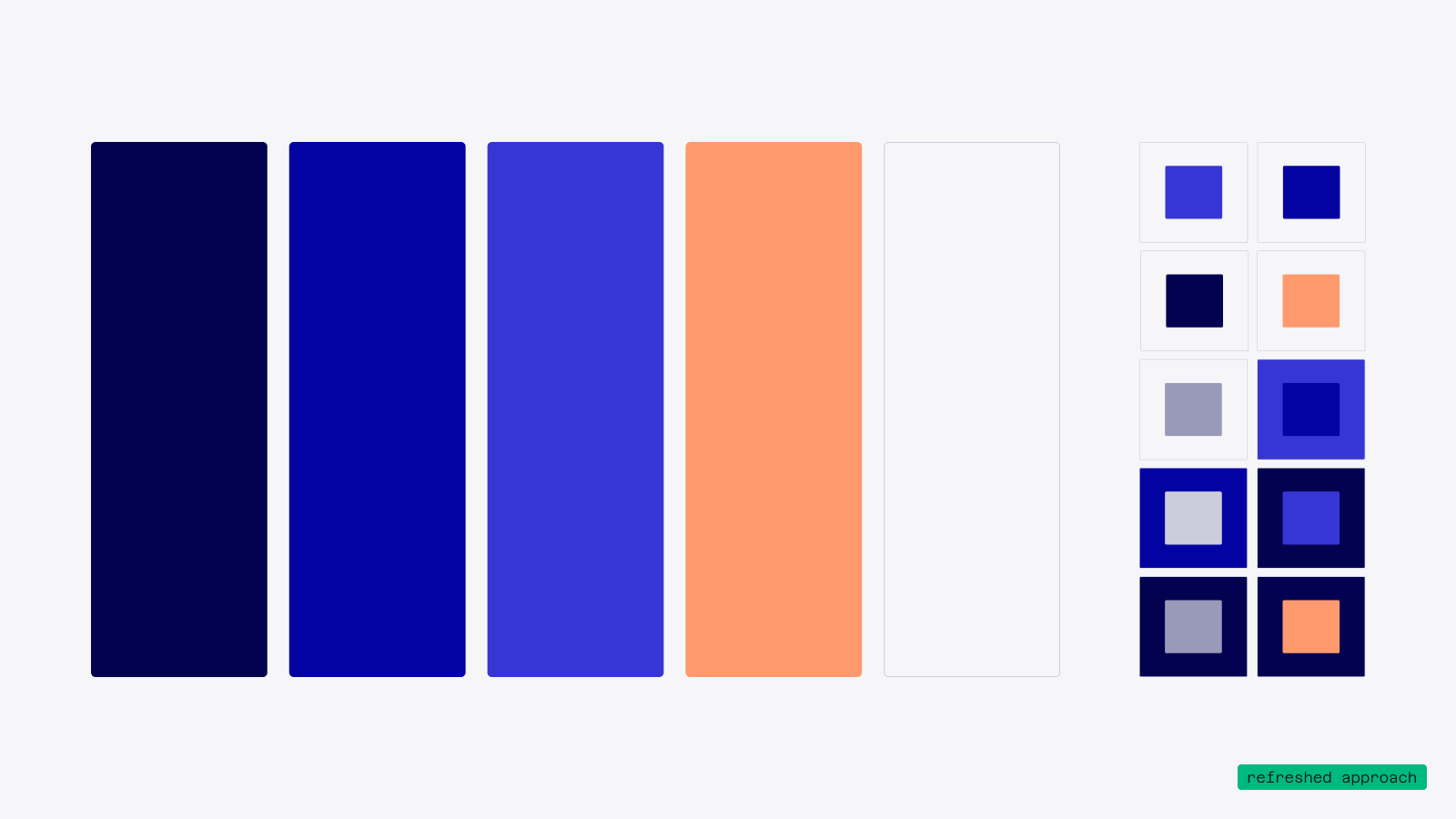
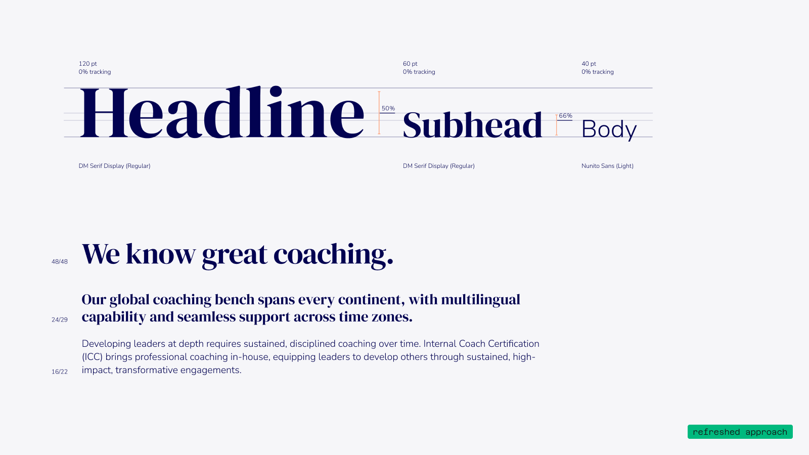
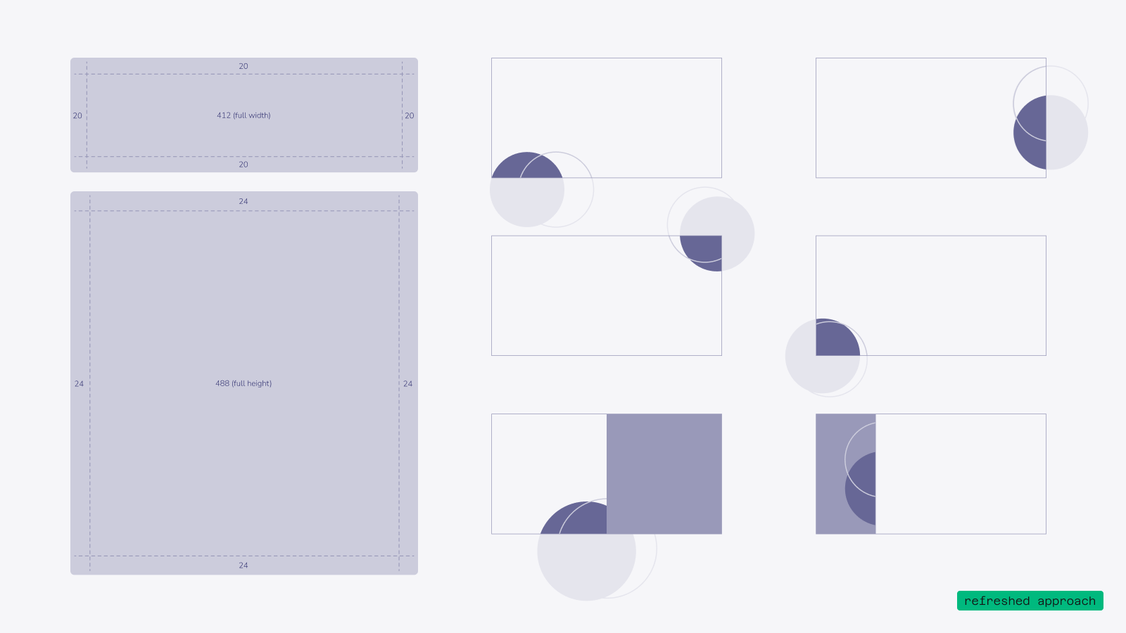
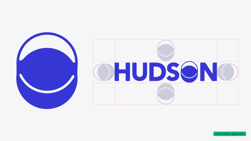
Slide with dark background and text reading 'Where did we end? Strategic Refresh' with 'Strategic Refresh' in large white letters.Text explains a new brand logomark featuring two overlapping circles: one filled and one outlined, symbolizing coaching's perspective shift and upward movement. The shape is clean, geometric with soft edges representing the human element, and replaces the 'O' in Hudson's logo for seamless use across decks, workbooks, and social templates.Blue circular logo with an abstract design of two white curved lines forming a horizontal oval shape inside it, next to the word HUDSON in blue capital letters with the letter O replaced by the same abstract logo. The logo and text are arranged on a grid with smaller faded versions of the logo around it.Text titled 'A Fresh Palette' describing a color palette grounded in purple-blues for trust and creativity, accented by a soft energetic orange for playful curiosity, working well in light and dark contexts, with an expanded version for digital consistency and a secondary palette for data visualizations.Color palette with five vertical large rectangles in navy blue, cobalt blue, royal blue, peach, and white next to a grid of smaller squares combining these colors in various overlays and background combinations on a light gray background.Slide titled 'A Consistent Typographic System' with a subtitle 'Type' and three bullet points explaining the updated typography. The points highlight a modern, humanistic style balancing soft serif headings with tall x-height sans-serif body for a clean, easy-to-read experience; integration of Google fonts into workflows to avoid licensing fees; and a clearly-defined type hierarchy ensuring size relationships between heading and body copy for brand alignment.Typography example showing headline, subhead, and body text styles: Headline in DM Serif Display font at 120 pt with 0% tracking, Subhead in DM Serif Display at 60 pt with 0% tracking, and Body in Nunito Sans Light at 40 pt with 0% tracking. Sample text reads: We know great coaching. Our global coaching bench spans every continent, with multilingual capability and seamless support across time zones. Below is a paragraph about Internal Coach Certification (ICC) offering professional in-house coaching for leaders.Presentation slide titled 'A Simplified Layout' focusing on 'Shapes & Ratios,' describing refreshed branding with decorative shapes including a primary shape echoing the logomark and organic secondary shapes; also notes design guidelines for layout integration and margin use for consistency.Diagram showing spacing guidelines and layered shapes including rectangles and overlapping circles in shades of purple on a light background, with measurements indicated as 20 and 24 pixels and labeled widths and heights.
Lorem ipsum dolor sit amet, consectetur adipiscing elit, sed do eiusmod tempor incididunt ut labore et dolore magna aliqua. Ut enim ad minim veniam, quis nostrud exercitation ullamco laboris nisi ut aliquip ex ea commodo consequat.
Dark gray background with an abstract black shape and text in the upper left reading: 'WHERE DID WE END? STRATEGIC REFRESH'.
Text titled 'A New Symbol' explaining a logomark: it can stand alone as a distinctive brand element, featuring two circles representing a shift in coaching perspective and upward movement in achievement or self-realization. The shape is clean and geometric with soft edges for a human touch. Core pieces include a filled circle overlapping an outlined circle for reuse as decorative elements. The logomark replaces the 'O' in Hudson’s lockup for seamless use across decks, workbooks, and social templates.
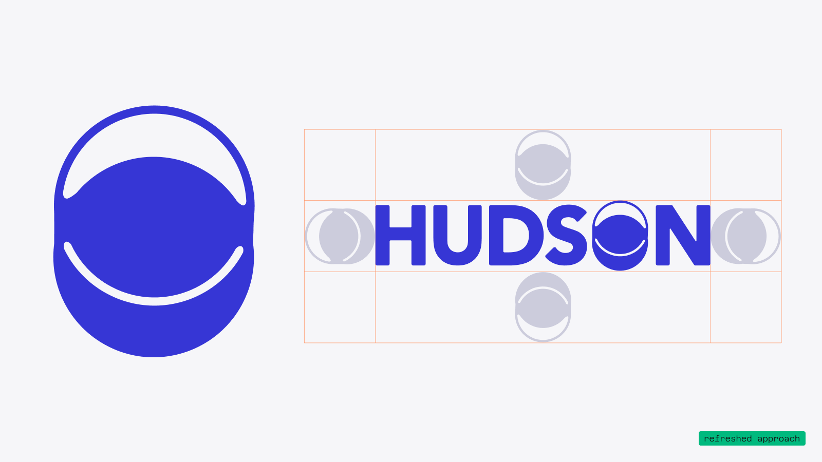
Blue circular logo with a curved white line inside, next to the word HUDSON in bold blue letters, with the letter O stylized as a smaller version of the circular logo, surrounded by faint alignment marks on a light gray background.
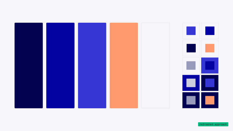
Text slide titled 'A Fresh Palette' describing a color palette grounded in purple-blues evoking trust and creativity, accented with soft energetic orange for playful curiosity. The palette works seamlessly across light and dark contexts for educational materials and self-reflection prompts. An expanded version ensures consistency across digital contexts, with a secondary palette for data visualizations like charts and tables that benefits color-mapping. A small label in the bottom right reads 'refreshed approach.'
Six vertical color blocks arranged horizontally representing a color palette: from left to right, very dark navy, deep blue, medium bright blue, light orange, and translucent white. To the right of these blocks are smaller squares showing pairings and overlays of these colors in various combinations on a light gray background.
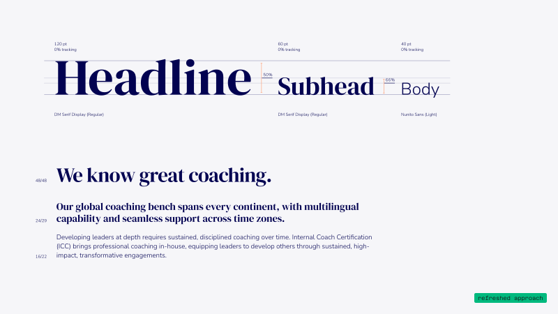
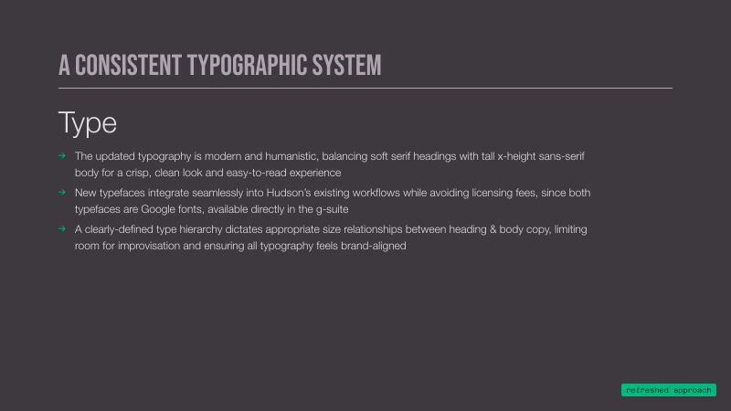
Slide titled 'A Consistent Typographic System' explaining the 'Type' section with three points: updated typography is modern and humanistic with soft serif headings and tall x-height sans-serif body for readability; new typefaces integrate seamlessly into workflows avoiding licensing fees using Google fonts via g-suite; a clear type hierarchy defines size relationships between heading and body copy ensuring brand alignment.
Typography example showing three text styles: Headline in large DM Serif Display Regular font at 120 pt with 0% tracking, Subhead in smaller DM Serif Display Regular at 60 pt with 0% tracking, and Body text in Nunito Sans Light at 40 pt with 0% tracking, with respective letter spacing percentages noted. Below, a section titled 'We know great coaching.' in bold, accompanied by supporting text explaining global coaching capabilities and internal coach certification for leadership development, with line height indicators on the left.
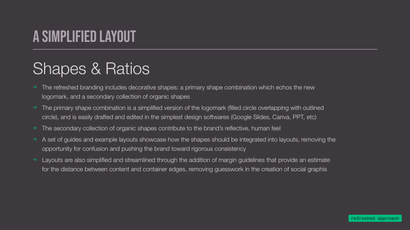
Slide titled 'A SIMPLIFIED LAYOUT' explaining Shapes & Ratios in branding, describing a primary shape combination echoing a logomark, a secondary collection of organic shapes, and how guides, example layouts, and margin guidelines simplify layout consistency and spacing in social graphics.
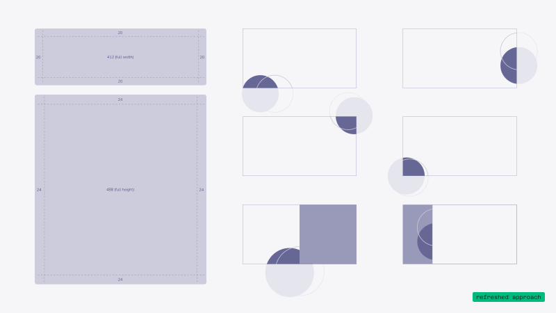
Diagram showing a large purple square with 24-unit margins labeled 488 full height, and a purple rectangle above it with 20-unit margins labeled 412 full width, next to six smaller rectangles containing overlapping solid and translucent circles at various corners, illustrating shape positioning within bounding boxes.
←
→
All Projects